David Cox Palette 5
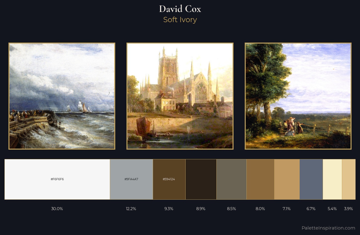
Palette Analysis
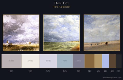
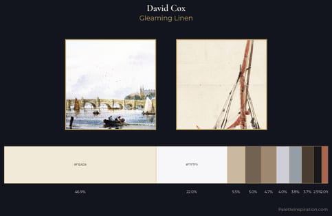
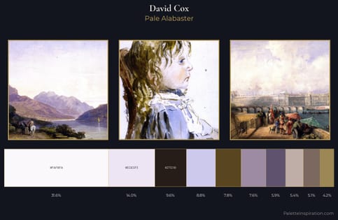
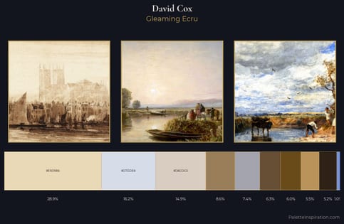
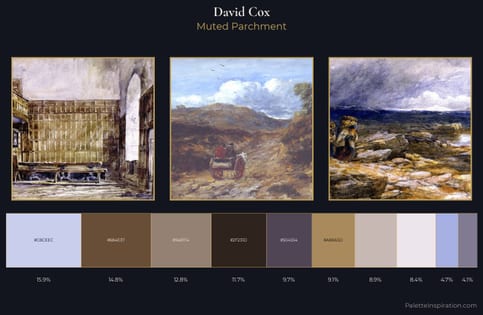
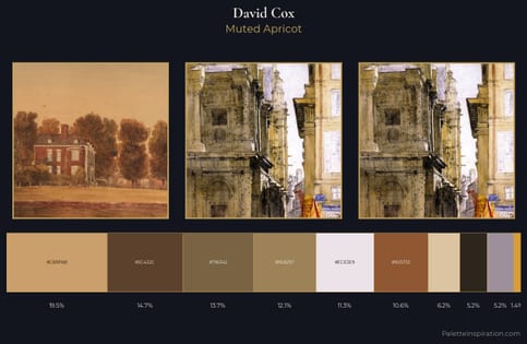
Light floods David Cox; the palette keeps values pale and airy across its range. David Cox tilts toward cool - blues and silver-greys carry the structural weight. Muted throughout, the palette achieves its effects through value and temperature rather than chromatic force. David Cox gives 30.0% of the composition to a single #F6F6F6 - a decisive chromatic anchor. Only 3.9% is devoted to #E0C38D, yet that small allocation delivers the palette's entire chromatic tension. A value spread of 71 units gives the palette both depth and air - shadows are genuinely dark, lights genuinely light. The palette has the character of outdoor light: cool, mid-bright, with colour rendered faithfully rather than expressively. Palette 5 sits within the larger chromatic argument that David Cox's complete body of work advances.
Example use cases
- exhibition design
- foundation branding
- estate management
- art education
- museums & galleries
I Love This!
Copy, export, or download for your project