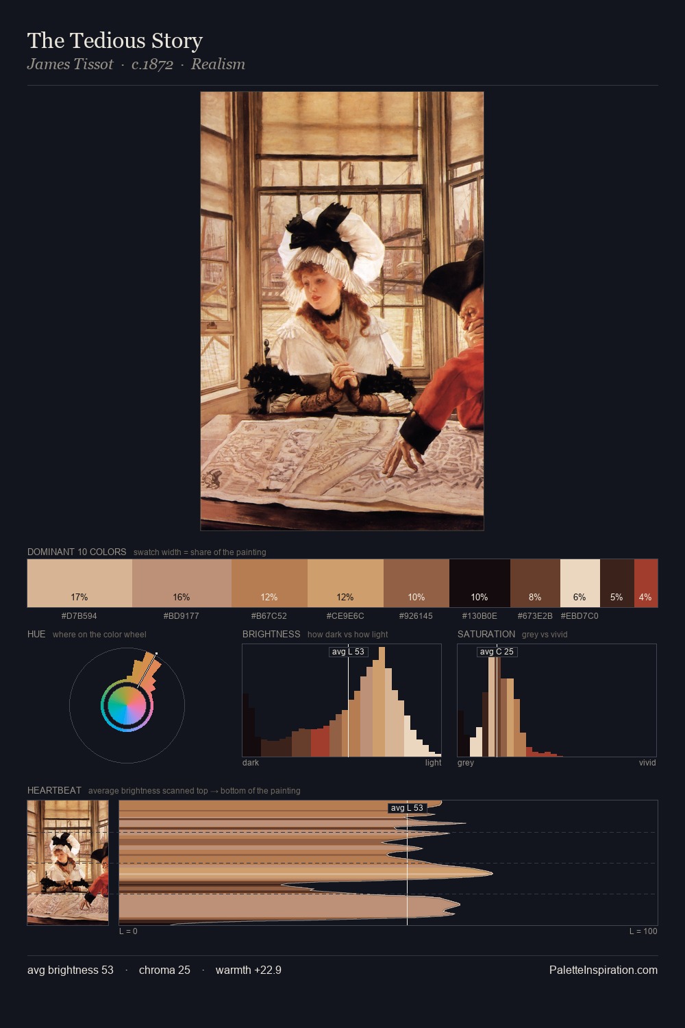
Daniel Huntington Palette 3

Palette Analysis
Daniel Huntington works almost entirely in the lower half of the value scale, privileging depth over brilliance. Warmth dominates - the palette of Daniel Huntington leans heavily on the yellow-orange-red arc of the colour wheel. Saturation is deliberately withheld - the beauty here lies in the near-monochromatic gradations rather than colour difference. #110B07 at 55.3% of the palette: an overwhelming presence that pulls all other colours into its gravitational field. #9F382A functions as the palette's exclamation mark: highest chroma, lowest percentage (1.4%). A value spread of 62 units gives the palette both depth and air - shadows are genuinely dark, lights genuinely light. Together these qualities place Daniel Huntington firmly in the tonal tradition - concerned with mood and atmosphere rather than chromatic display. Palette 3 sits within the larger chromatic argument that Daniel Huntington's complete body of work advances.
Example use cases
- theater design
- jewelry brands
- tobacco-adjacent retail
- event branding
- film & entertainment
I Love This!
Copy, export, or download for your project