Dada Palette 8
Muted Parchment
Muted Deliberately desaturated - chroma pulled toward gray, the restraint of tonal painting.
Parchment Aged warm neutral - the color of old manuscript parchment, tan and slightly yellowed.

Palette Analysis
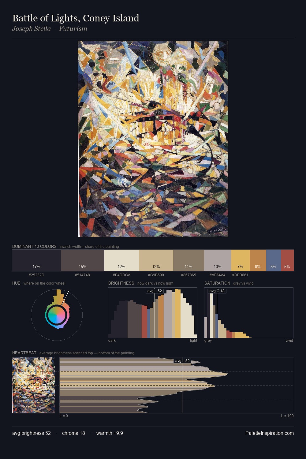
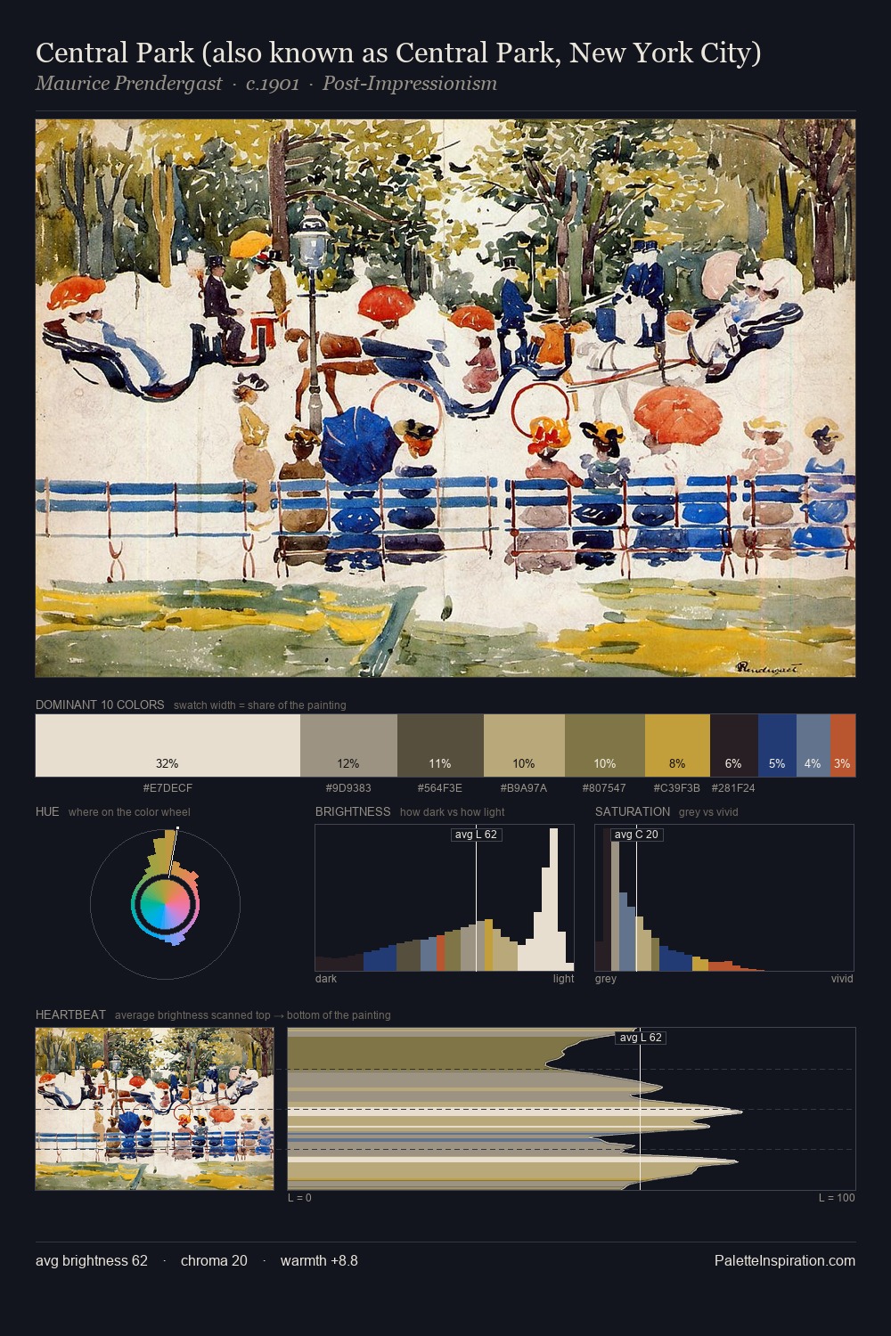
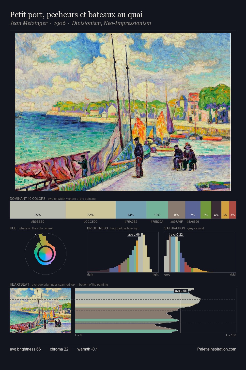
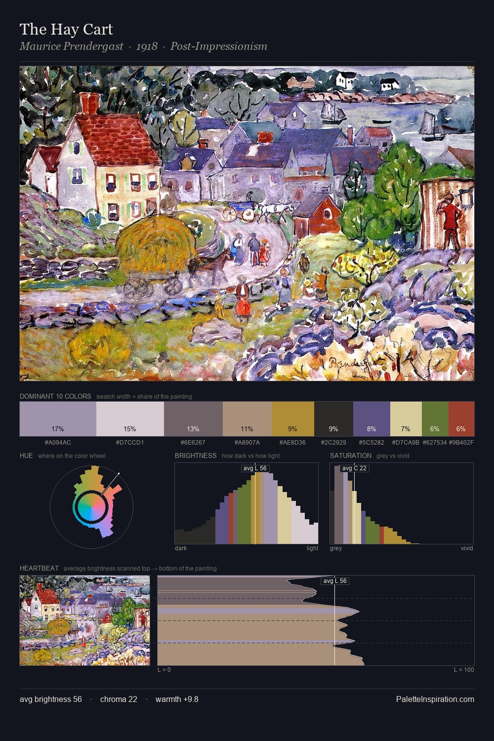
Dada occupies the comfortable middle of the value scale, avoiding both extremes to hold the eye in a sustained middle grey. Warm and cool tones are held in careful balance - neither family dominates, creating tension and resolution simultaneously. Every colour is desaturated; the palette proceeds through near-neutrals and gently-coloured greys. Only 1.8% is devoted to #465287, yet that small allocation delivers the palette's entire chromatic tension. 66 units of value range underpin the palette's structural clarity: the eye always knows where light falls.
Example use cases
- nonprofit identity
- public libraries
- historical sites
- literary journals
- archival print
I Love This!
Use This Palette
Copy, export, or download for your project
Copy, export, or download for your project
Copy:
Download:
Share: