Dada Palette 2
Gleaming Linen
Gleaming Bright and polished - high-key, often warm, suggesting reflective or luminous surfaces.
Linen Warm light neutral - the color of natural linen, slightly warm beige.

Palette Analysis
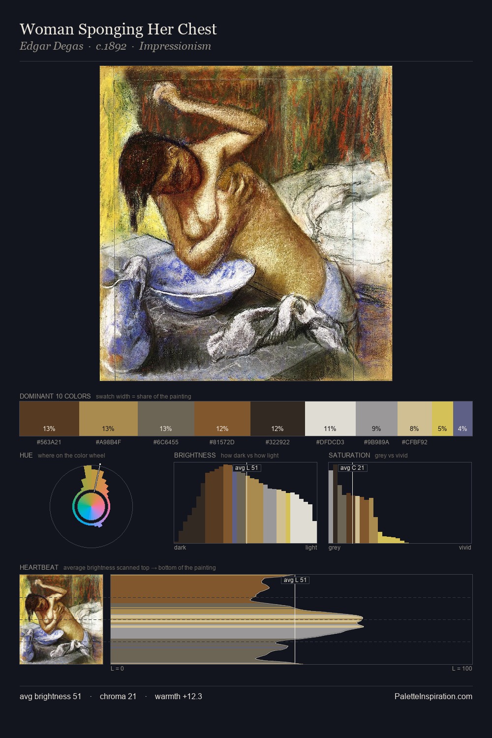
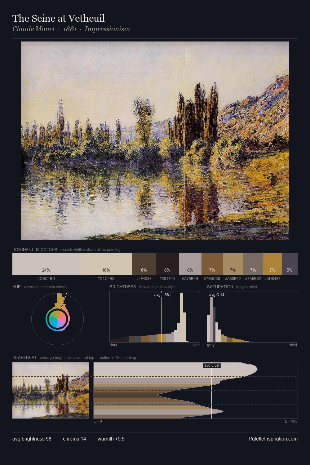
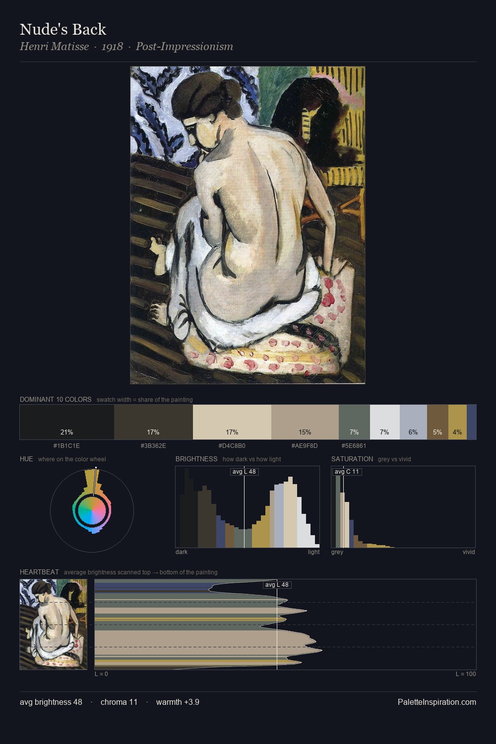
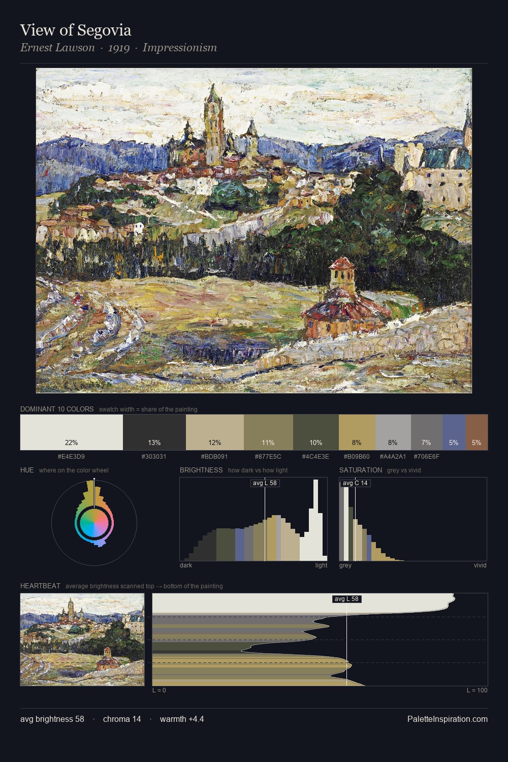
Dada is strongly light-biased - shadow is suggested rather than declared. Cool hues prevail: blues, greens, and greys anchor the palette's emotional temperature. The absence of saturated colour is itself an expressive choice: this is a palette of restraint and atmosphere. At 32.5%, #DBDFE0 functions less as a colour accent and more as a complete atmospheric environment. Only 2.9% is devoted to #9D8640, yet that small allocation delivers the palette's entire chromatic tension. 62 units of value range underpin the palette's structural clarity: the eye always knows where light falls. The mid-to-high key, cool bias, and moderate chroma point to outdoor observation - sky and diffused daylight as the dominant light source.
Example use cases
- florist branding
- event design
- real estate
- jewelry retail
- hospitality branding
I Love This!
Use This Palette
Copy, export, or download for your project
Copy, export, or download for your project
Copy:
Download:
Share: