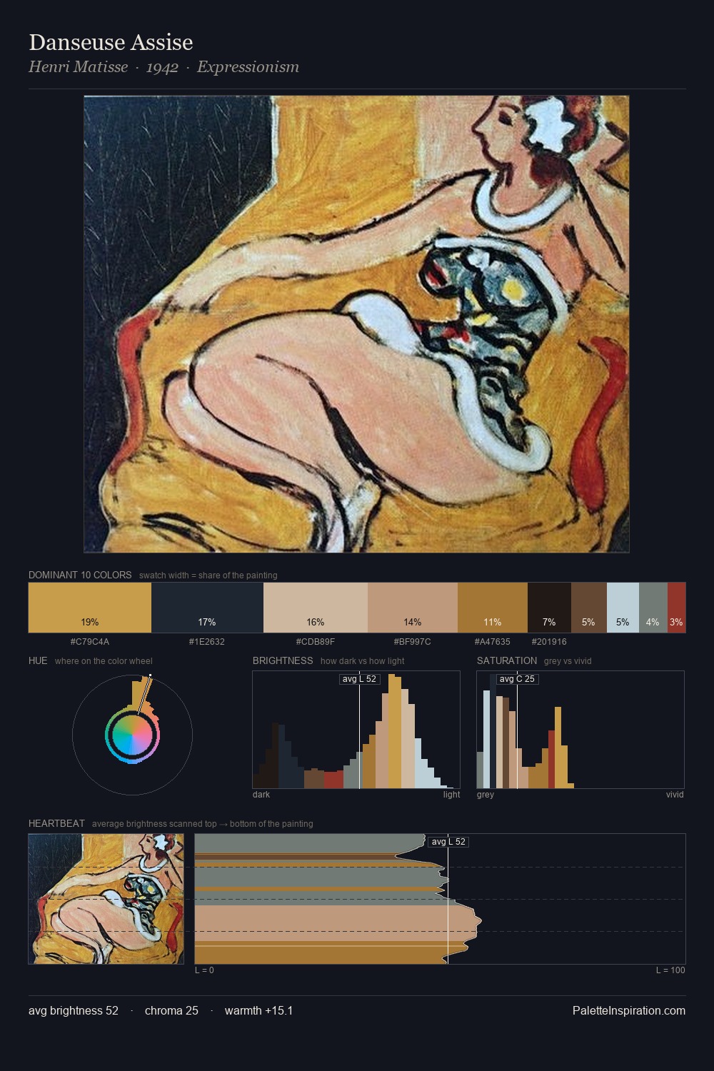
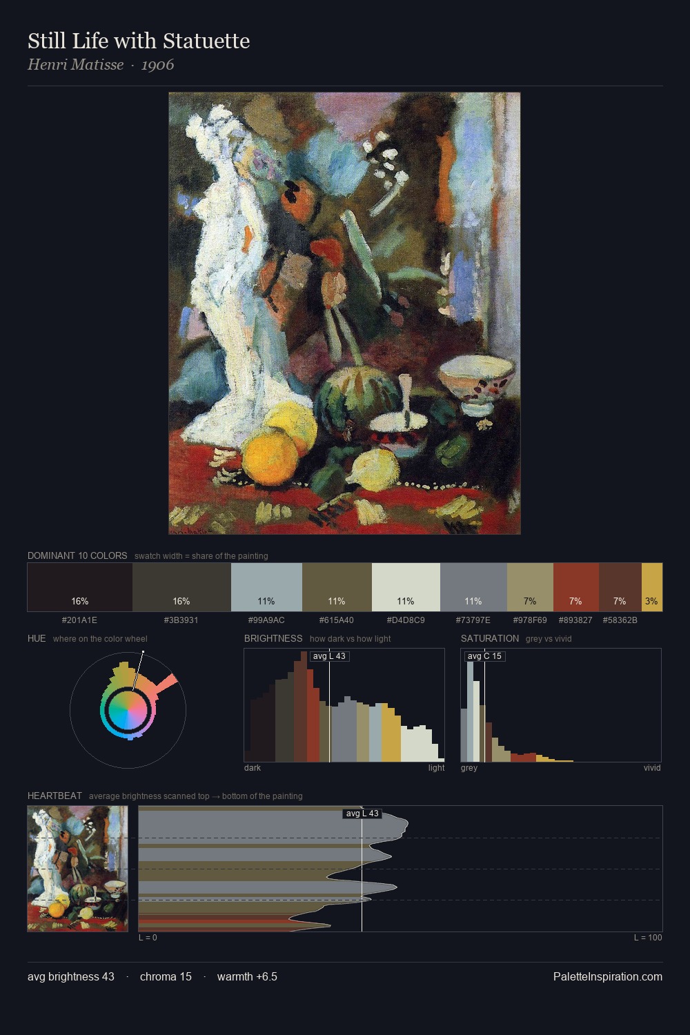
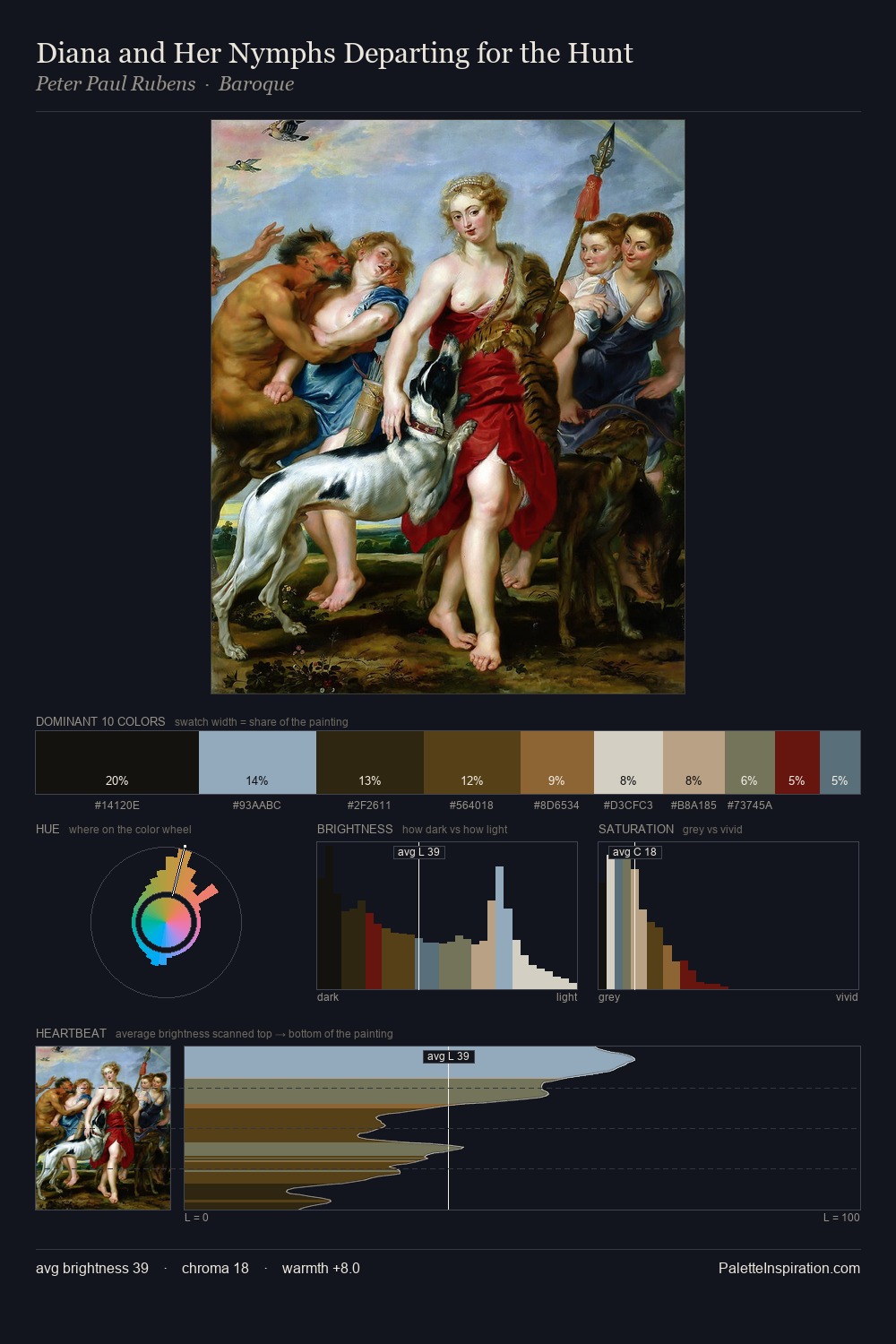
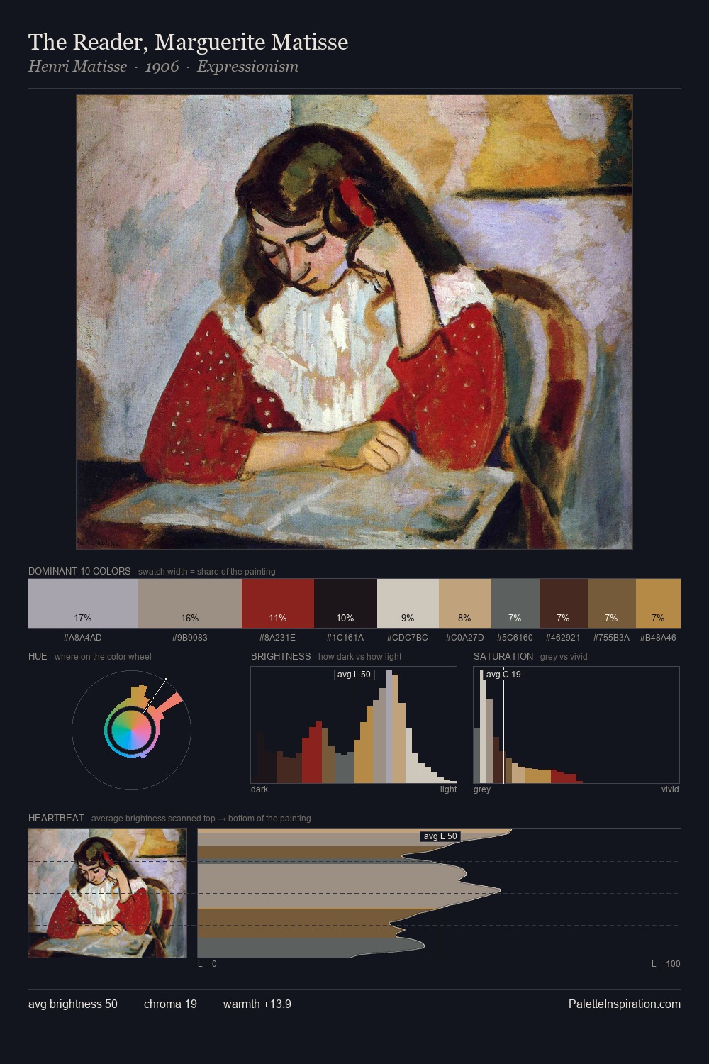
Cornelius Johnson Palette 2

Palette Analysis
Cornelius Johnson works almost entirely in the lower half of the value scale, privileging depth over brilliance. Blues and teal-greys govern the palette, lending it an aquatic or atmospheric quality. Every colour is desaturated; the palette proceeds through near-neutrals and gently-coloured greys. #0D0E0D claims 42.0% of the surface, functioning as the work's tonal foundation. #BDCCD8 delivers the chromatic peak at only 6.2% - a small shot of colour with outsized visual impact. A value spread of 68 units gives the palette both depth and air - shadows are genuinely dark, lights genuinely light. The combination of low values, muted chroma, and compressed range is the signature of the Tonalist mode - painting as atmosphere. In the context of Cornelius Johnson's full range of palettes, group 2 represents one movement in an ongoing chromatic dialogue.
Example use cases
- theater design
- jewelry brands
- tobacco-adjacent retail
- event branding
- film & entertainment
I Love This!
Copy, export, or download for your project