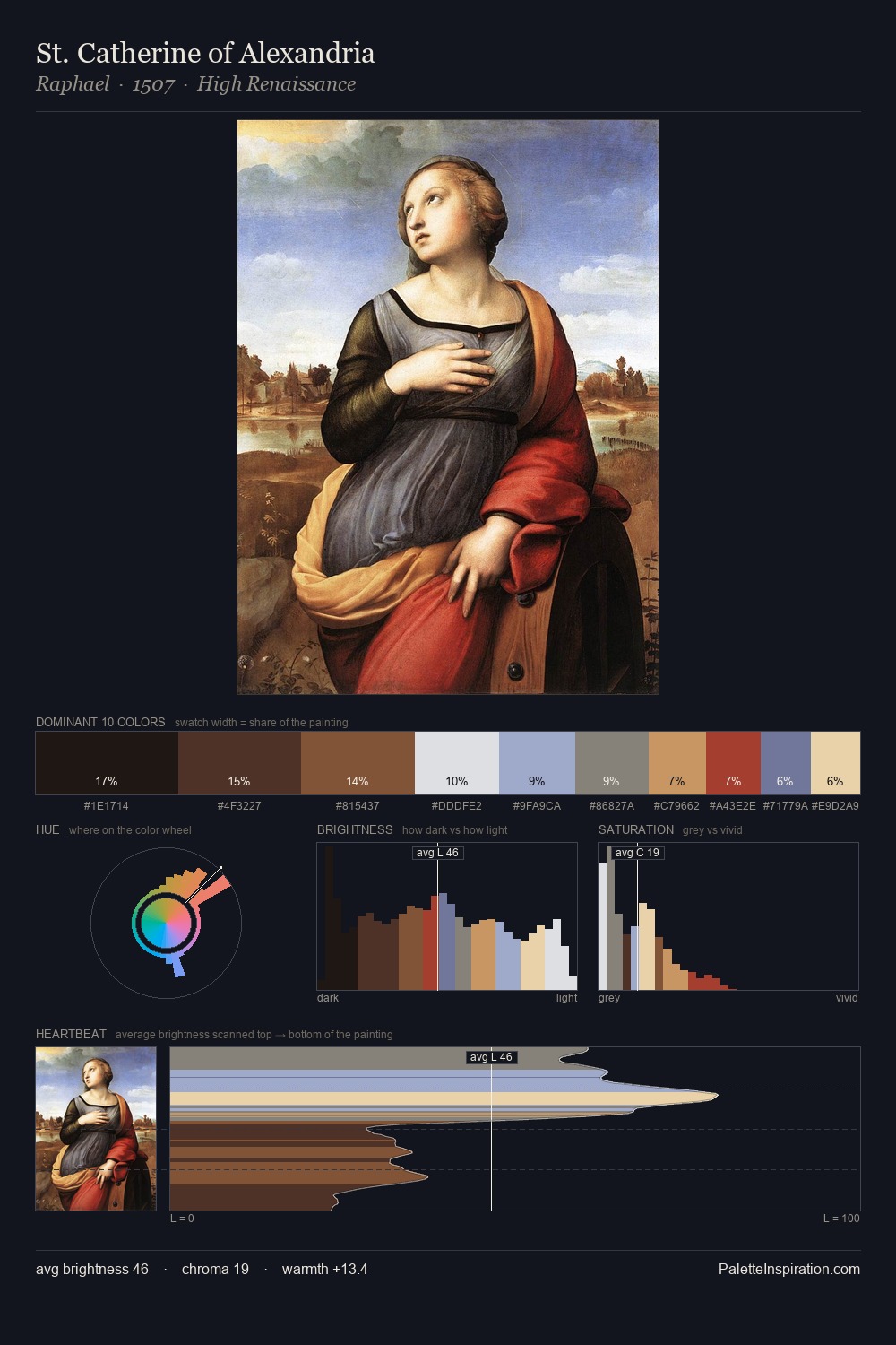
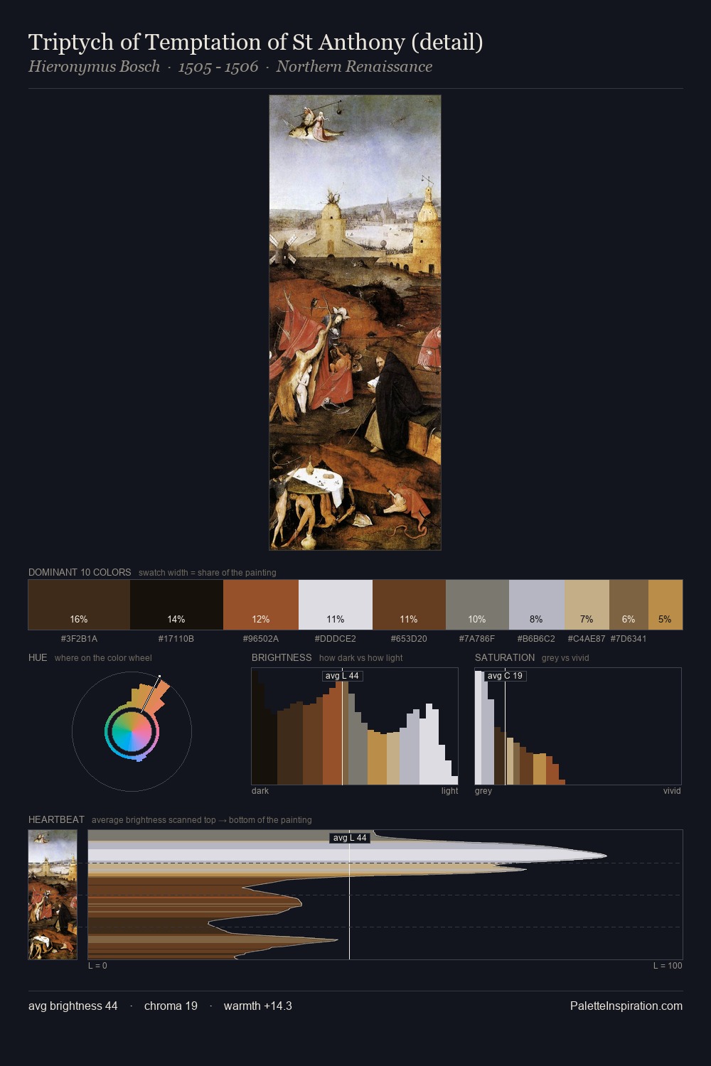
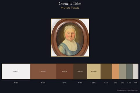
Cornelis Thim Palette 1
Muted Topaz
Muted Deliberately desaturated - chroma pulled toward gray, the restraint of tonal painting.
Topaz Golden yellow - the color of topaz gemstone, warm and slightly saturated.
Palette Analysis
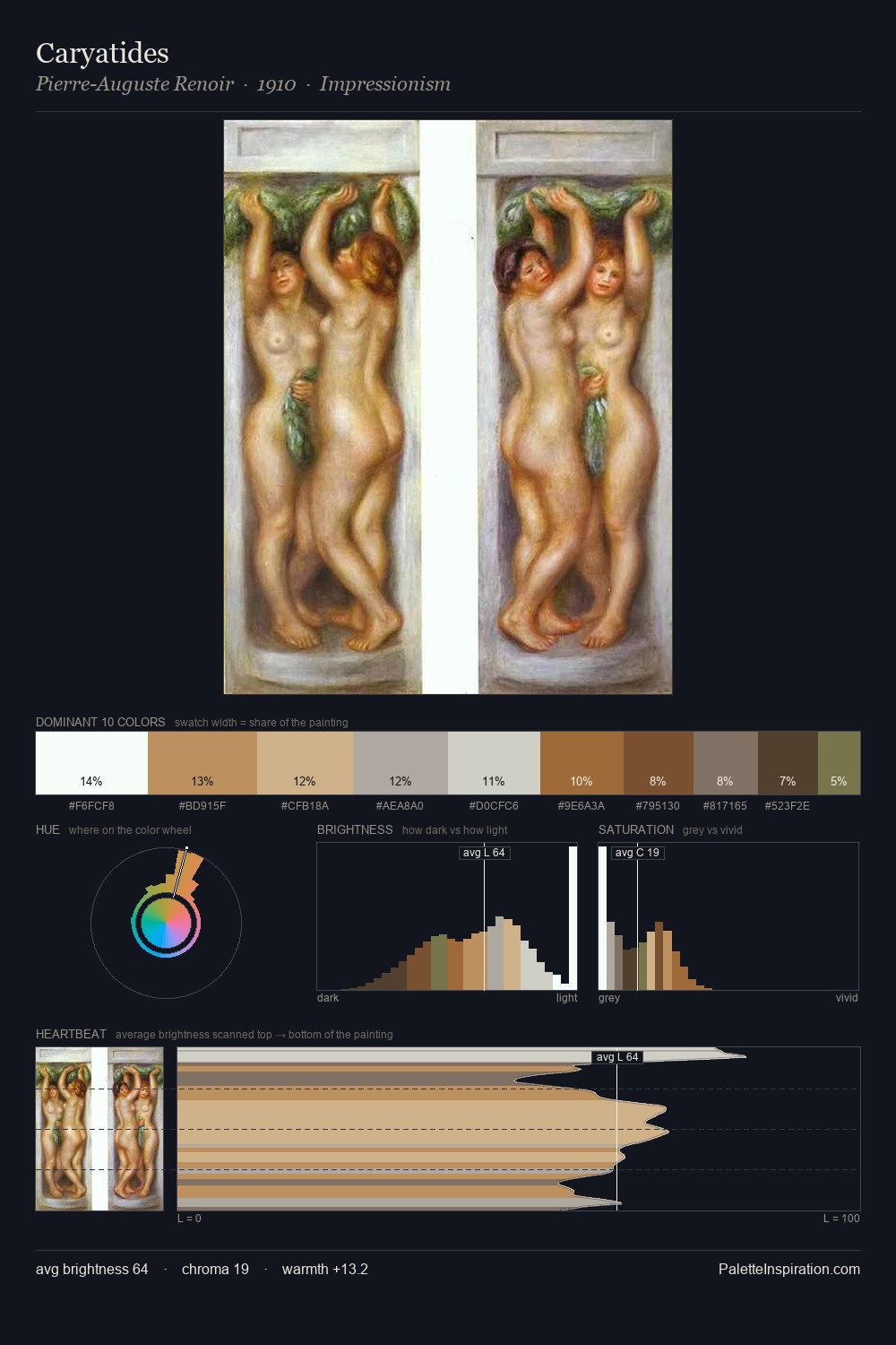
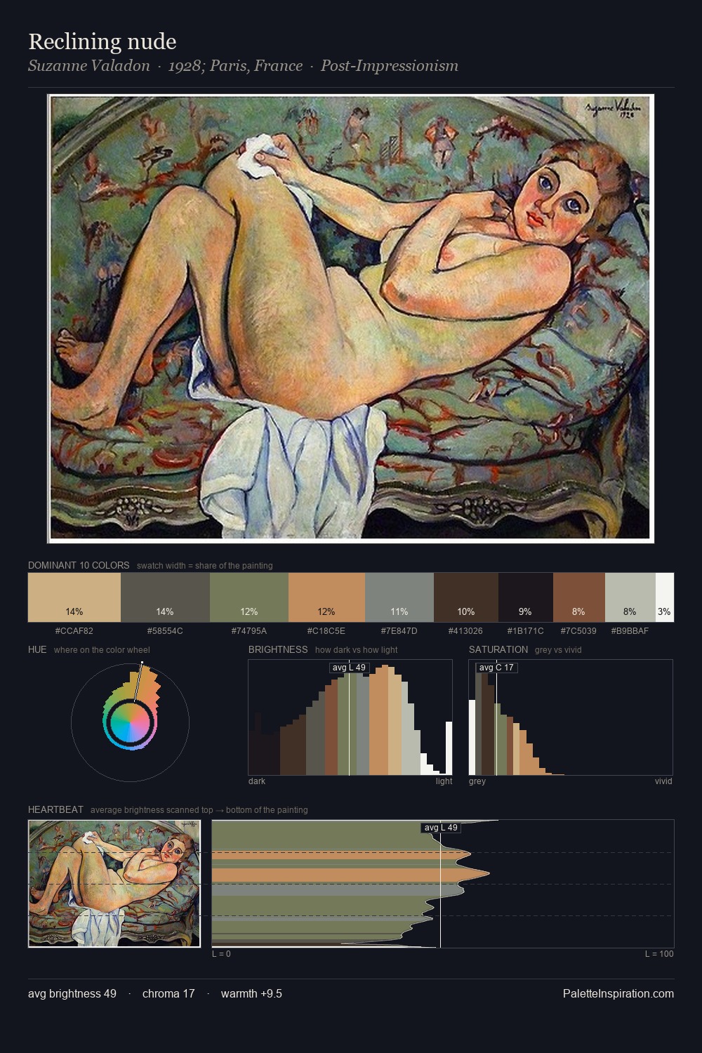
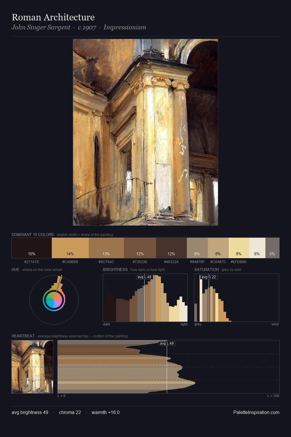
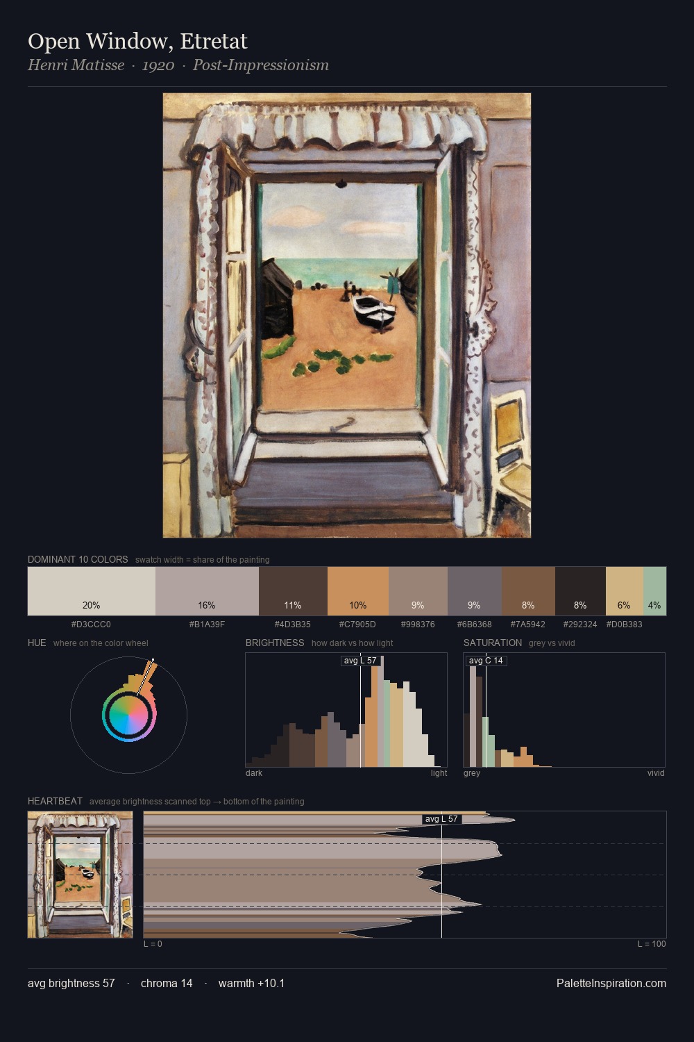
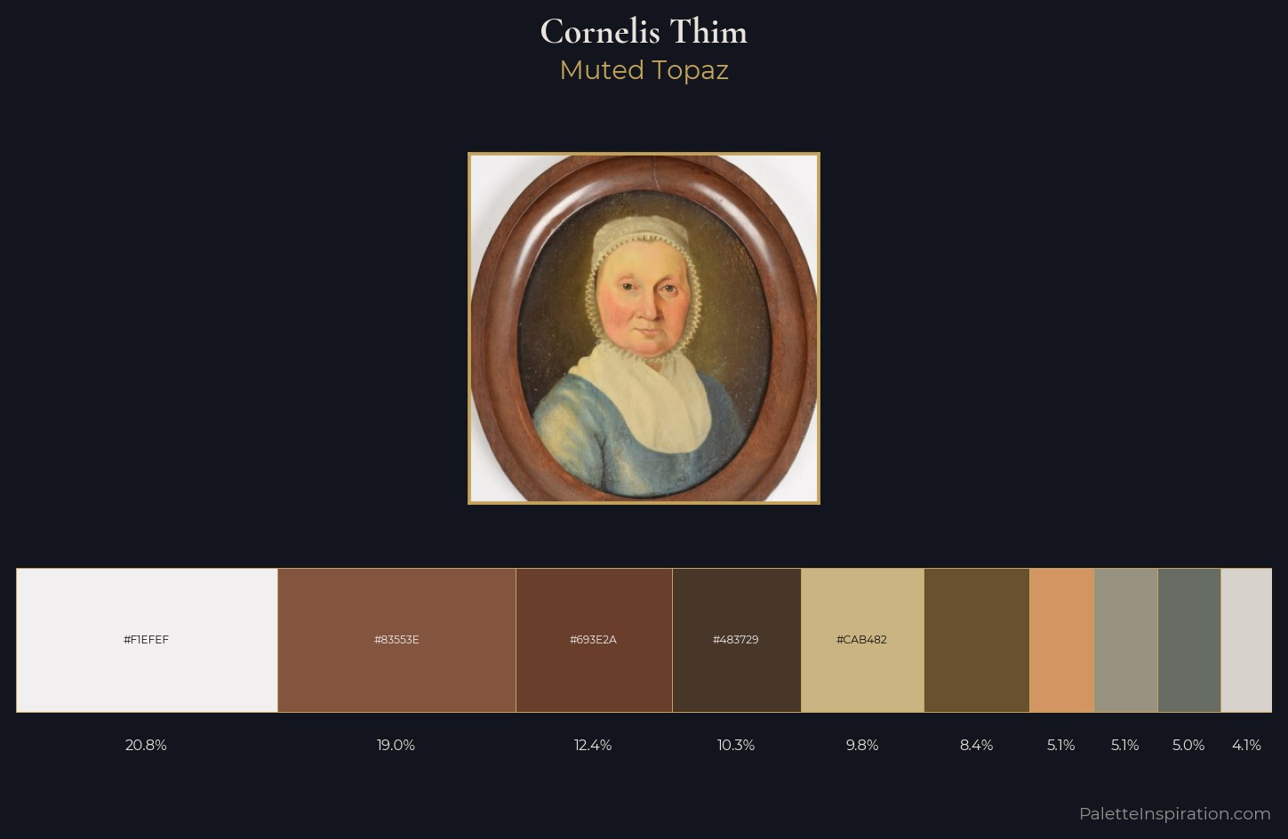
Cornelis Thim sits in the centre of the value range, lending the palette a sense of even, sustained light. Heat pervades this palette; warm chromatic identities outweigh cool ones at almost every weight. All colours lean toward grey, building depth through value rather than colour punch. The saturated accent, #CAB482, registers at 9.8% - sparse enough to feel like a deliberate surprise. From deepest dark to palest light, the palette traverses 60 units of the value scale - a span that creates natural depth. Palette 1 sits within the larger chromatic argument that Cornelis Thim's complete body of work advances.
Example use cases
- ceramics & pottery
- boutique hospitality
- menswear
- heritage food brands
- craft & artisan brands
I Love This!
Use This Palette
Copy, export, or download for your project
Copy, export, or download for your project
Copy:
Download:
Share: