Constantin Stahi Palette 4
Nocturnal Terracotta
Nocturnal Night-register palette - very low values, the world after dark.
Terracotta Fired clay red-orange - the color of unglazed earthenware pottery.

Palette Analysis
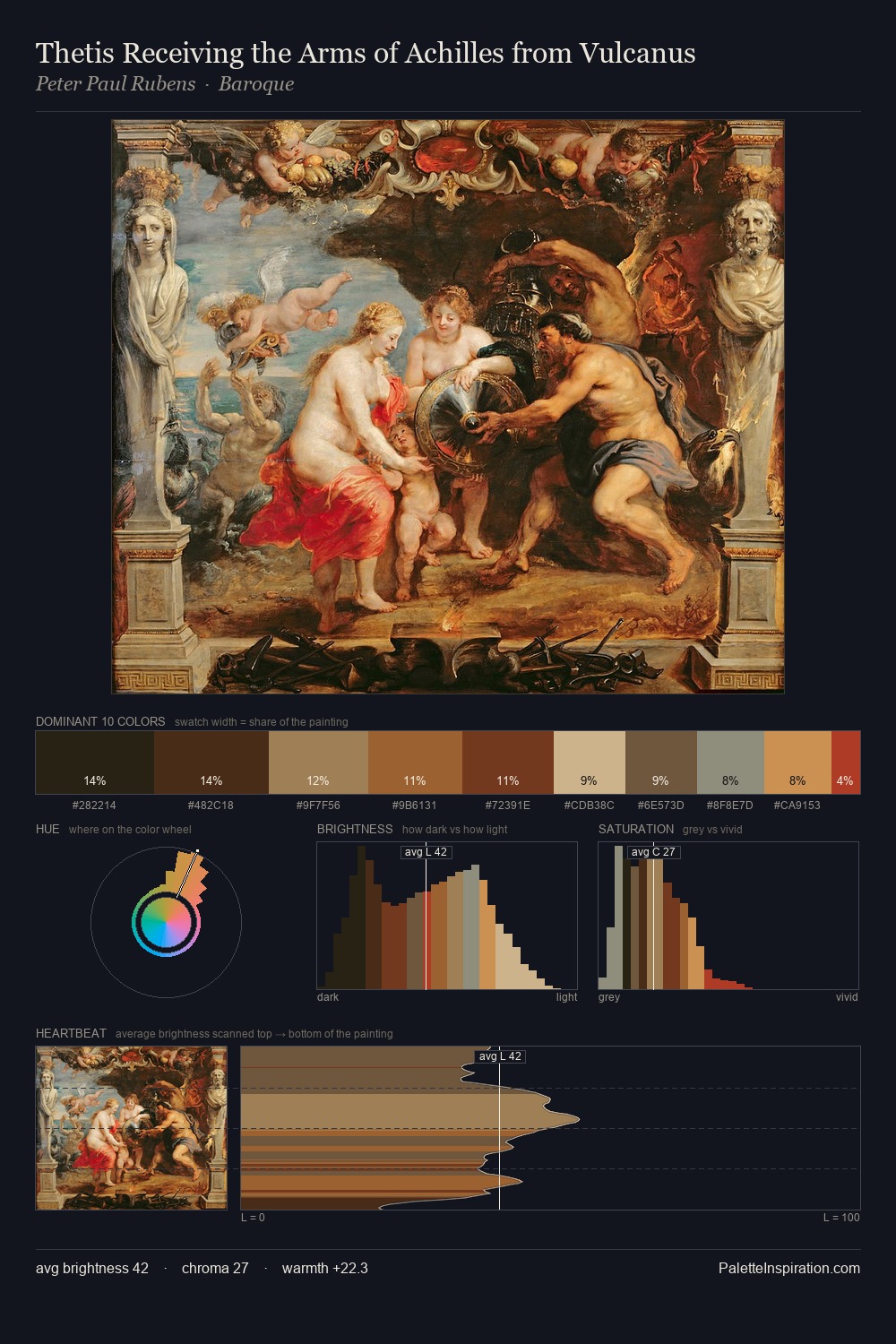
Constantin Stahi distributes its values across the middle register, creating harmony without high contrast. Constantin Stahi orchestrates warmth above all else - reds, ambers, and siennas take the lead. A restrained, mid-chroma palette: every hue is present and legible, but nothing shouts. 33.5% of the palette belongs to #2D2517, a concentration that makes it the unmistakable visual centre. Only 4.1% is devoted to #9D341A, yet that small allocation delivers the palette's entire chromatic tension. At 39 units across the value scale, the palette keeps contrast readable without letting it dominate. This is palette 4 of Constantin Stahi's sequence - a single chapter in a chromatic story told across many works.
Example use cases
- theater design
- jewelry brands
- tobacco-adjacent retail
- event branding
- film & entertainment
I Love This!
Use This Palette
Copy, export, or download for your project
Copy, export, or download for your project
Copy:
Download:
Share: