Constantin Daniel Rosenthal Palette 2

Palette Analysis
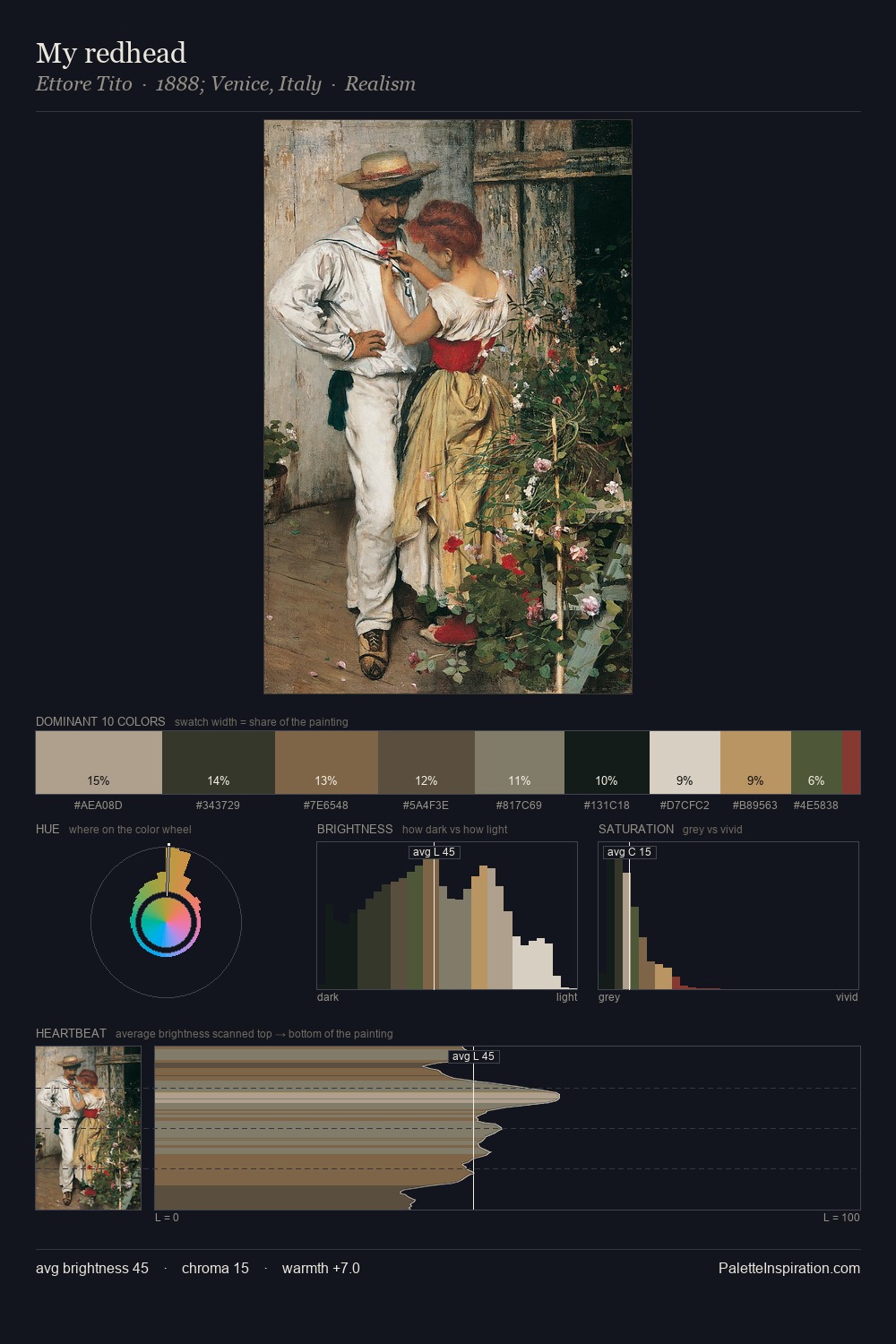
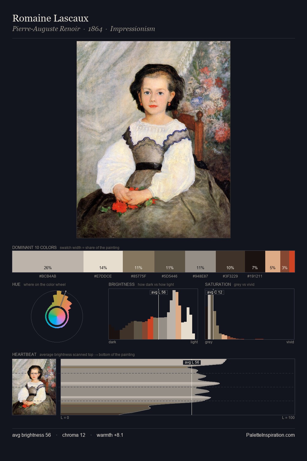
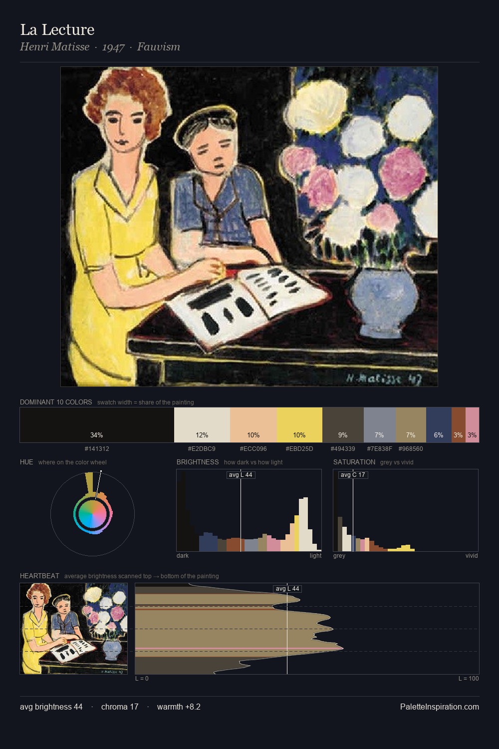
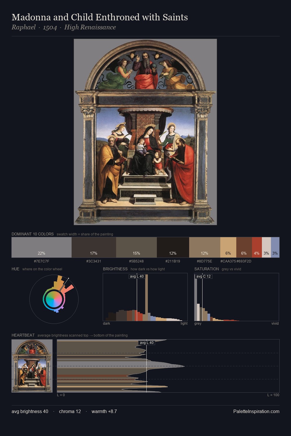
Values in Constantin Daniel Rosenthal rest in the mid-range - neither dramatically lit nor steeped in shadow. Constantin Daniel Rosenthal tilts toward cool - blues and silver-greys carry the structural weight. Chroma is kept low across all colours, producing the soft, enveloping quality that characterises tonal painting. At 4.3%, #DFB389 carries the palette's sharpest chromatic charge: an accent that earns its place precisely because it is withheld. 65 units of value range underpin the palette's structural clarity: the eye always knows where light falls. The mid-to-high key, cool bias, and moderate chroma point to outdoor observation - sky and diffused daylight as the dominant light source. Constantin Daniel Rosenthal's palette 2 carries its own internal logic while remaining in conversation with the artist's broader colour intelligence.
Example use cases
- theater design
- jewelry brands
- tobacco-adjacent retail
- event branding
- film & entertainment
I Love This!
Copy, export, or download for your project