Colors that go with

St. Patrick's blue

#23297A

Or pick a different color

Open on color wheel →

St. Patrick's blue (#23297A) is a deep cool shade that appears across 4 master palettes in our corpus, most prominently in the work of Jean Fouquet, Rockwell Kent, and Luigi Russolo and the Northern Renaissance tradition. Master painters paired it most often with Medium champagne (#F3E5AB), Rufous (#A81C07), and Smoky black (#100C08). The combination forms an austere, contemplative chord, built on a complementary hue split, leans on warm companions to lift a cool source color, with the pair colors held at a similar value to the source.
Artworks Featuring This Color

Girl in a Blue Apron palette card
Girl in a Blue Apron
Egon Schiele · 1912
Pines by the Sea palette card
Pines by the Sea
Henri-Edmond Cross
Iona palette card
Iona
Samuel Peploe · 1930
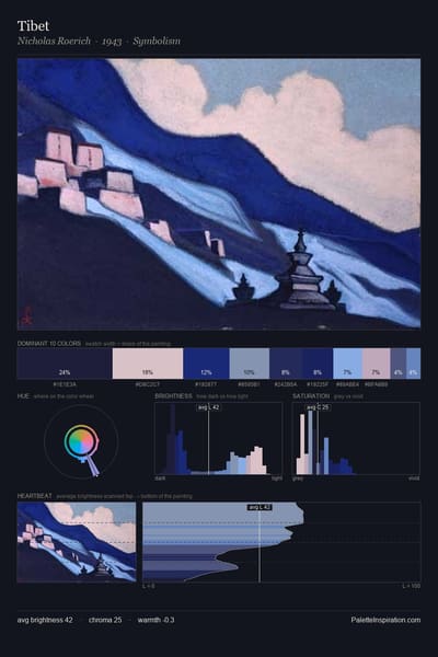
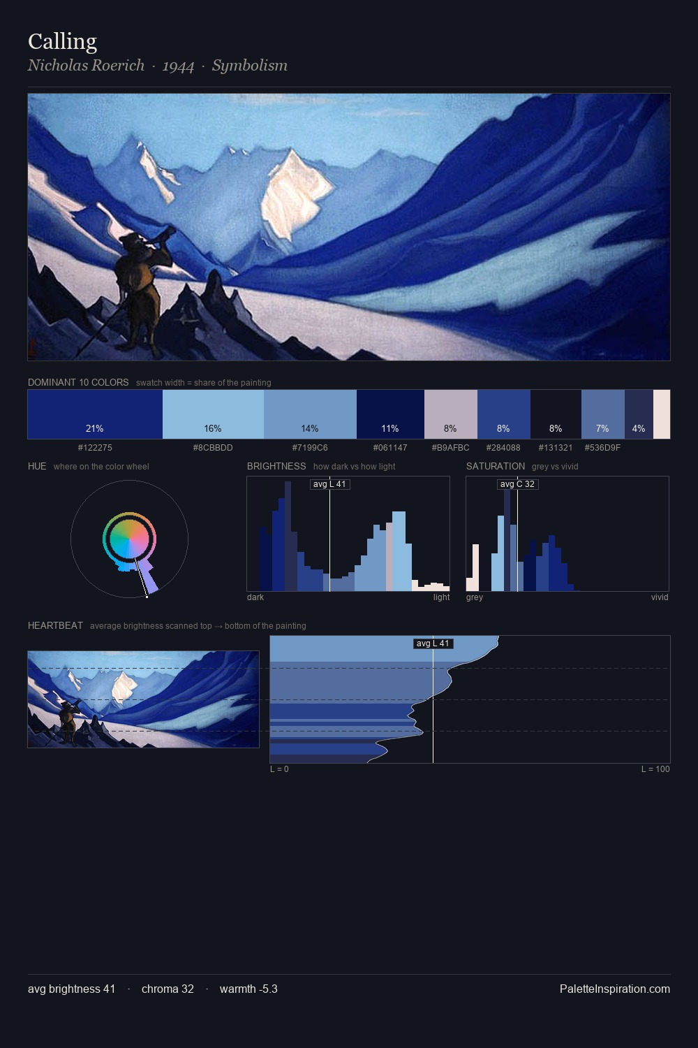
Tibet palette card
Tibet
Nicholas Roerich · 1943
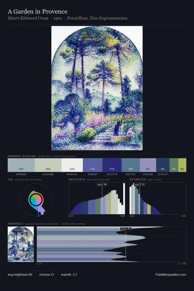
A Garden in Provence palette card
A Garden in Provence
Henri-Edmond Cross · 1901
The Cypresses at Cagnes palette card
The Cypresses at Cagnes
Henri-Edmond Cross · 1908

Master palettes

Palettes Featuring St. Patrick's blue

4 palettes where St. Patrick's blue appears prominently — one per artist.

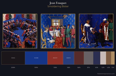
Jean Fouquet Palette 11 - Smoldering Bister

Jean Fouquet

19.9% St. Patrick's blue

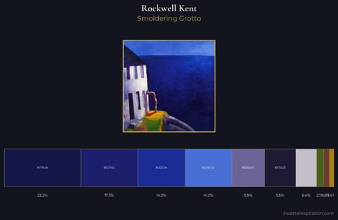
Rockwell Kent Palette 5 - Smoldering Grotto

Rockwell Kent

17.3% St. Patrick's blue

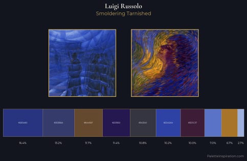
Luigi Russolo Palette 3 - Smoldering Tarnished

Luigi Russolo

16.4% St. Patrick's blue

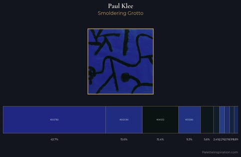
Paul Klee Palette 15 - Smoldering Grotto

Paul Klee

15.6% St. Patrick's blue

Choose another color