Colors that go with

Paua

#1F005E

Top 5 most prevalent

Colors that go with Paua

Click any swatch below to see 3-color combinations and master palettes that feature both.

Explore less common pairings with our palette roulette →

Or pick a different color

Open on color wheel →

Paua (#1F005E) is a deep cool shade that appears across 1 master palette in our corpus and the Kitsch tradition. Master painters paired it most often with Citrine (#E4D00A), Rich black (#010203), and Black Shadows (#BFAFB2). The combination forms an austere, contemplative chord, built on a split-complementary spread, spans a mixed temperature range, with a moderate step up in value that keeps the source recessed.
Artworks Featuring This Color

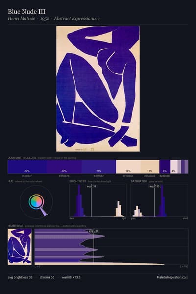
Blue Nude III palette card
Blue Nude III
Henri Matisse · 1952
Himalayas palette card
Himalayas
Nicholas Roerich · 1937
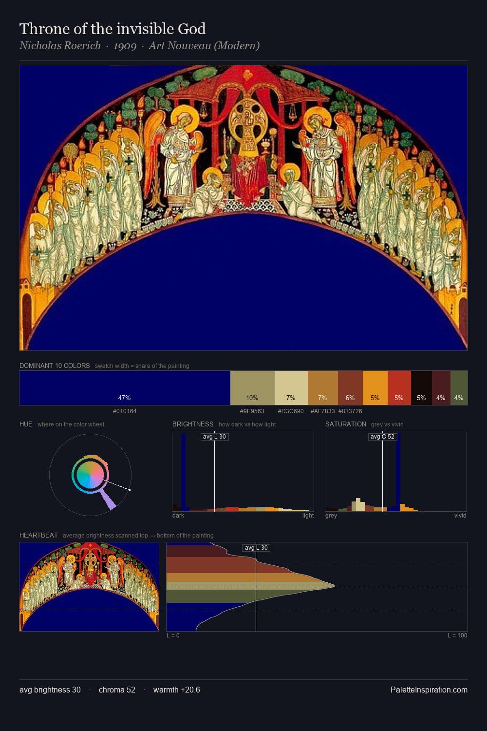
Throne of the invisible God palette card
Throne of the invisible God
Nicholas Roerich · 1909
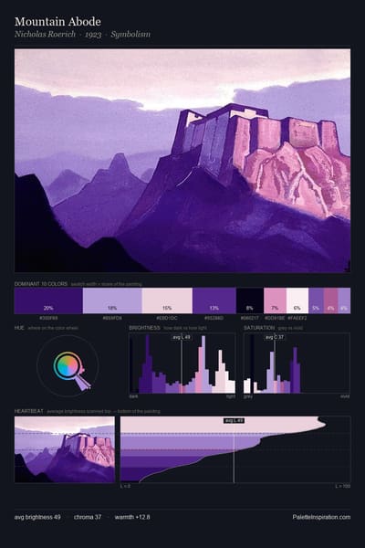
Mountain Abode palette card
Mountain Abode
Nicholas Roerich · 1923
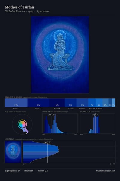
Mother of Turfan palette card
Mother of Turfan
Nicholas Roerich · 1924
Himalayas palette card
Himalayas
Nicholas Roerich · 1939

Master palettes

Palettes Featuring Paua

1 palettes where Paua appears prominently — one per artist.

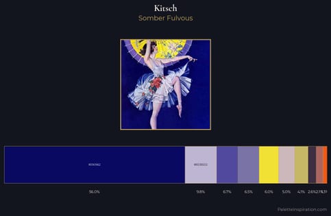
Kitsch Palette 8 - Somber Fulvous

Kitsch

56.0% Paua

Choose another color