Colors that go with

Parchment

#F1E9D2

Or pick a different color

Open on color wheel →

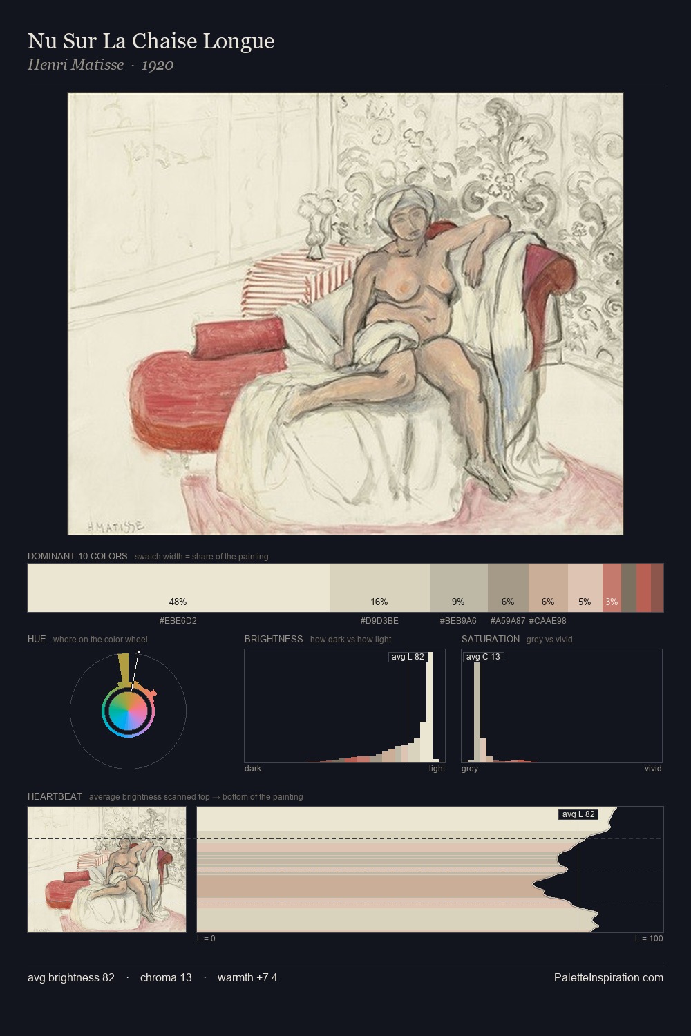
Parchment (#F1E9D2) is a very pale warm shade that appears across 19 master palettes in our corpus, most prominently in the work of Oskar Schlemmer, Meyer von Bremen, and Karl Bryullov and the Romanticism tradition. Master painters paired it most often with Eerie black (#1B1B1B), Bistre (#3D2B1F), and Coffee (#6F4E37). The combination forms an almost-white, sunlit chord, built on closely related hues, reads as a unified warm palette, with a sharp light/dark contrast that lets the darker companions read as depth.
Artworks Featuring This Color

Shady Paths, Vizcaya palette card
Shady Paths, Vizcaya
John Singer Sargent · 1917
In the Peristyle palette card
In the Peristyle
Sir Lawrence Alma-Tadema · 1866
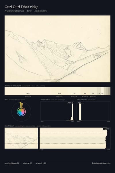
Guri Guri Dhar ridge palette card
Guri Guri Dhar ridge
Nicholas Roerich · 1931
Landscape palette card
Landscape
Nicholas Roerich
London Visitors palette card
London Visitors
James Tissot · 1874
Two Figures by a Statue of Sphinx (study) palette card
Two Figures by a Statue of Sphinx (study)
Henryk Siemiradzki · 1870

Master palettes

Palettes Featuring Parchment

6 palettes where Parchment appears prominently — one per artist.

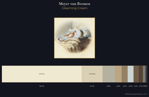
Meyer von Bremen Palette 1 - Gleaming Cream

Meyer von Bremen

55.0% Parchment

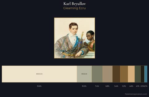
Karl Bryullov Palette 8 - Gleaming Ecru

Karl Bryullov

51.6% Parchment

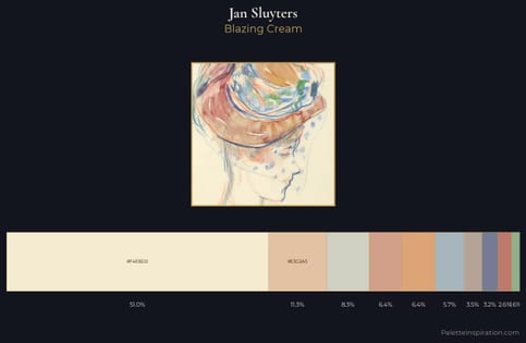
Jan Sluyters Palette 1 - Blazing Cream

Jan Sluyters

51.0% Parchment

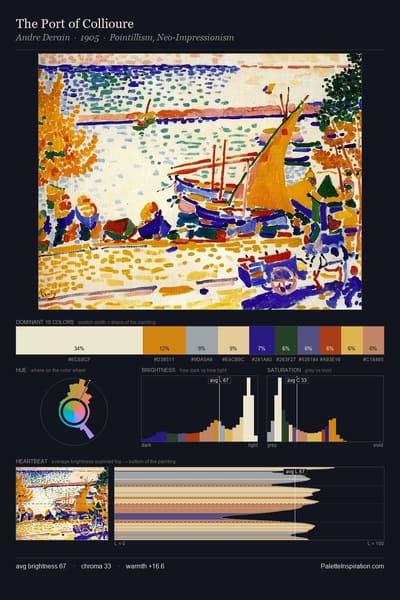
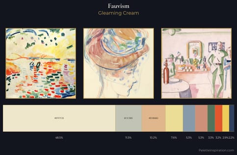
Fauvism Palette 1 - Gleaming Cream

Fauvism

48.5% Parchment

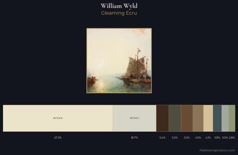
William Wyld Palette 5 - Gleaming Ecru

William Wyld

47.3% Parchment

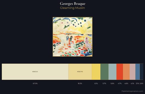
Georges Braque Palette 1 - Gleaming Muslin

Georges Braque

47.0% Parchment

Choose another color