Colors that go with

Mountbatten pink

#997A8D

Or pick a different color

Open on color wheel →

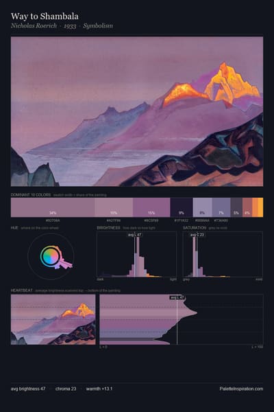
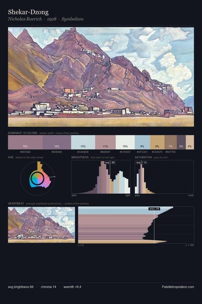
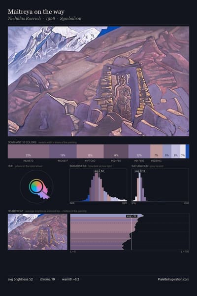
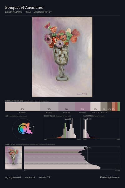
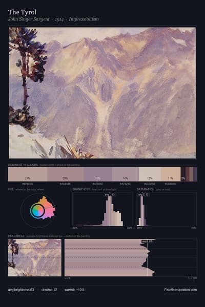
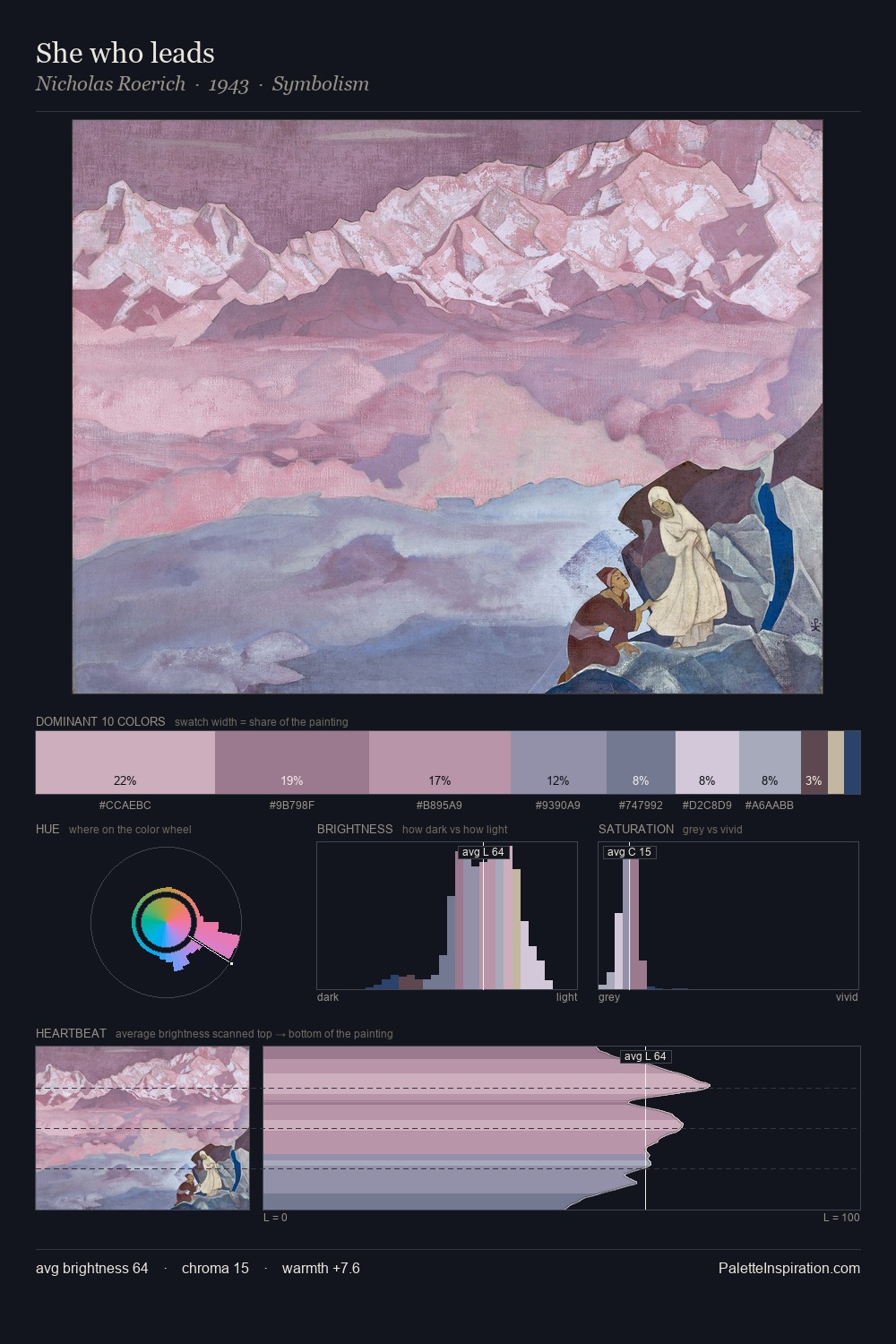
Mountbatten pink (#997A8D) is a mid-tone jewel-toned shade that appears across 2 master palettes in our corpus, most prominently in the work of Nicolae Darascu, and Esaias van de Velde and the Impressionism tradition. Master painters paired it most often with White (#FFFFFF), Desert sand (#EDC9AF), and Khaki (#C3B091). The combination forms a balanced, focal chord, spans a mixed temperature range, with a moderate step up in value that keeps the source recessed.
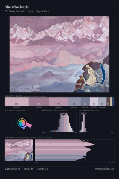
Artworks Featuring This Color

Willows in Fog palette card
Willows in Fog
Gustave Loiseau · 1915
Les Crocus palette card
Les Crocus
Lucien Pissarro · 1900
The Sacred Wood palette card
The Sacred Wood
Maurice Denis · 1898
Kervaudu, View from the Marsh palette card
Kervaudu, View from the Marsh
Ferdinand du Puigaudeau
The Pearl Fan palette card
The Pearl Fan
Robert Lewis Reid
Steppe palette card
Steppe
Arkhyp Kuindzhi · 1875

Master palettes

Palettes Featuring Mountbatten pink

2 palettes where Mountbatten pink appears prominently — one per artist.

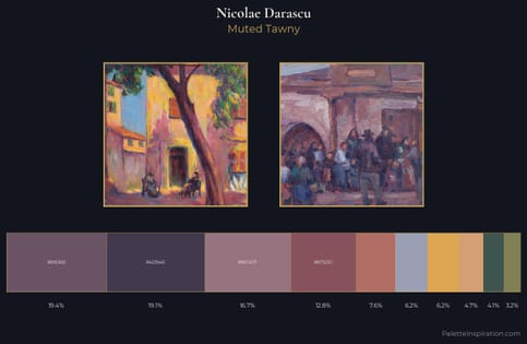
Nicolae Darascu Palette 5 - Muted Tawny

Nicolae Darascu

16.7% Mountbatten pink

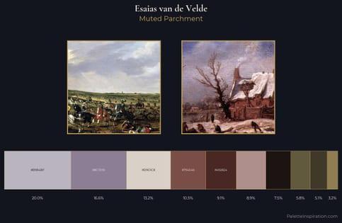
Esaias van de Velde Palette 5 - Muted Parchment

Esaias van de Velde

16.6% Mountbatten pink

Choose another color