Color one

Light orange

#FED8B1

Color two

Opal

#A8C3BC

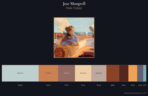
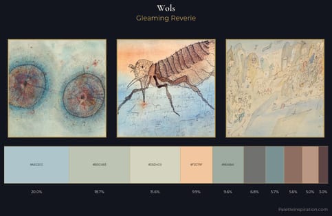
Light orange (#FED8B1) and Opal (#A8C3BC) appear together across 2 master palettes in our corpus, most prominently in the work of Jose Mongrell, and Wols and the Realism tradition. Painters typically deployed light orange at an average of 11% of the canvas, with opal at 23%. Third colors most often completing the combination include Ash gray (#B2BEB5), Burnished brown (#A17A74), and Bone (#E3DAC9).
Artworks Featuring Light orange & Opal

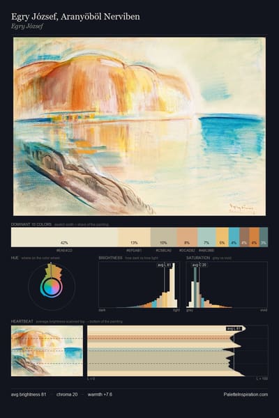
Egry József, Aranyöböl Nerviben palette card
Egry József, Aranyöböl Nerviben
Egry József
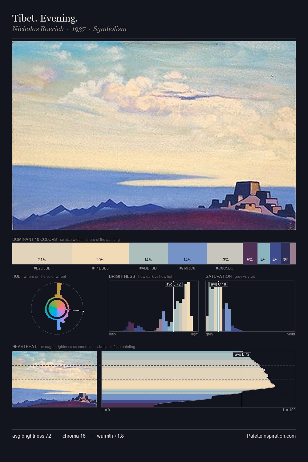
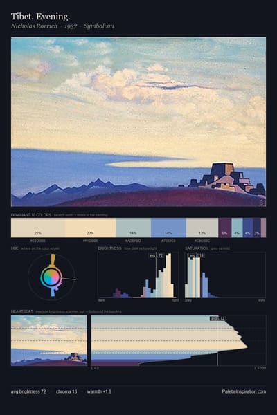
Tibet. Evening. palette card
Tibet. Evening.
Nicholas Roerich · 1937
Psyche and Pan palette card
Psyche and Pan
Edward Burne-Jones · 1872
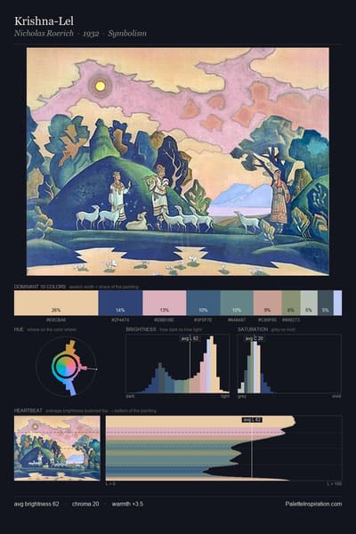
Krishna-Lel palette card
Krishna-Lel
Nicholas Roerich · 1932
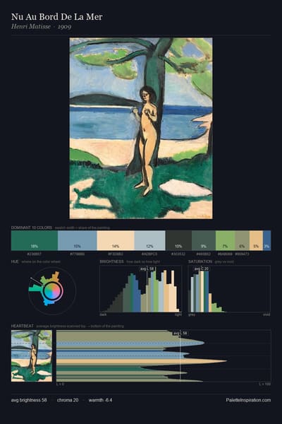
Nu Au Bord De La Mer palette card
Nu Au Bord De La Mer
Henri Matisse · 1909
Beyond the seas there are the great lands palette card
Beyond the seas there are the great lands
Nicholas Roerich · 1910

Master palettes

Palettes Featuring Light orange & Opal

2 master palettes where Light orange and Opal appear together most prominently.

Jose Mongrell Palette 1 - Pale Topaz

Jose Mongrell

11.4% Light orange · 25.5% Opal

Wols Palette 1 - Gleaming Reverie

Wols

9.9% Light orange · 20.0% Opal

Choose another color