Colors that go with

Light gray

#D3D3D3

Or pick a different color

Open on color wheel →

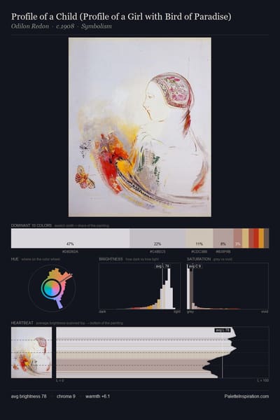
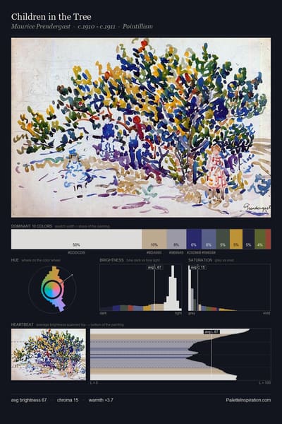
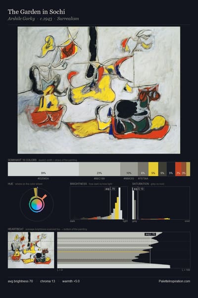
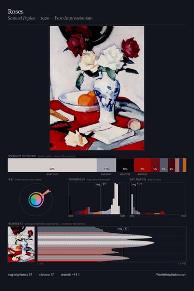
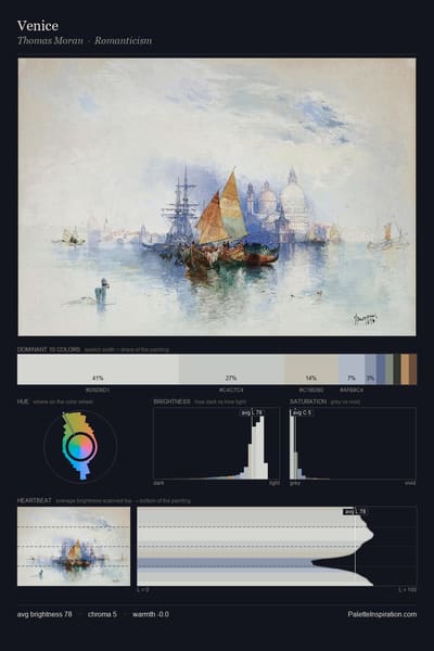
Light gray (#D3D3D3) is a light neutral shade that appears across 19 master palettes in our corpus, most prominently in the work of Benedetta Cappa, Koloman Moser, and Jørgen Sonne and the Romanticism tradition. Master painters paired it most often with Khaki (#C3B091), Drab dark brown (#4A412A), and Dutch white (#EFDFBB). The combination forms a pale, paper-and-plaster chord, pulls a neutral anchor into a warm composition, with a moderate step down in value that keeps the source forward.
Artworks Featuring This Color

Study of scene decoration for "The Rite of Spring" palette card
Study of scene decoration for "The Rite of Spring"
Nicholas Roerich · 1930
Along the Ghats, Mathura palette card
Along the Ghats, Mathura
Edwin Lord Weeks
A View of Lake Brienz from Bodeli palette card
A View of Lake Brienz from Bodeli
Ferdinand Hodler
In the Studio palette card
In the Studio
Herbert James Draper
Niagara palette card
Niagara
John Henry Twachtman · 1893
Himalayas palette card
Himalayas
Nicholas Roerich

Master palettes

Palettes Featuring Light gray

6 palettes where Light gray appears prominently — one per artist.

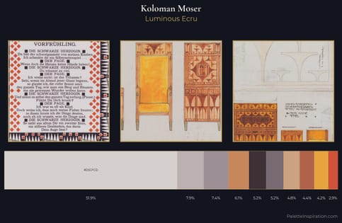
Koloman Moser Palette 6 - Luminous Ecru

Koloman Moser

51.9% Light gray

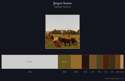
Jørgen Sonne Palette 6 - Veiled Tawny

Jørgen Sonne

46.2% Light gray

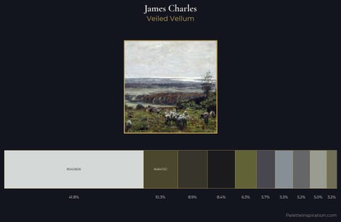
James Charles Palette 7 - Veiled Vellum

James Charles

41.8% Light gray

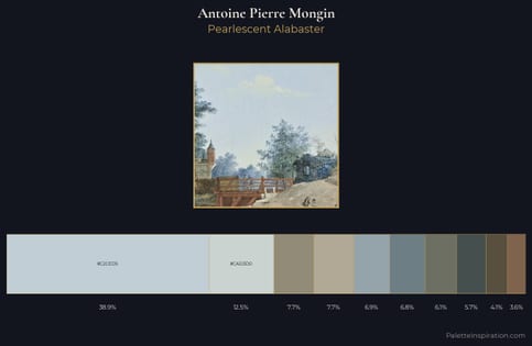
Antoine Pierre Mongin Palette 1 - Pearlescent Alabaster

Antoine Pierre Mongin

38.9% Light gray

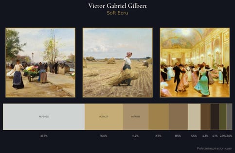
Victor Gabriel Gilbert Palette 2 - Soft Ecru

Victor Gabriel Gilbert

35.7% Light gray

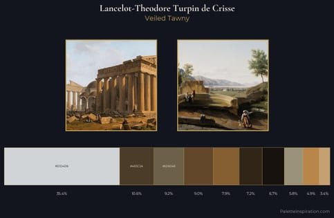
Lancelot-Theodore Turpin de Crisse Palette 3 - Veiled Tawny

Lancelot-Theodore Turpin de Crisse

35.4% Light gray

Choose another color