Colors that go with

Ecru

#C2B280

Or pick a different color

Open on color wheel →

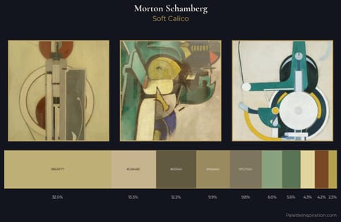
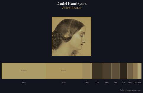
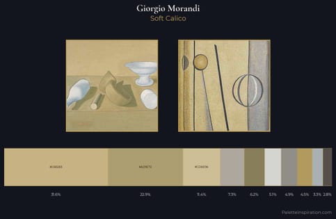
Ecru (#C2B280) is a mid-tone warm shade that appears across 19 master palettes in our corpus, most prominently in the work of Morton Schamberg, Daniel Huntington, and Giorgio Morandi and the Romanticism tradition. Master painters paired it most often with Raisin black (#242124), Bistre (#3D2B1F), and Bole (#79443B). The combination forms a sun-bleached, daylight chord, built on closely related hues, reads as a unified warm palette, with a sharp light/dark contrast that lets the darker companions read as depth.
Artworks Featuring This Color

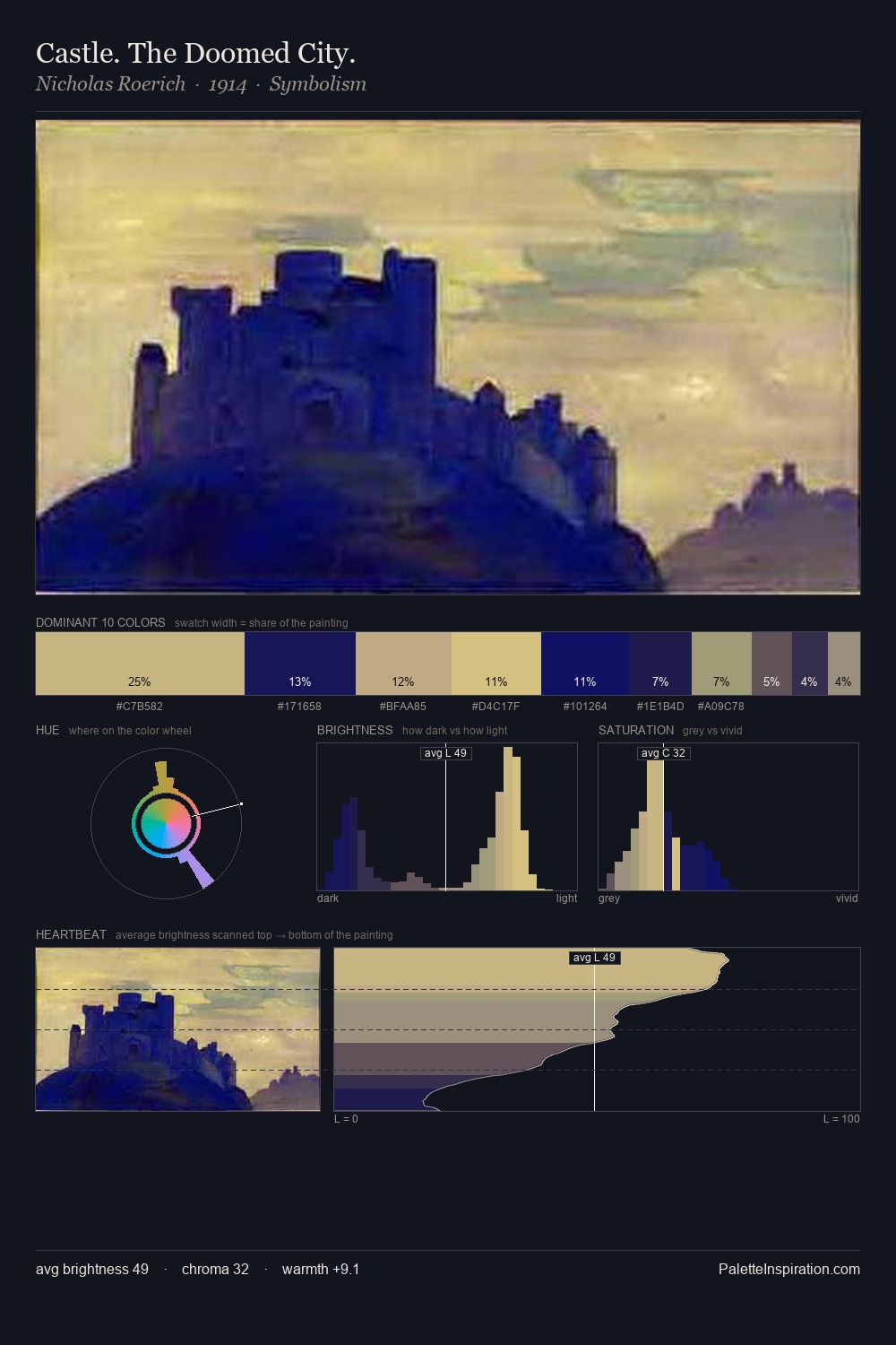
Castle. The Doomed City. palette card
Castle. The Doomed City.
Nicholas Roerich · 1914
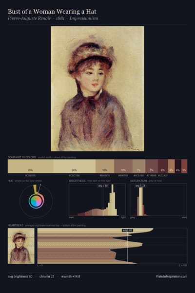
Bust of a Woman Wearing a Hat palette card
Bust of a Woman Wearing a Hat
Pierre-Auguste Renoir · 1881
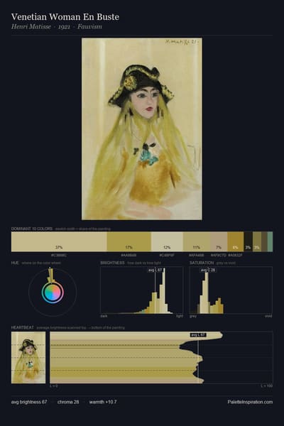
Venetian Woman En Buste palette card
Venetian Woman En Buste
Henri Matisse · 1921
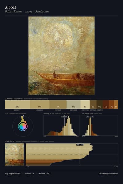
A boat palette card
A boat
Odilon Redon · 1901
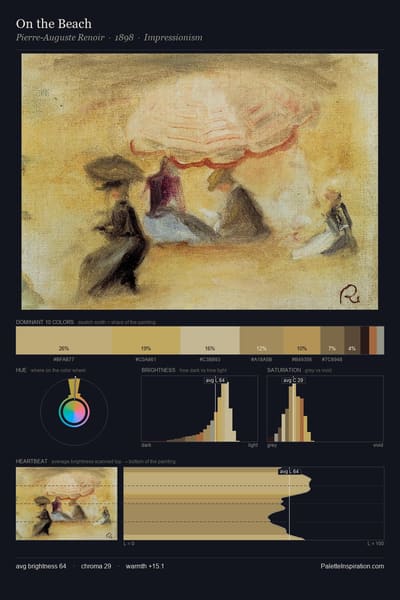
On the Beach palette card
On the Beach
Pierre-Auguste Renoir · 1898
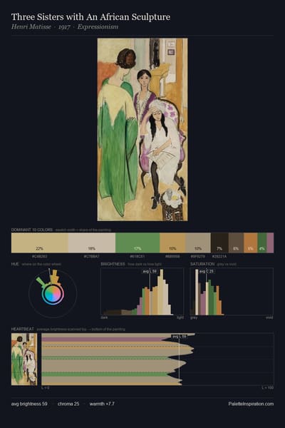
Three Sisters with An African Sculpture palette card
Three Sisters with An African Sculpture
Henri Matisse · 1917

Master palettes

Palettes Featuring Ecru

6 palettes where Ecru appears prominently — one per artist.

Morton Schamberg Palette 1 - Soft Calico

Morton Schamberg

32.0% Ecru

Daniel Huntington Palette 1 - Veiled Bisque

Daniel Huntington

31.6% Ecru

Giorgio Morandi Palette 1 - Soft Calico

Giorgio Morandi

31.6% Ecru

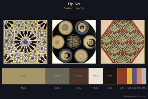
Op Art Master Palette - Veiled Tawny

Op Art

30.0% Ecru

Metaphysical art Palette 1 - Soft Calico

Metaphysical art

29.4% Ecru

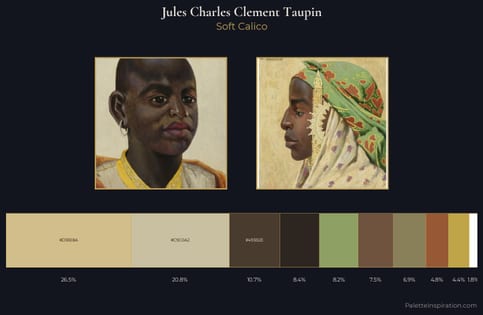
Jules Charles Clement Taupin Palette 2 - Soft Calico

Jules Charles Clement Taupin

26.5% Ecru

Choose another color