Colors that go with

Burlywood

#DEB887

Or pick a different color

Open on color wheel →

Burlywood (#DEB887) is a mid-tone warm shade that appears across 20+ master palettes in our corpus, most prominently in the work of Zinaida Serebriakova, Orest Kiprensky, and Franz Stuck and the Romanticism tradition. Master painters paired it most often with Raisin black (#242124), Bole (#79443B), and Dark sienna (#3C1414). The combination forms a sun-bleached, daylight chord, built on closely related hues, reads as a unified warm palette, with a sharp light/dark contrast that lets the darker companions read as depth.
Artworks Featuring This Color

Theatre in Martigues palette card
Theatre in Martigues
Raoul Dufy · 1903
Aline and Pierre palette card
Aline and Pierre
Pierre-Auguste Renoir · 1887
The Pearl of Love, from The Kingdom of the Pearl palette card
The Pearl of Love, from The Kingdom of the Pearl
Edmund Dulac
Children At La Berrada palette card
Children At La Berrada
Nasreddine Dinet · 1894
Portrait of a Woman palette card
Portrait of a Woman
Amedeo Modigliani · 1915
At The River Crossing palette card
At The River Crossing
Edwin Lord Weeks · 1880

Master palettes

Palettes Featuring Burlywood

6 palettes where Burlywood appears prominently — one per artist.

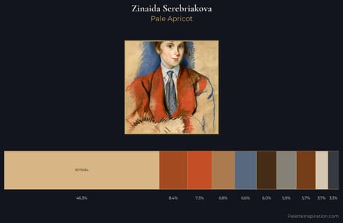
Zinaida Serebriakova Palette 10 - Pale Apricot

Zinaida Serebriakova

46.2% Burlywood

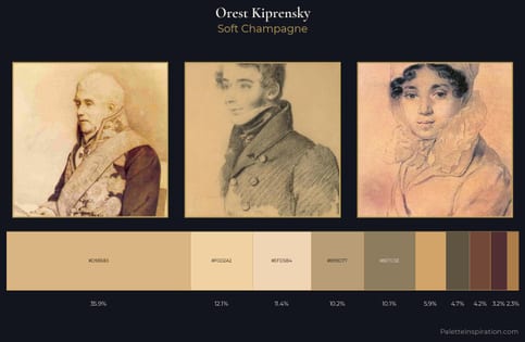
Orest Kiprensky Palette 4 - Soft Champagne

Orest Kiprensky

35.9% Burlywood

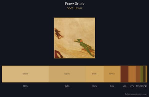
Franz Stuck Palette 6 - Soft Fawn

Franz Stuck

32.2% Burlywood

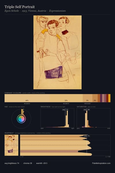
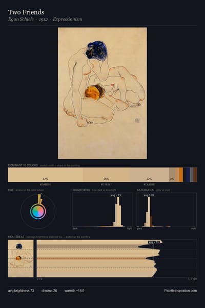
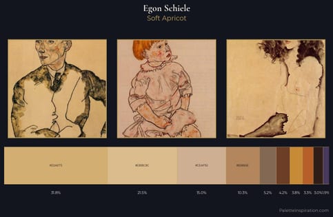
Egon Schiele Palette 6 - Soft Apricot

Egon Schiele

31.8% Burlywood

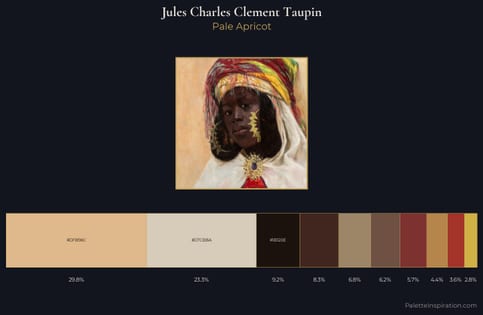
Jules Charles Clement Taupin Palette 3 - Pale Apricot

Jules Charles Clement Taupin

29.8% Burlywood

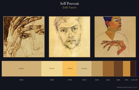
self-portrait Palette 6 - Soft Fawn

self-portrait

29.1% Burlywood

Choose another color