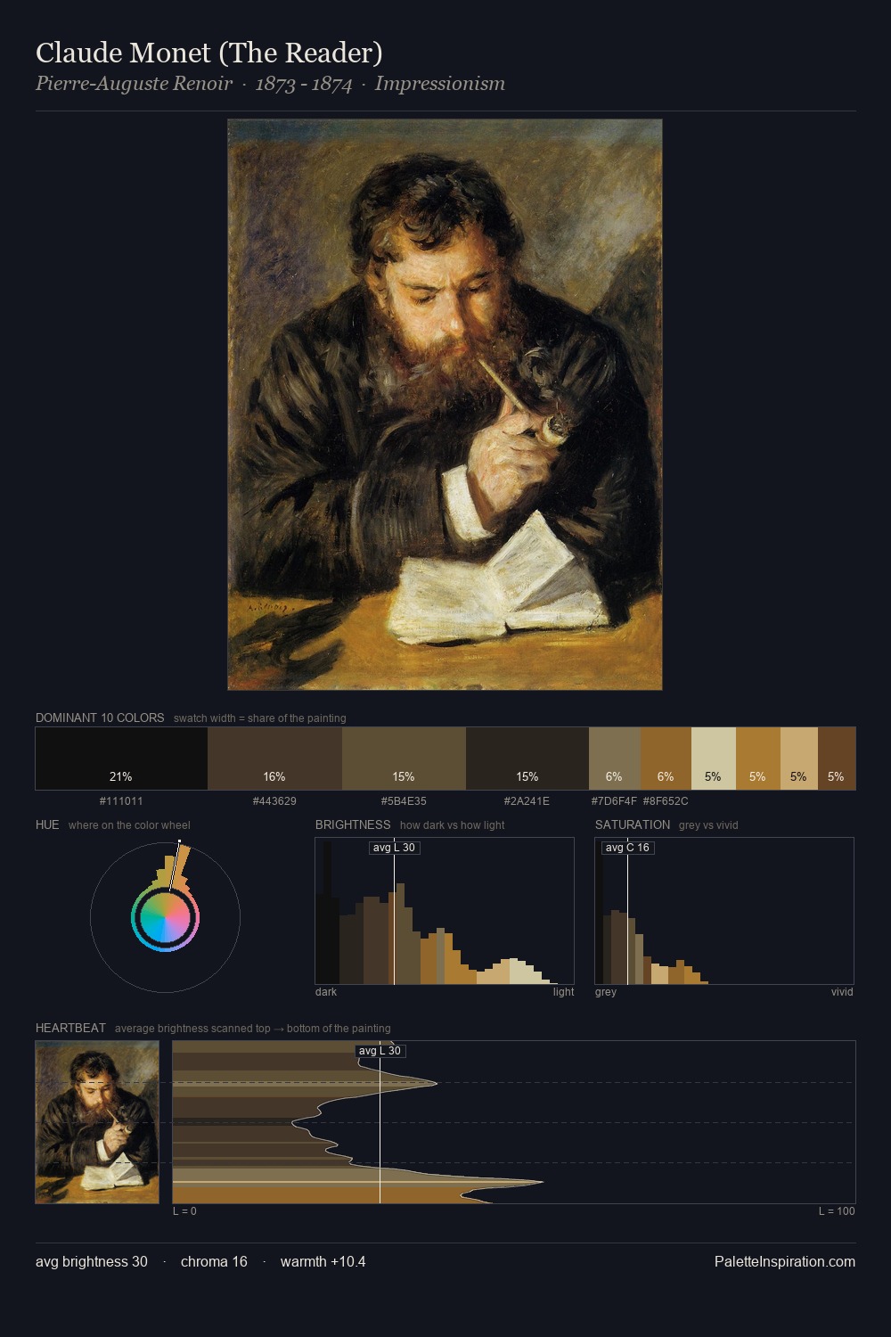
Claude Arnulphy Palette 5
Tenebrous Bister
Tenebrous Dark and murky - low-key values with obscured form, Baroque in temperament.
Bister Dark warm brown - a traditional ink and wash pigment made from wood soot.

Palette Analysis
The palette of Claude Arnulphy sits in the lower register of the value scale - dense, contained, and weighted. Claude Arnulphy tilts toward cool - blues and silver-greys carry the structural weight. The absence of saturated colour is itself an expressive choice: this is a palette of restraint and atmosphere. The most saturated colour, #C59C6E, is reserved to 1.6% of the surface, where it acts as a focal punctuation. 52 units of value spread create a palette that is varied but unified - contrast in the service of harmony. This tonal restraint is characteristic of the Claude Arnulphy approach: colour serves light, not the reverse. This is palette 5 of Claude Arnulphy's sequence - a single chapter in a chromatic story told across many works.
Example use cases
- theater design
- jewelry brands
- tobacco-adjacent retail
- event branding
- film & entertainment
I Love This!
Use This Palette
Copy, export, or download for your project
Copy, export, or download for your project
Copy:
Download:
Share: