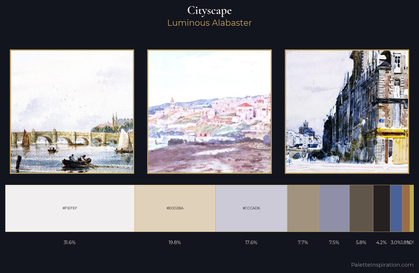
Cityscape Palette 5
Luminous Alabaster
Luminous Self-illuminated feeling - high-key values with an inner glow quality.
Alabaster Warm off-white - creamy stone white, luminous and slightly translucent.
Palette Analysis
cityscape is strongly light-biased - shadow is suggested rather than declared. The artist keeps warm and cool in parity, a balance that lends the work a perceptual shimmer. Saturation is deliberately withheld - the beauty here lies in the near-monochromatic gradations rather than colour difference. The dominant colour, #F1EFEF, takes 31.6% of the total area, establishing the overall mood before any other hue is introduced. Only 1.0% is devoted to #BBB050, yet that small allocation delivers the palette's entire chromatic tension. At 70 units of value range, the palette has the tonal breadth to sustain complex spatial readings.
Example use cases
- florist branding
- event design
- real estate
- jewelry retail
- hospitality branding
I Love This!
Use This Palette
Copy, export, or download for your project
Copy, export, or download for your project
Copy:
Download:
Share: