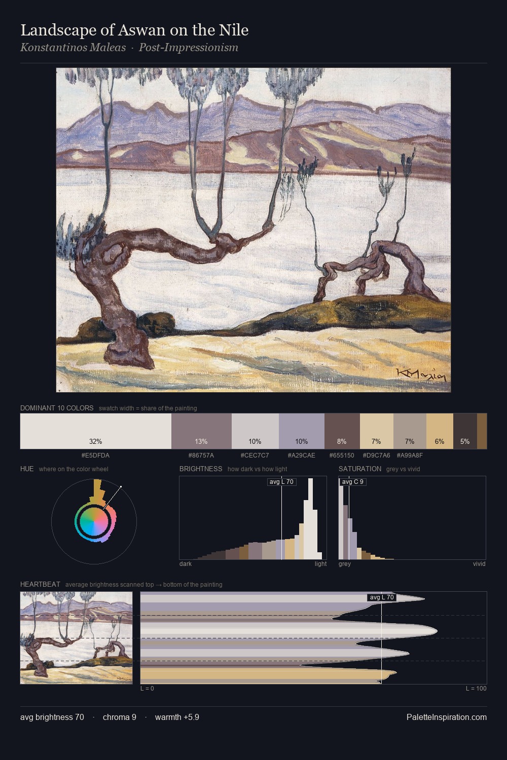
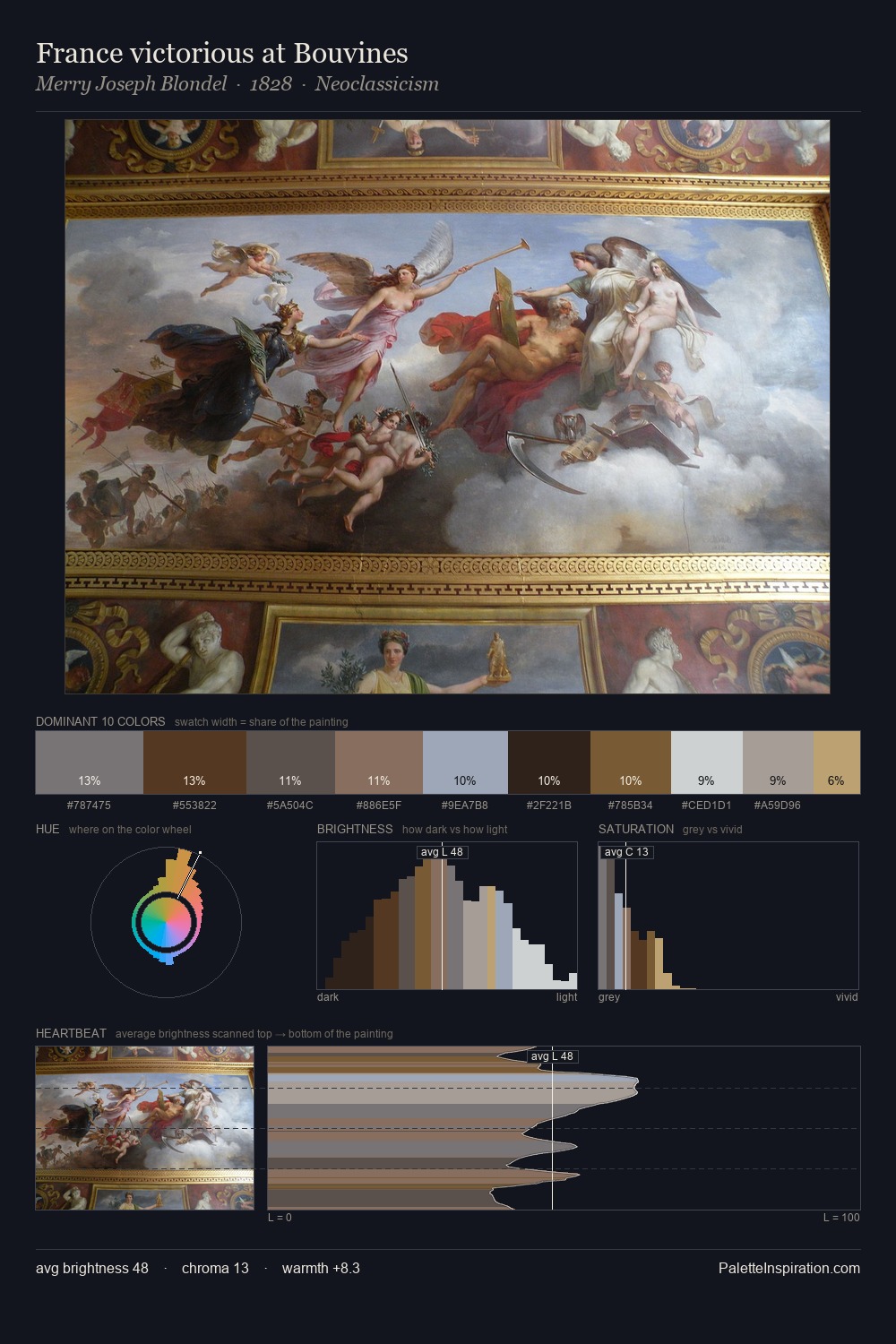
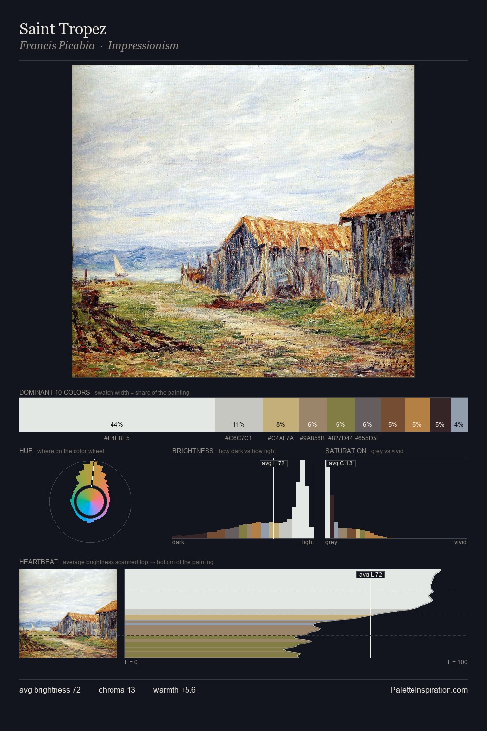
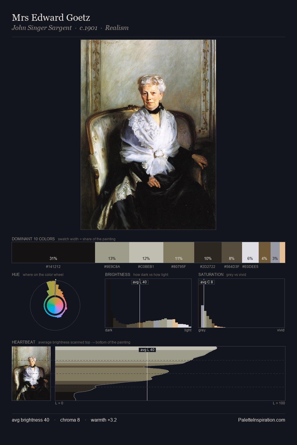
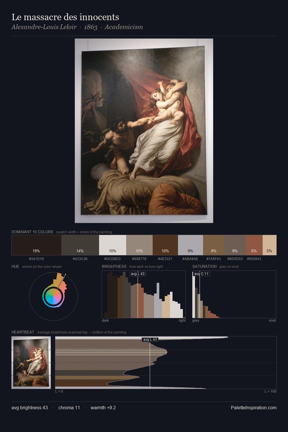
Cityscape Palette 12
Pale Ivory
Pale High-key and low-chroma - delicate, bleached, washed with light.
Ivory Warm creamy white - the color of natural ivory, warmer than pure white.

Palette Analysis
Values in cityscape tilt decisively toward white, giving the palette its luminous character. The palette achieves thermal balance - reds and blues, ochres and greens, each holding the other in check. Muted throughout, the palette achieves its effects through value and temperature rather than chromatic force. The highest-chroma note - #7E553D - appears at just 4.2%, deployed as a precision accent against the quieter ground. 62 units of value range underpin the palette's structural clarity: the eye always knows where light falls.
Example use cases
- exhibition design
- foundation branding
- estate management
- art education
- museums & galleries
I Love This!
Use This Palette
Copy, export, or download for your project
Copy, export, or download for your project
Copy:
Download:
Share: