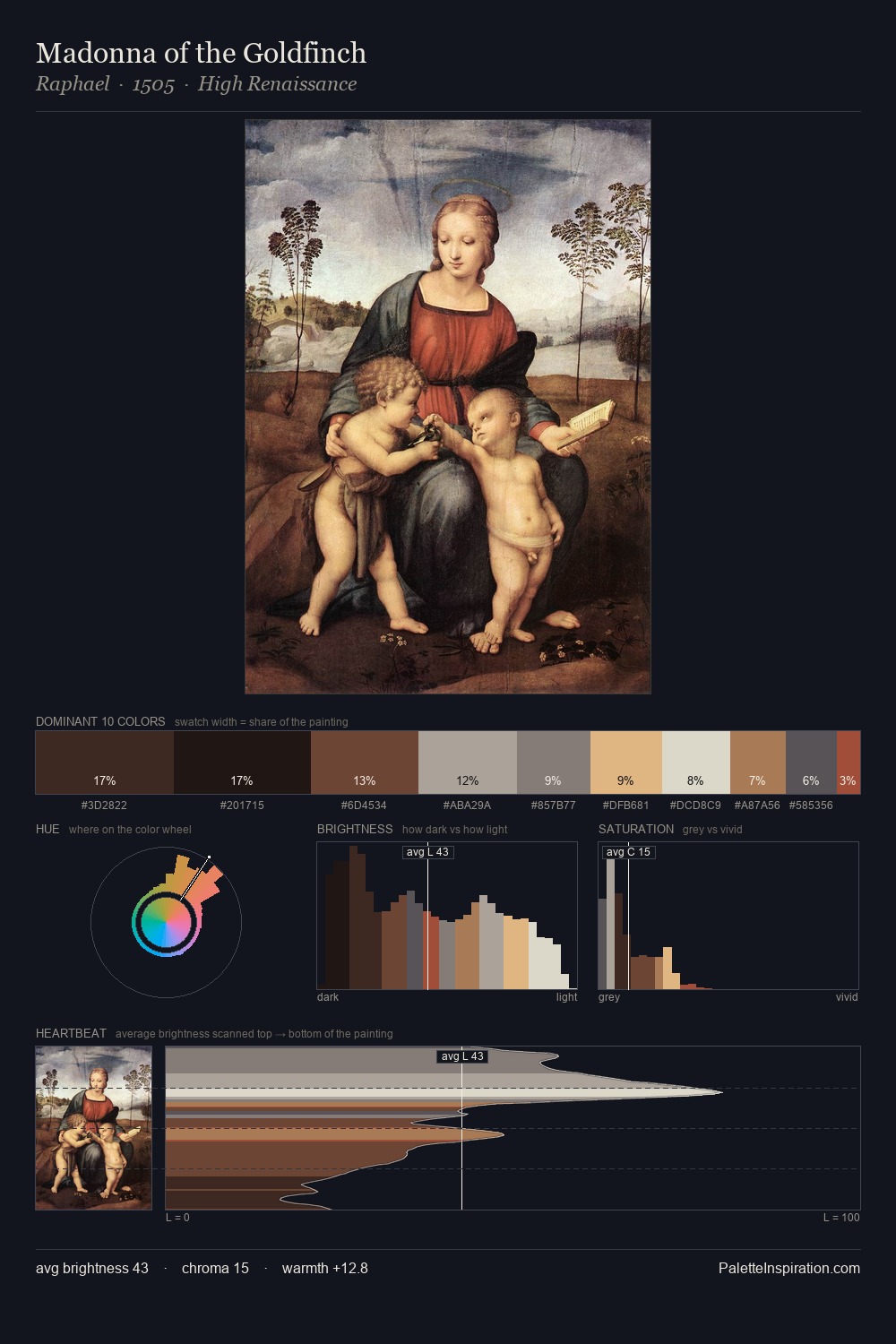
Cimabue Palette 5

Palette Analysis
The high-key values of Cimabue give it an effulgent, almost bleached quality. Cool tones set the register here - the blues and greens easily outweigh any warm accents. Every colour is desaturated; the palette proceeds through near-neutrals and gently-coloured greys. #DFE2BE at 62.2% of the palette: an overwhelming presence that pulls all other colours into its gravitational field. Only 3.9% is devoted to #5D3929, yet that small allocation delivers the palette's entire chromatic tension. From deepest dark to palest light, the palette traverses 66 units of the value scale - a span that creates natural depth. The mid-to-high key, cool bias, and moderate chroma point to outdoor observation - sky and diffused daylight as the dominant light source. This is palette 5 of Cimabue's sequence - a single chapter in a chromatic story told across many works.
Example use cases
- publishing
- corporate identity
- consumer apps
- hospitality
- design agencies
I Love This!
Copy, export, or download for your project