Cimabue Palette 2

Palette Analysis
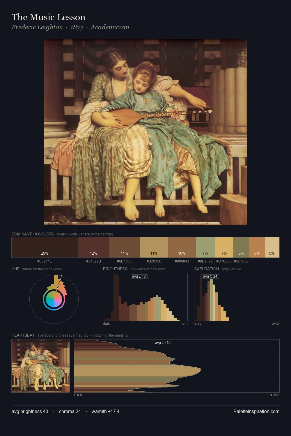
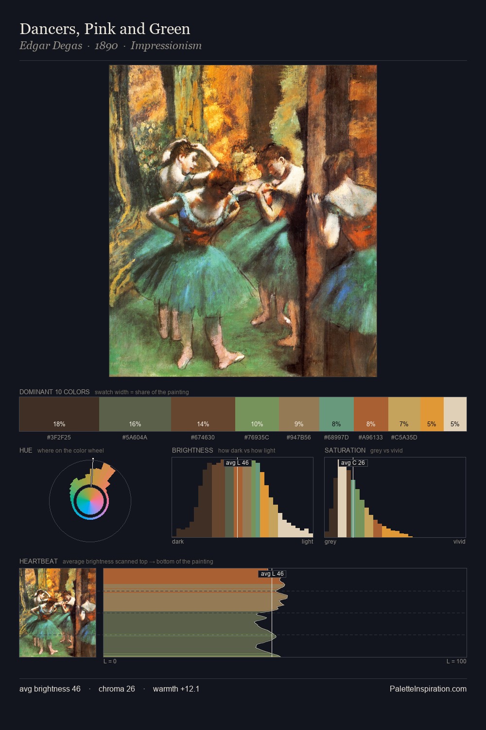
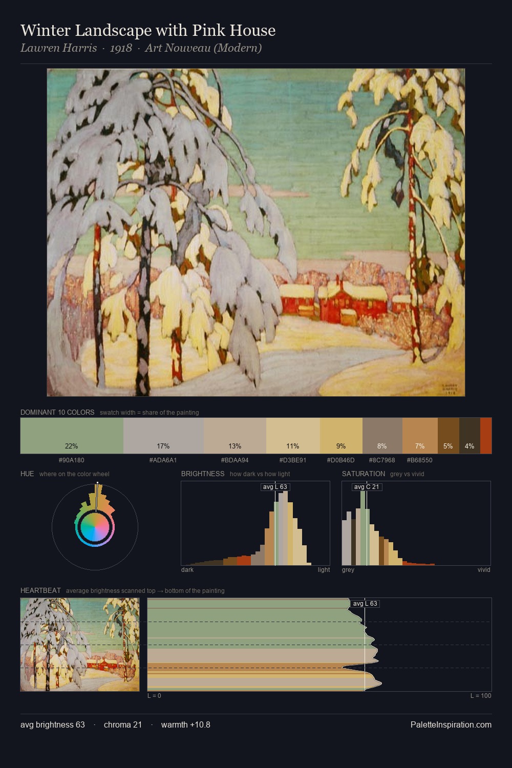
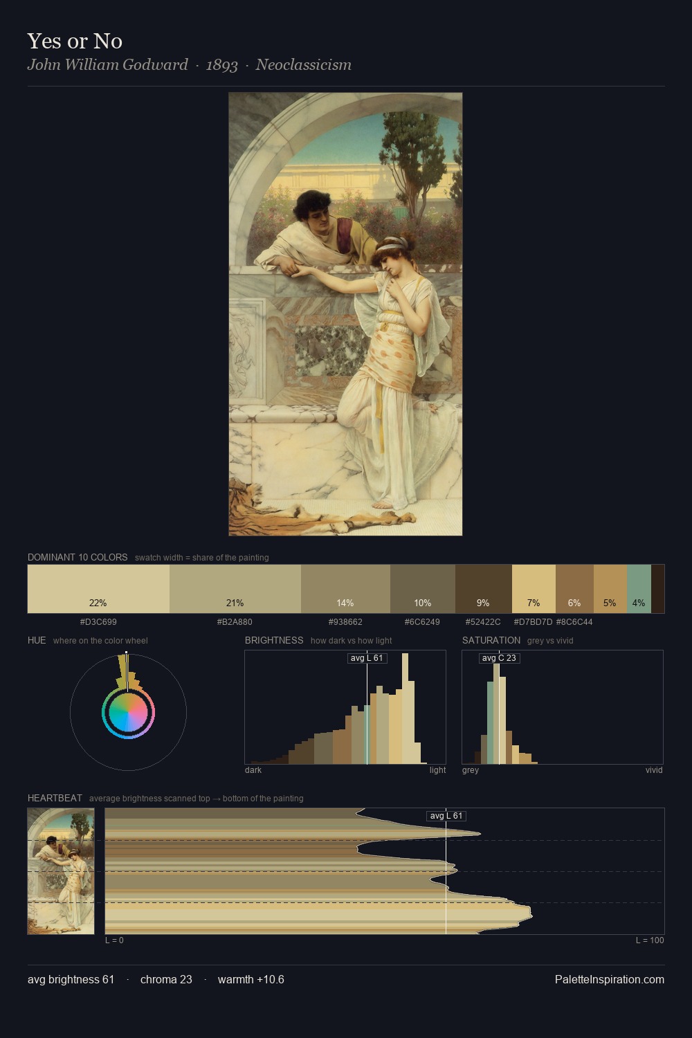
Cimabue works in the upper reaches of the value scale, creating an atmosphere of brightness and expansiveness. Warm and cool tones are held in careful balance - neither family dominates, creating tension and resolution simultaneously. Saturation is measured and controlled, giving the palette presence without visual aggression. Only 8.1% is devoted to #684832, yet that small allocation delivers the palette's entire chromatic tension. At 44 units across the value scale, the palette keeps contrast readable without letting it dominate. The combination of mid-to-high key, balanced temperature, and elevated chroma is characteristic of Impressionist observation: light broken into its component hues. In the context of Cimabue's full range of palettes, group 2 represents one movement in an ongoing chromatic dialogue.
Example use cases
- craft & artisan brands
- specialty coffee
- home goods
- lifestyle retail
- ceramics & pottery
I Love This!
Copy, export, or download for your project