Christoffer Wilhelm Eckersberg Palette 4

Palette Analysis
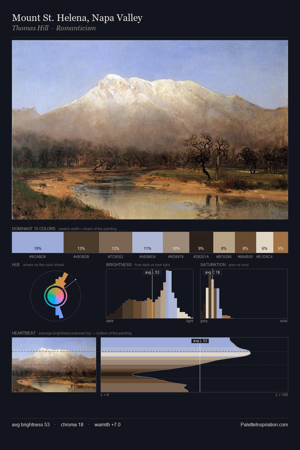
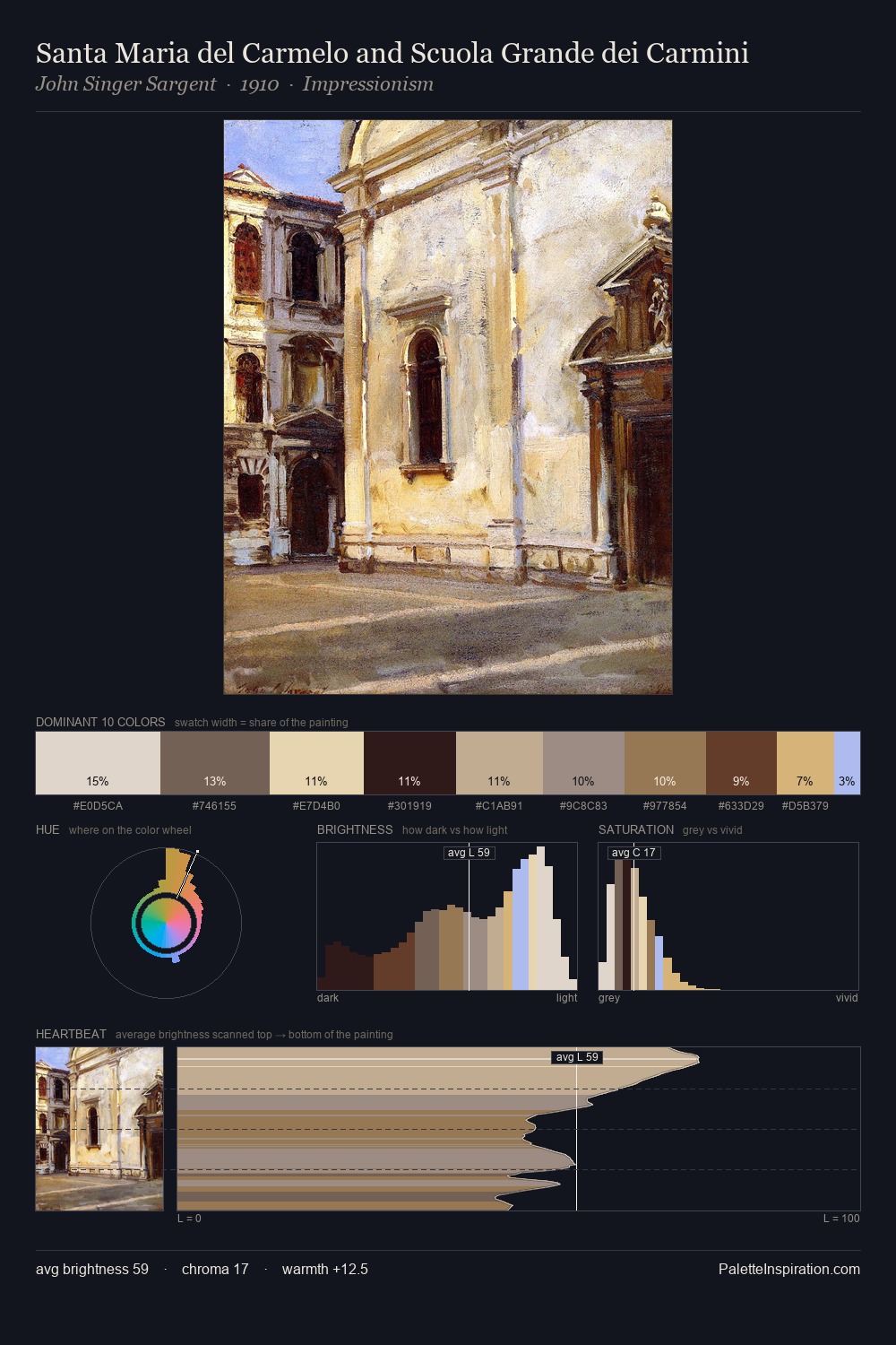
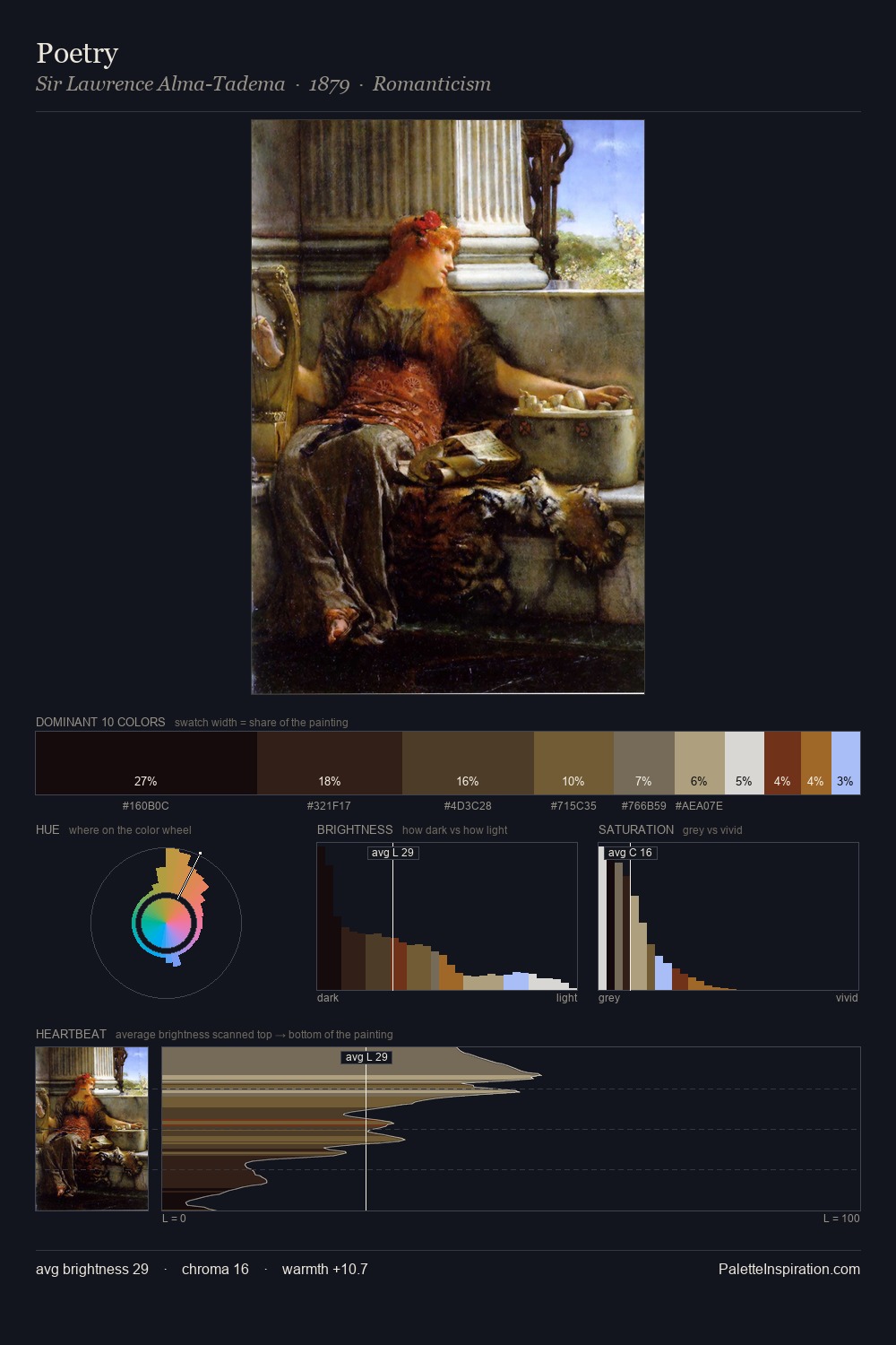
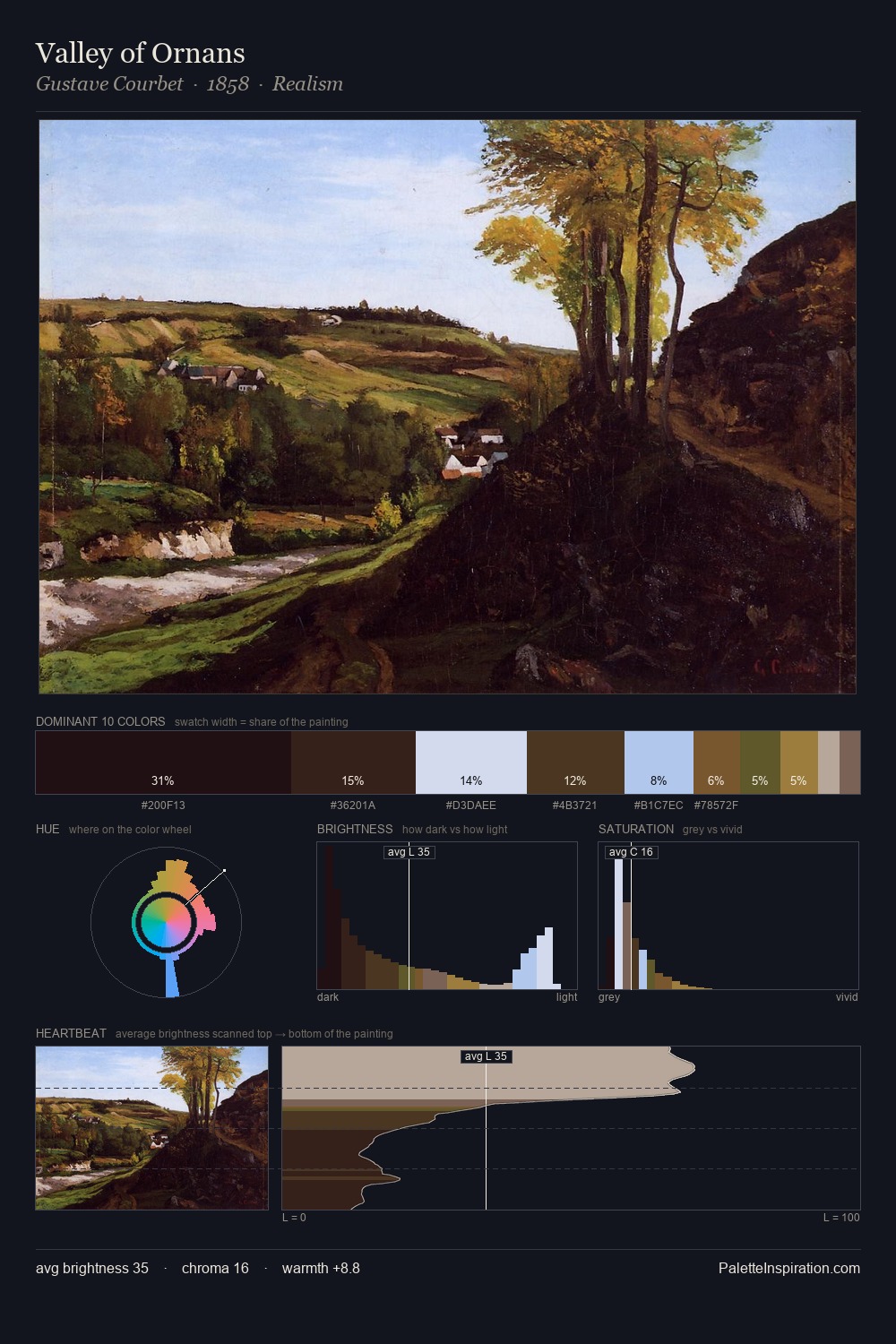
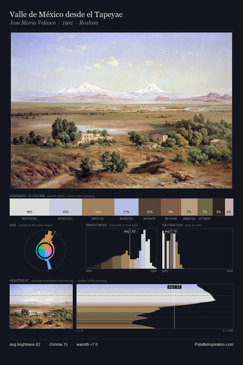
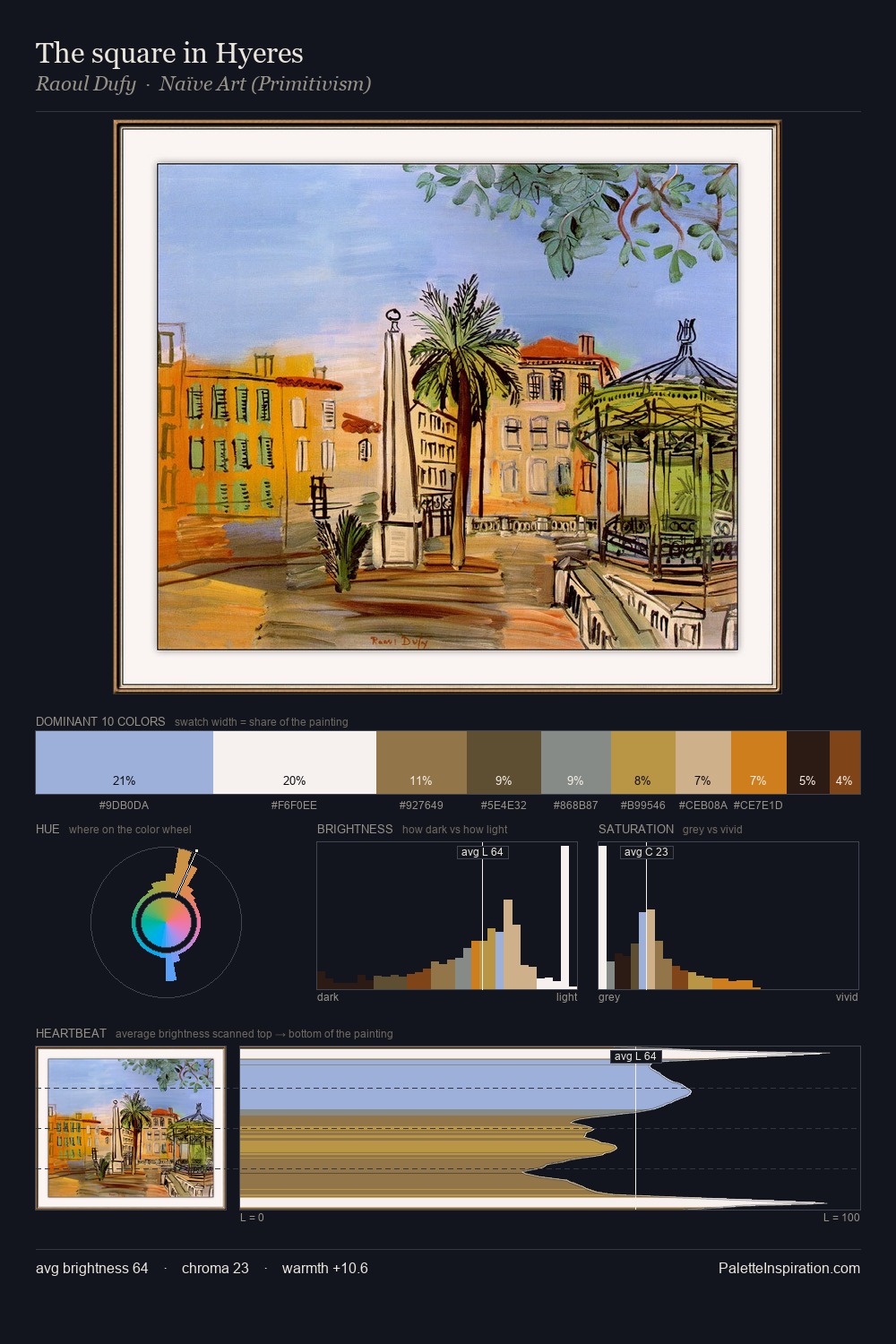
Christoffer Wilhelm Eckersberg sits in the centre of the value range, lending the palette a sense of even, sustained light. The palette achieves thermal balance - reds and blues, ochres and greens, each holding the other in check. Mid-range chroma keeps the palette grounded - colourful but not strident. The most saturated colour, #96B2EA, covers 26.1% of the surface: too much to call an accent, too strong to ignore. From deepest dark to palest light, the palette traverses 63 units of the value scale - a span that creates natural depth. The palette reads as an Impressionist one - light-biased, chromatically direct, and built on temperature contrast rather than value opposition. Christoffer Wilhelm Eckersberg's palette 4 carries its own internal logic while remaining in conversation with the artist's broader colour intelligence.
Example use cases
- publishing
- corporate identity
- consumer apps
- hospitality
- design agencies
I Love This!
Copy, export, or download for your project