Christian Albrecht Jensen Palette 2

Palette Analysis
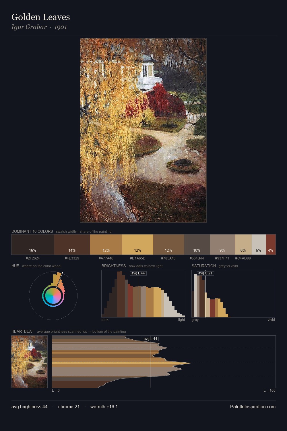
Christian Albrecht Jensen occupies the comfortable middle of the value scale, avoiding both extremes to hold the eye in a sustained middle grey. Temperature reads distinctly warm: the reds and earth tones from Christian Albrecht Jensen carry the compositional weight. All colours lean toward grey, building depth through value rather than colour punch. The dominant colour, #2D2520, takes 27.7% of the total area, establishing the overall mood before any other hue is introduced. At 2.7%, #D4A753 carries the palette's sharpest chromatic charge: an accent that earns its place precisely because it is withheld. 58 units of value range underpin the palette's structural clarity: the eye always knows where light falls. Palette 2 sits within the larger chromatic argument that Christian Albrecht Jensen's complete body of work advances.
Example use cases
- food packaging
- leather accessories
- travel & outdoor
- natural cosmetics
- interior design
I Love This!
Copy, export, or download for your project