Charles Willson Peale Palette 3

Palette Analysis
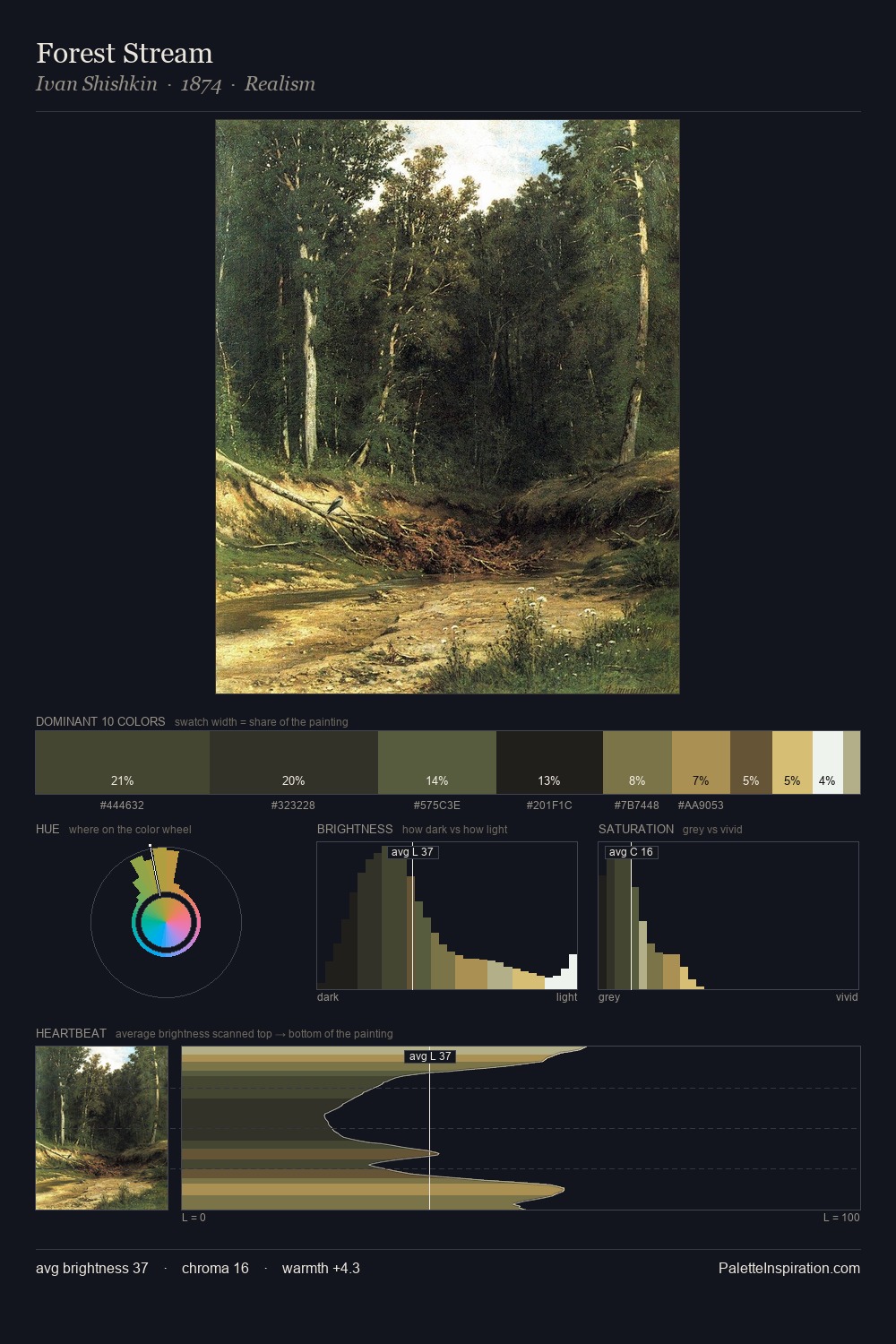
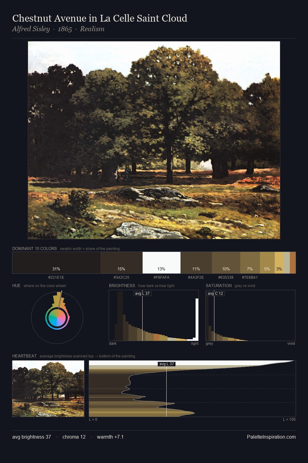
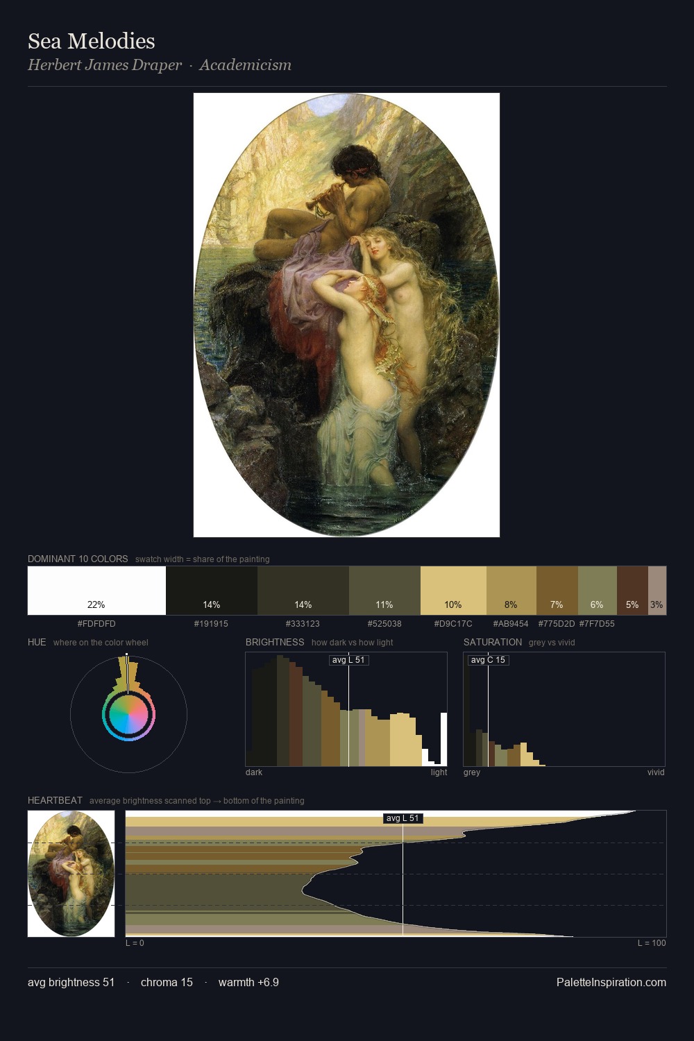
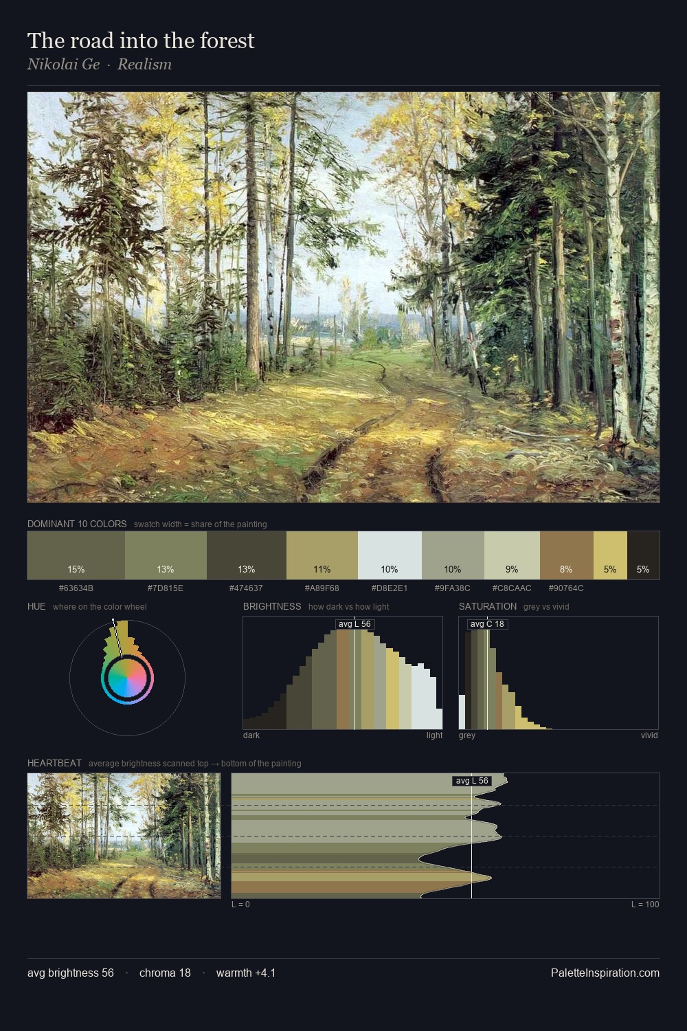
Charles Willson Peale distributes its values across the middle register, creating harmony without high contrast. Warm hues command this palette; Charles Willson Peale favours the reds, oranges, and yellows of firelight and earth. Saturation is deliberately withheld - the beauty here lies in the near-monochromatic gradations rather than colour difference. A single dominant - #1B1816 at 28.2% - sets the character of the whole composition. At 5.9%, #9A7142 carries the palette's sharpest chromatic charge: an accent that earns its place precisely because it is withheld. At 77 units of value range, the palette has the tonal breadth to sustain complex spatial readings. This is palette 3 of Charles Willson Peale's sequence - a single chapter in a chromatic story told across many works.
Example use cases
- music labels
- luxury hospitality
- editorial photography
- leather goods
- premium streaming
I Love This!
Copy, export, or download for your project