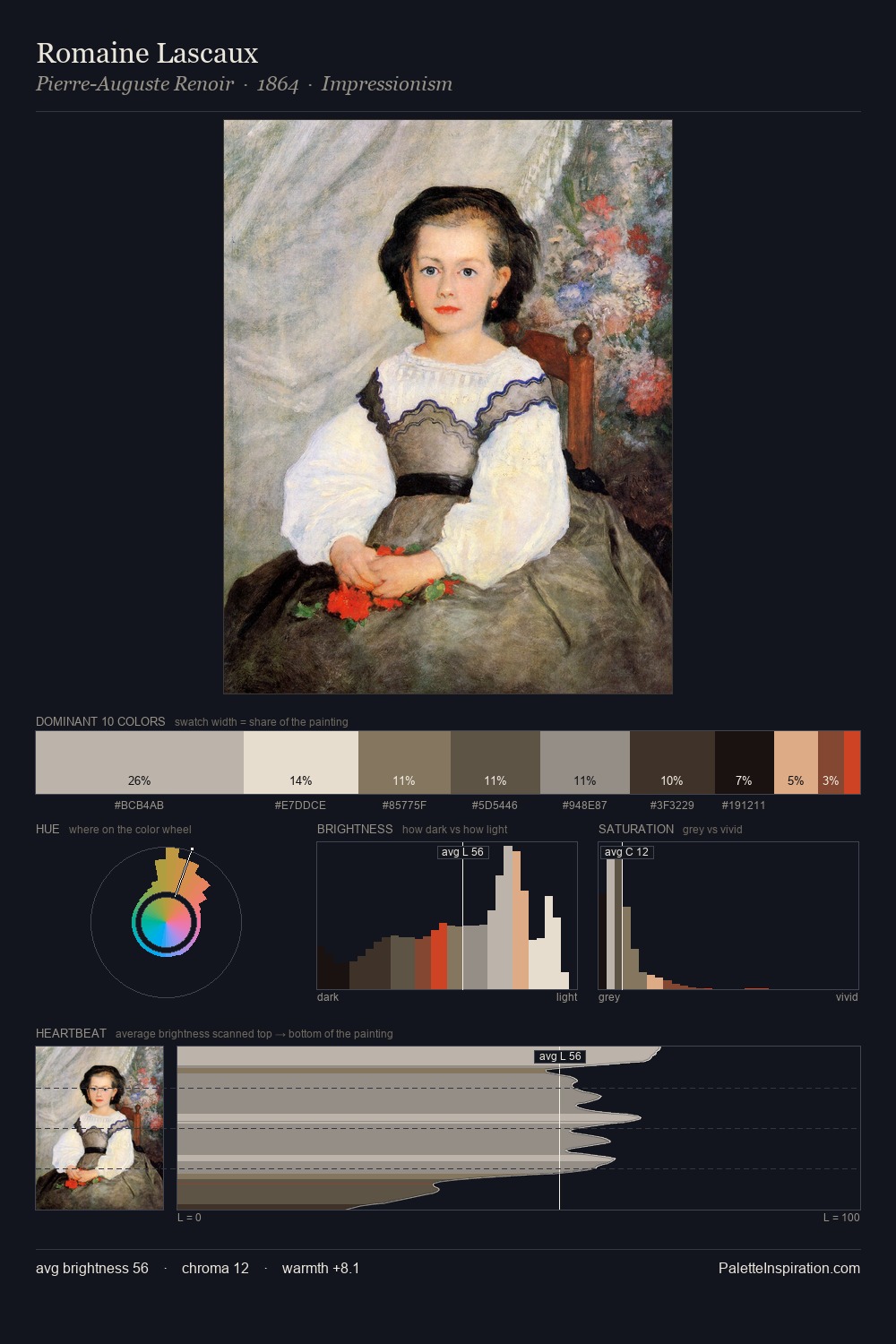
Charles Turner Palette 2

Palette Analysis
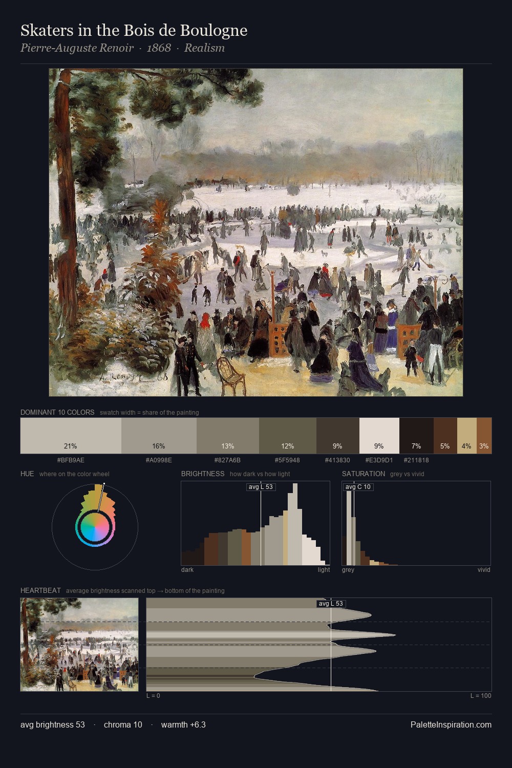
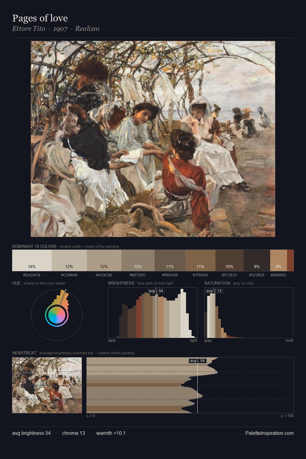
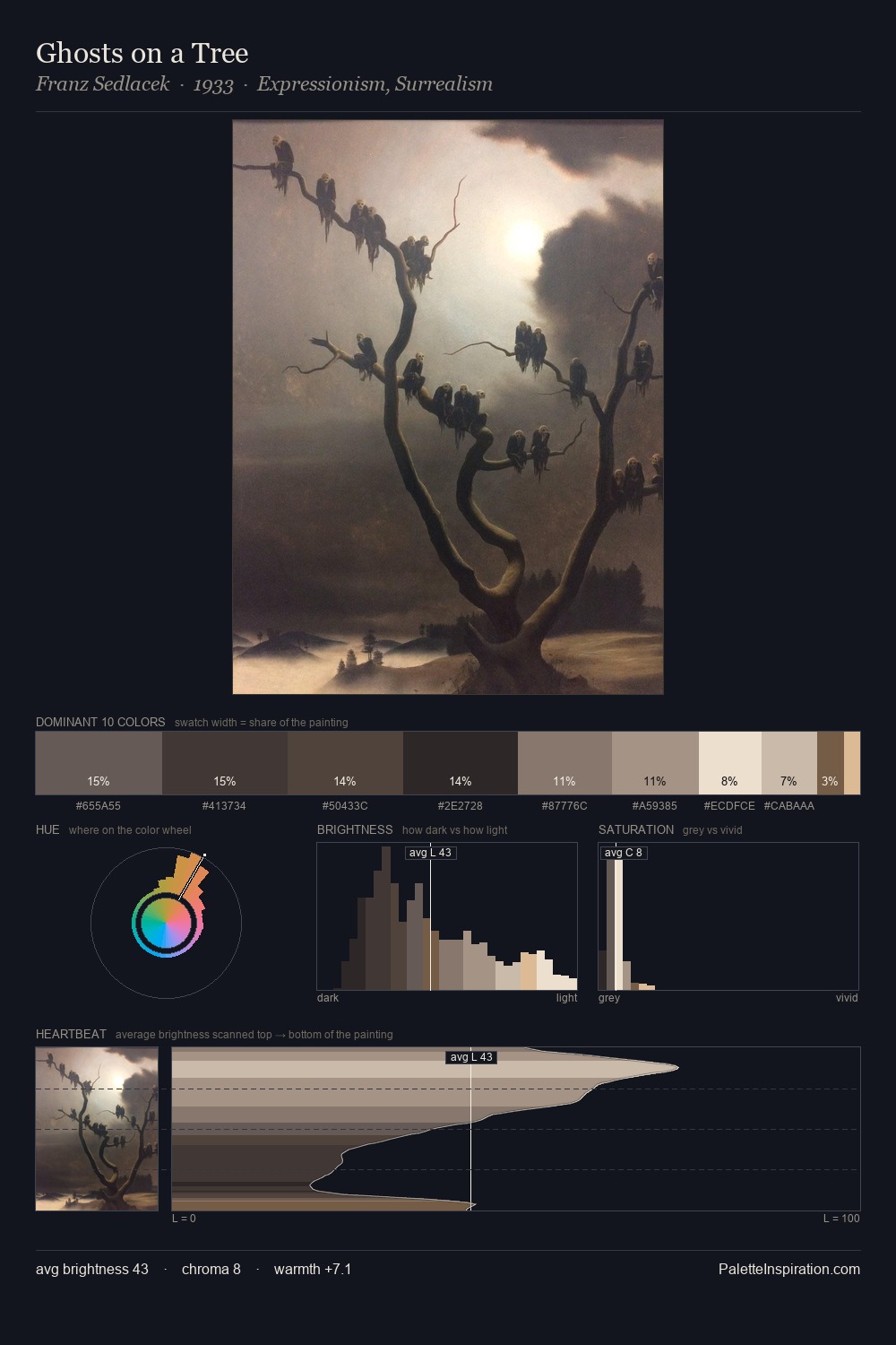
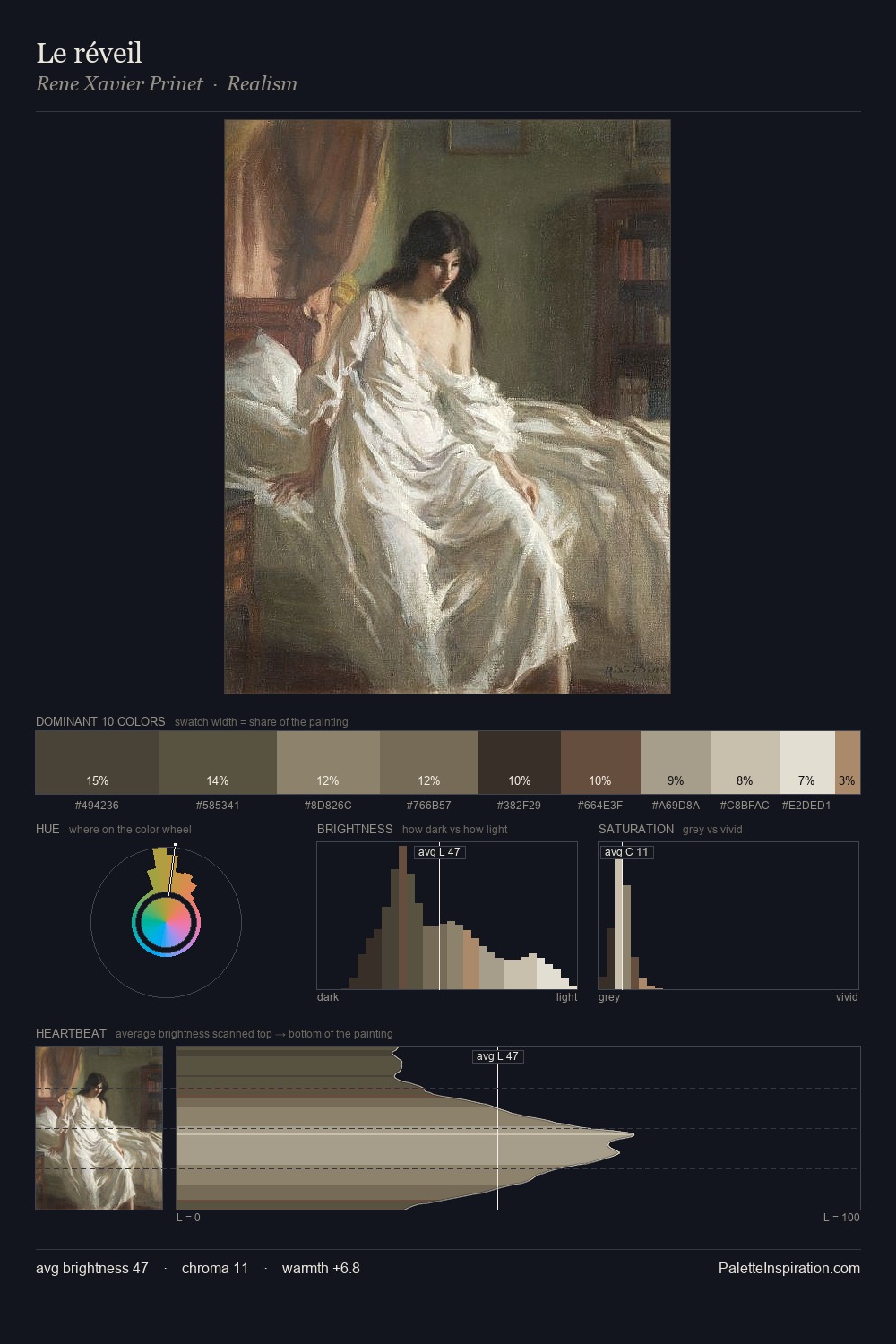
Charles Turner occupies the comfortable middle of the value scale, avoiding both extremes to hold the eye in a sustained middle grey. Warm and cool tones are held in careful balance - neither family dominates, creating tension and resolution simultaneously. Chroma hovers near zero; colour declares itself through subtle shifts in hue rather than outright saturation. At 12.2%, #E7E0D6 carries the palette's sharpest chromatic charge: an accent that earns its place precisely because it is withheld. A value spread of 58 units gives the palette both depth and air - shadows are genuinely dark, lights genuinely light. Charles Turner's palette 2 carries its own internal logic while remaining in conversation with the artist's broader colour intelligence.
Example use cases
- exhibition design
- foundation branding
- estate management
- art education
- museums & galleries
I Love This!
Copy, export, or download for your project