Charles Schreyvogel Palette 1
Palette Analysis
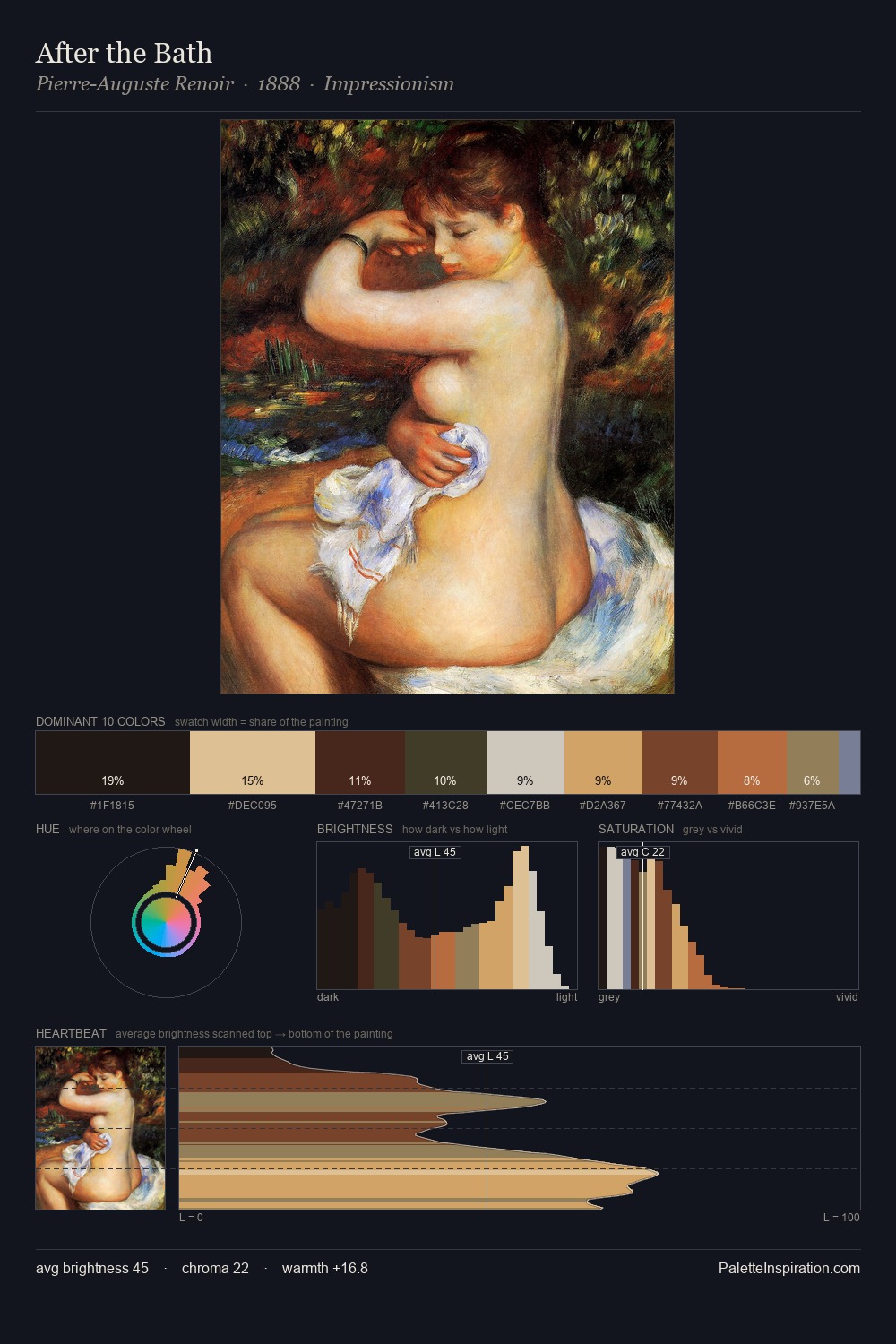
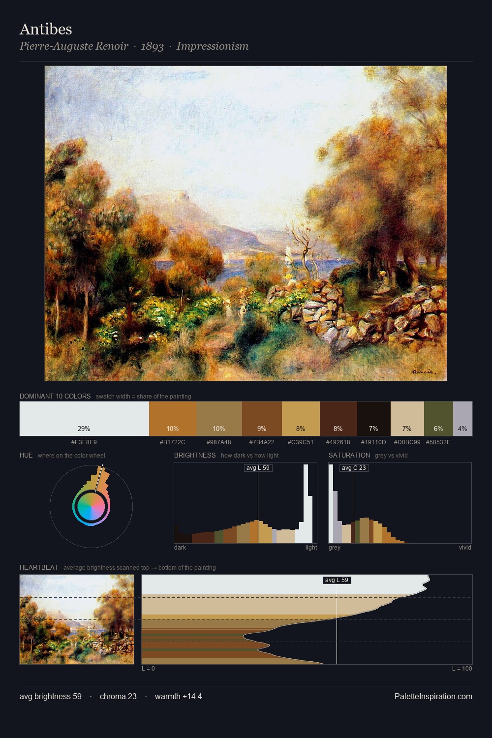
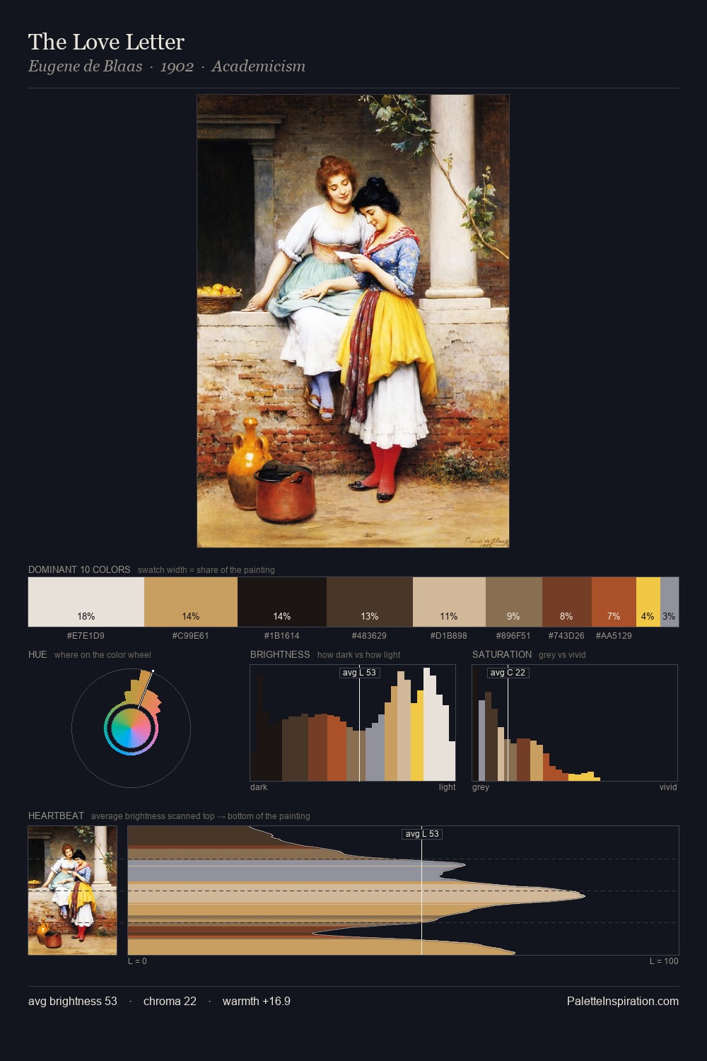
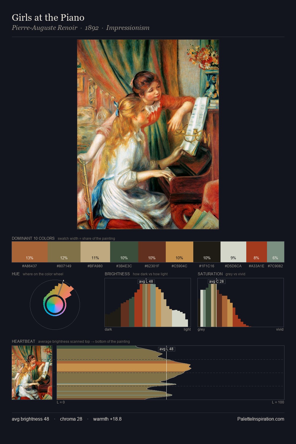
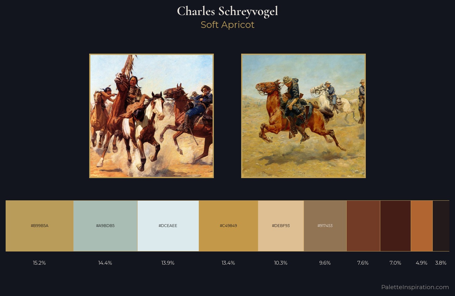
Charles Schreyvogel works in the upper reaches of the value scale, creating an atmosphere of brightness and expansiveness. Cool hues prevail: blues, greens, and greys anchor the palette's emotional temperature. A restrained, mid-chroma palette: every hue is present and legible, but nothing shouts. The most saturated colour, #DEBF93, is reserved to 10.3% of the surface, where it acts as a focal punctuation. From deepest dark to palest light, the palette traverses 70 units of the value scale - a span that creates natural depth. The mid-to-high key, cool bias, and moderate chroma point to outdoor observation - sky and diffused daylight as the dominant light source. This is palette 1 of Charles Schreyvogel's sequence - a single chapter in a chromatic story told across many works.
Example use cases
- interior design
- furniture brands
- cookbook publishing
- wine & spirits
- food packaging
I Love This!
Copy, export, or download for your project