Charles Rennie Mackintosh Palette 8

Palette Analysis
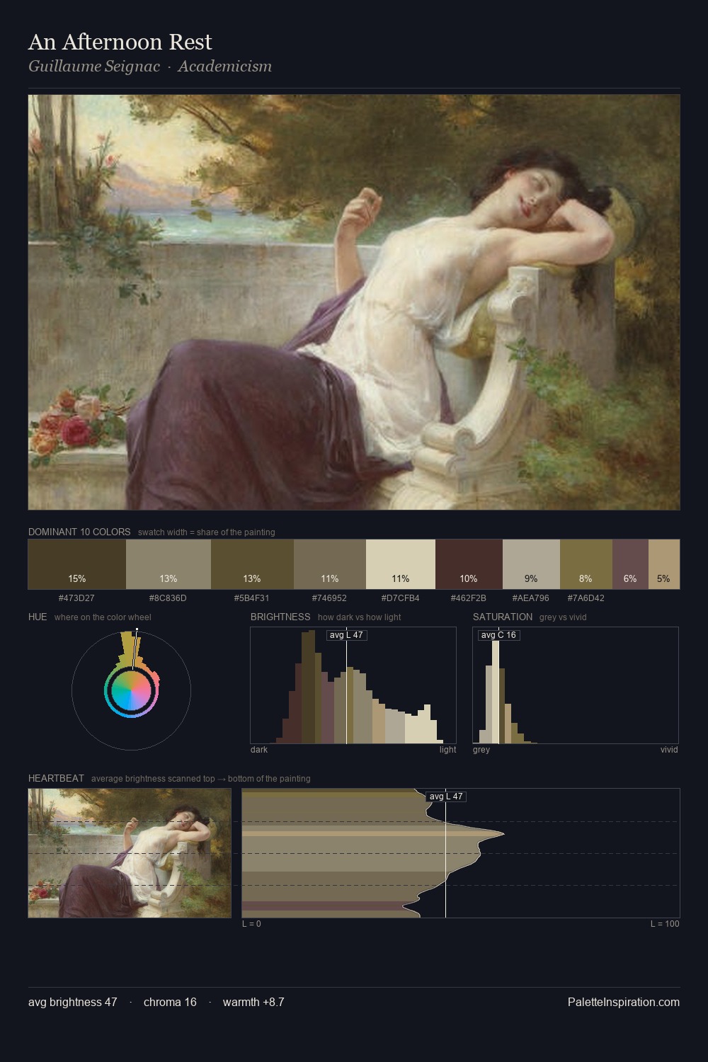
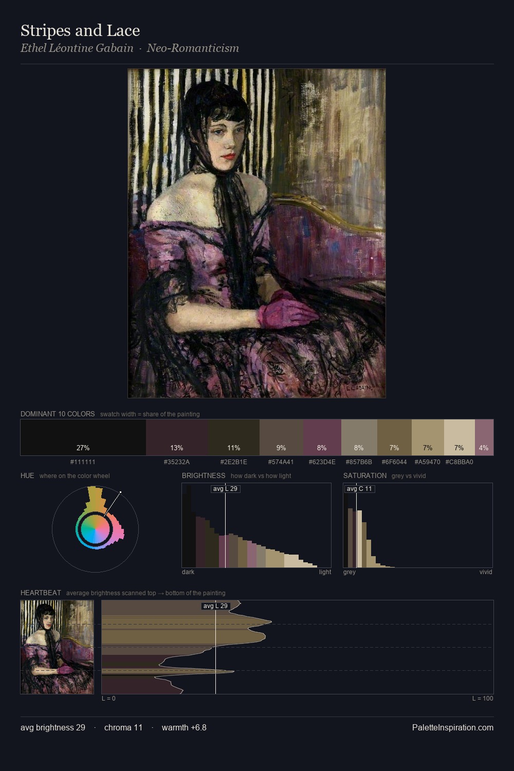
Charles Rennie Mackintosh is strongly light-biased - shadow is suggested rather than declared. Charles Rennie Mackintosh tilts toward cool - blues and silver-greys carry the structural weight. The absence of saturated colour is itself an expressive choice: this is a palette of restraint and atmosphere. The dominant colour, #C4BCA9, takes 70.3% of the total area, establishing the overall mood before any other hue is introduced. The highest-chroma note - #714750 - appears at just 3.3%, deployed as a precision accent against the quieter ground. At 49 units across the value scale, the palette keeps contrast readable without letting it dominate. The palette has the character of outdoor light: cool, mid-bright, with colour rendered faithfully rather than expressively. Palette 8 sits within the larger chromatic argument that Charles Rennie Mackintosh's complete body of work advances.
Example use cases
- florist branding
- event design
- real estate
- jewelry retail
- hospitality branding
I Love This!
Copy, export, or download for your project