Charles Hermans Master Palette
Shadowed Gamboge
Shadowed Low-key - values weighted toward shadow, the palette of dim interiors and overcast skies.
Gamboge Deep golden yellow - a traditional warm pigment, rich amber-gold.

Palette Analysis
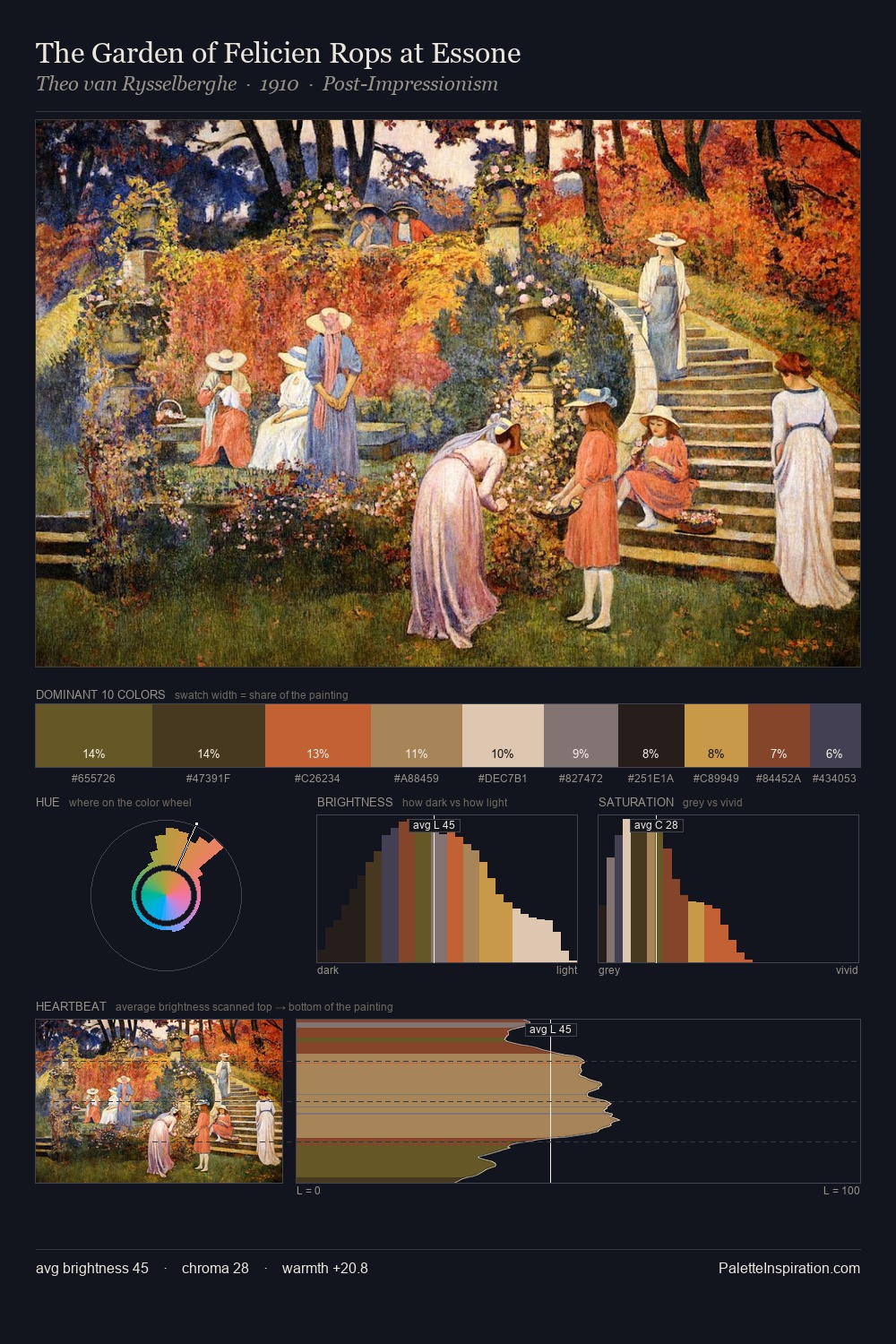
Charles Hermans occupies the comfortable middle of the value scale, avoiding both extremes to hold the eye in a sustained middle grey. Temperature reads distinctly warm: the reds and earth tones from Charles Hermans carry the compositional weight. Every colour is desaturated; the palette proceeds through near-neutrals and gently-coloured greys. At 6.6%, #DBA660 carries the palette's sharpest chromatic charge: an accent that earns its place precisely because it is withheld. The full value range is 64 units: broad enough to build convincing three-dimensional form. The palette is recognisably Charles Hermans's own: particular in its temperature, chroma, and the economy of its brightest note.
Example use cases
- theater design
- jewelry brands
- tobacco-adjacent retail
- event branding
- film & entertainment
I Love This!
Use This Palette
Copy, export, or download for your project
Copy, export, or download for your project
Copy:
Download:
Share: