Charles Hermans Palette 6
Tenebrous Bister
Tenebrous Dark and murky - low-key values with obscured form, Baroque in temperament.
Bister Dark warm brown - a traditional ink and wash pigment made from wood soot.

Palette Analysis
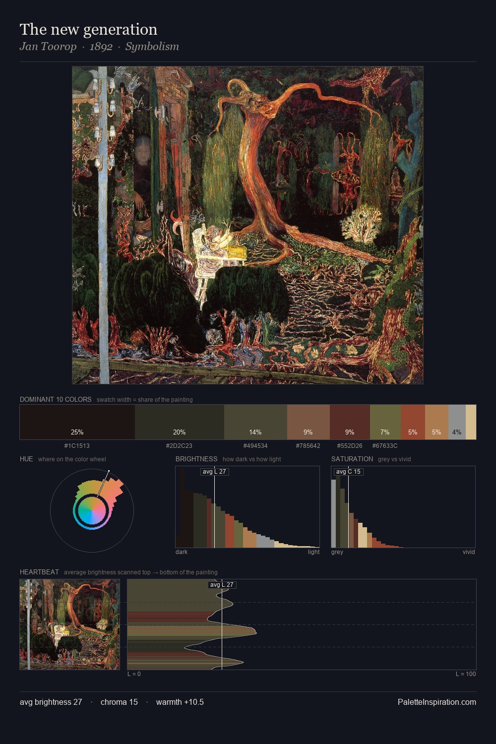
Values in Charles Hermans rest in the mid-range - neither dramatically lit nor steeped in shadow. Charles Hermans builds on cool foundations: the palette favours the blue-cyan-green arc. The absence of saturated colour is itself an expressive choice: this is a palette of restraint and atmosphere. The saturated accent, #562623, registers at 6.6% - sparse enough to feel like a deliberate surprise. Spanning 48 units on the value axis, the palette achieves the balance between tonal flatness and fragmentation. The palette has the character of outdoor light: cool, mid-bright, with colour rendered faithfully rather than expressively. This is palette 6 of Charles Hermans's sequence - a single chapter in a chromatic story told across many works.
Example use cases
- film & entertainment
- fine dining
- spirits branding
- menswear
- theater design
I Love This!
Use This Palette
Copy, export, or download for your project
Copy, export, or download for your project
Copy:
Download:
Share: