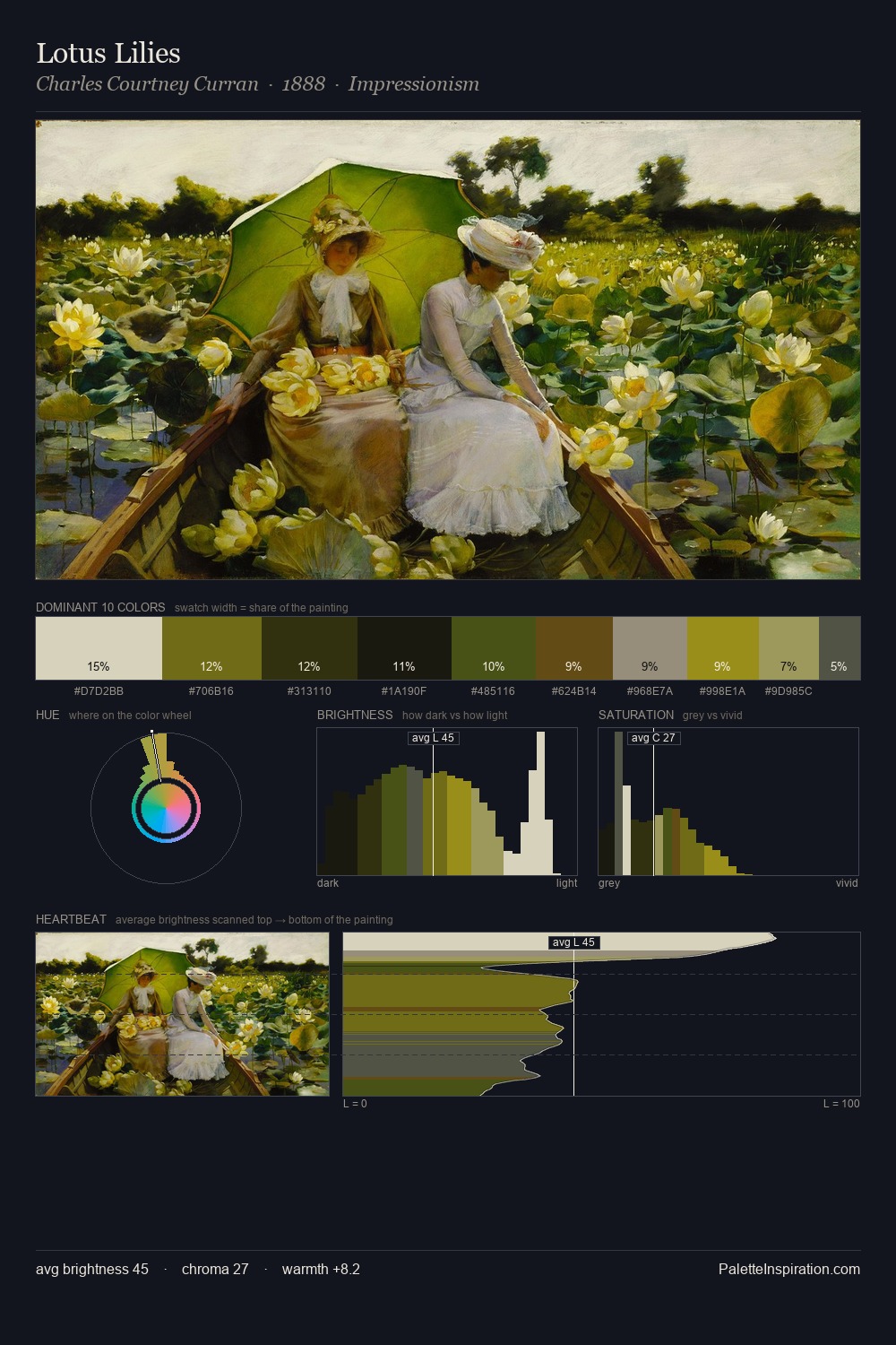
Charles Courtney Curran Palette 5

Palette Analysis
Charles Courtney Curran distributes its values across the middle register, creating harmony without high contrast. Cool hues prevail: blues, greens, and greys anchor the palette's emotional temperature. Saturation is measured and controlled, giving the palette presence without visual aggression. The most saturated colour, #5D6012, is reserved to 11.0% of the surface, where it acts as a focal punctuation. From deepest dark to palest light, the palette traverses 63 units of the value scale - a span that creates natural depth. The palette has the character of outdoor light: cool, mid-bright, with colour rendered faithfully rather than expressively. Charles Courtney Curran's palette 5 carries its own internal logic while remaining in conversation with the artist's broader colour intelligence.
Example use cases
- theater design
- jewelry brands
- tobacco-adjacent retail
- event branding
- film & entertainment
I Love This!
Copy, export, or download for your project
Related Palettes

Charles Courtney Curran Palette 1
Pearlescent Vellum

Charles Courtney Curran Palette 2
Veiled Parchment

Charles Courtney Curran Palette 3
Penumbral Tawny

Charles Courtney Curran Palette 4
Tenebrous Sienna

Charles Courtney Curran Palette 6
Veiled Bisque

Charles Courtney Curran Master Palette
Veiled Tawny