Charles Conder Master Palette

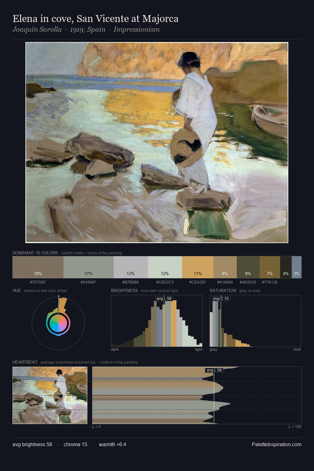
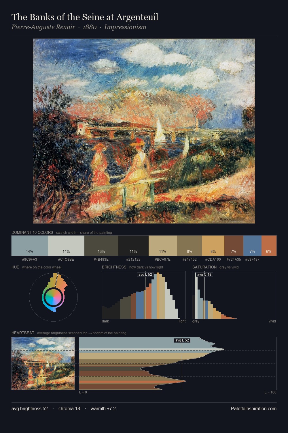
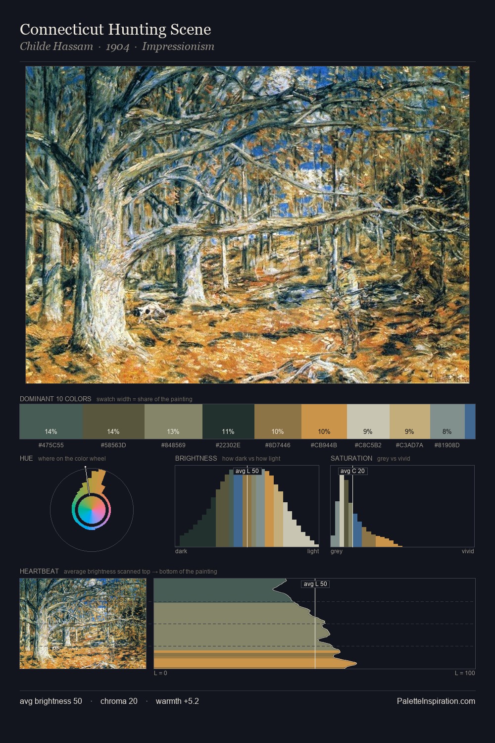
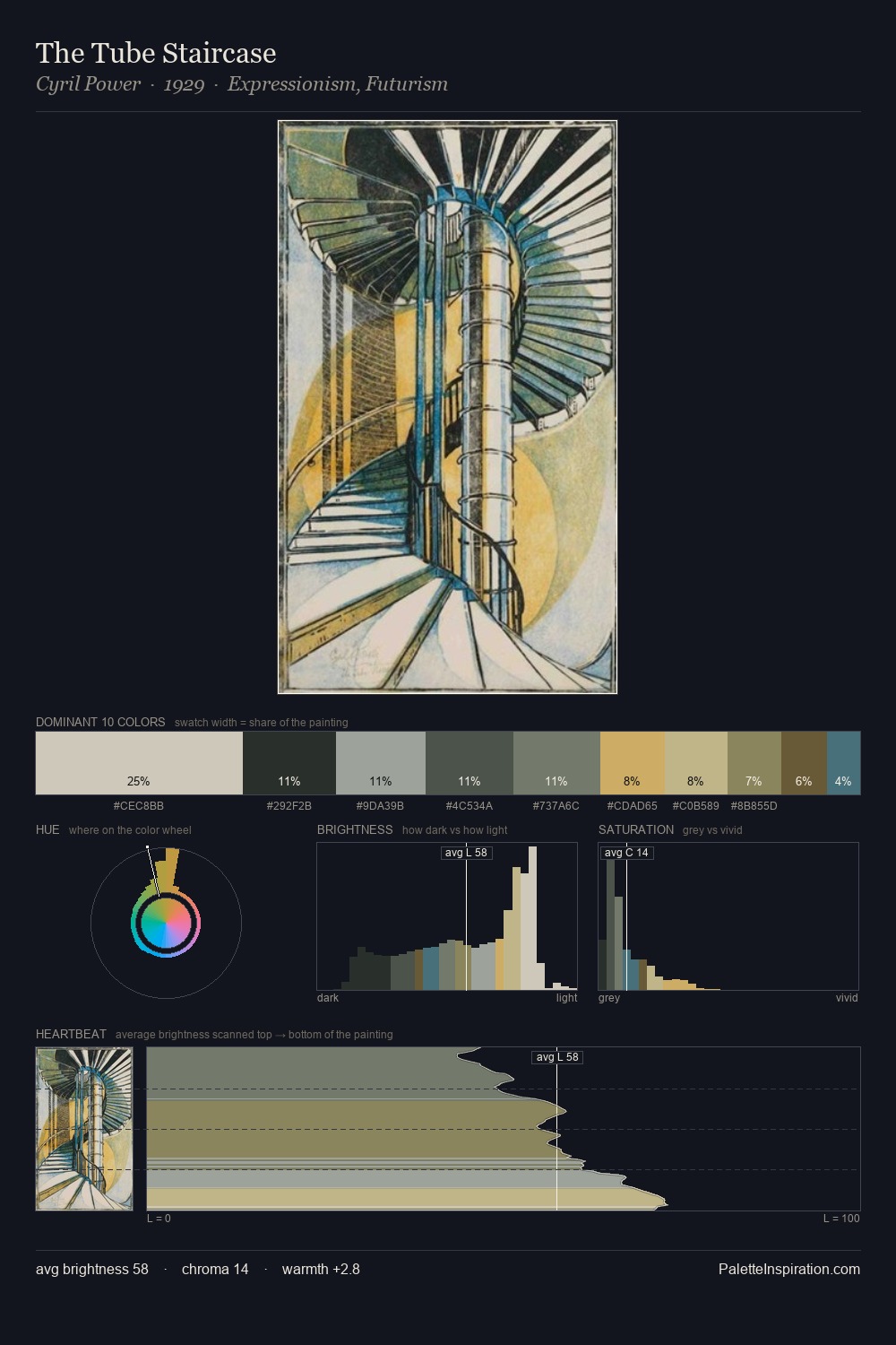
Palette Analysis
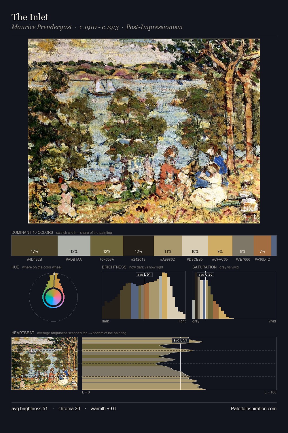
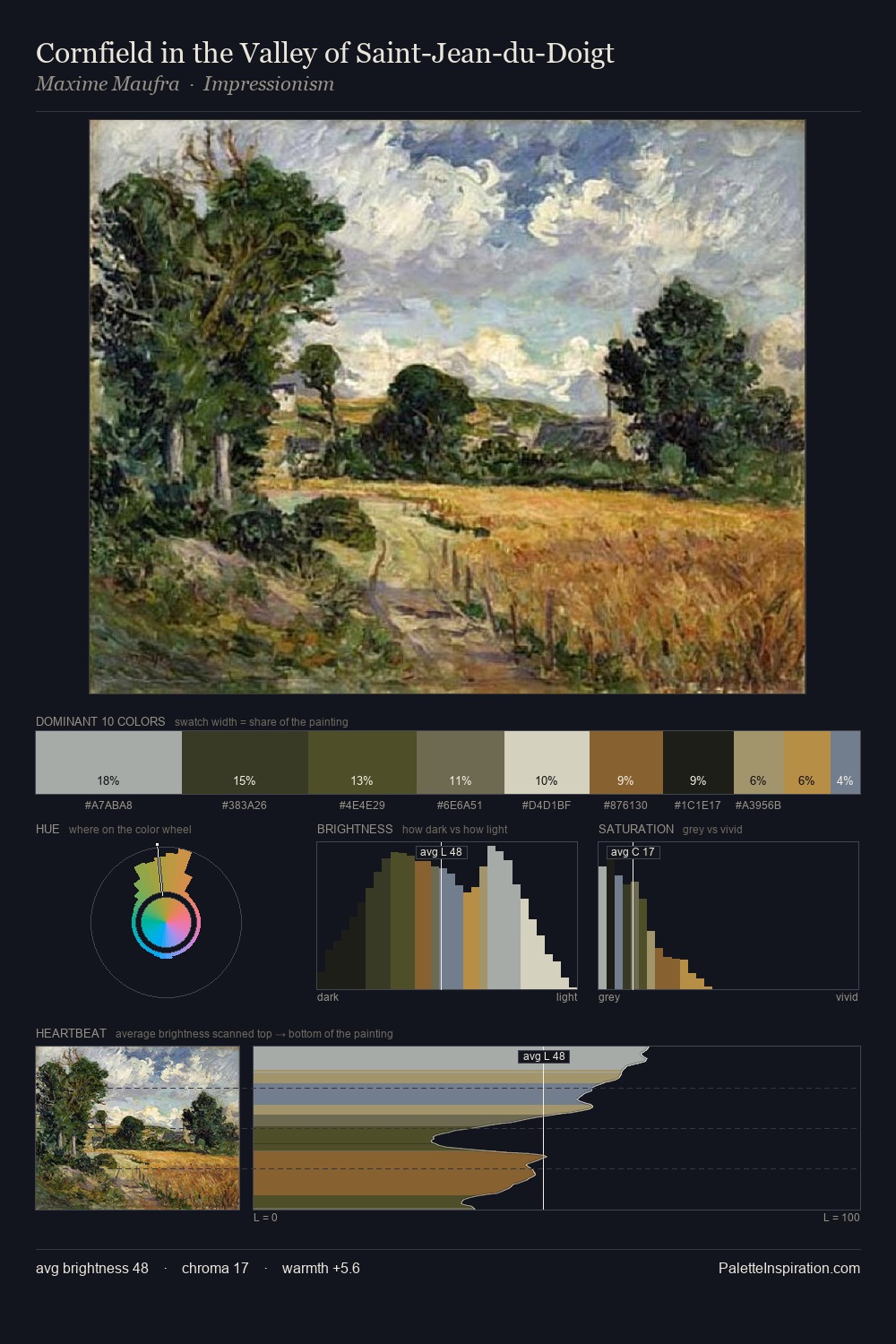
Charles Conder sits in the centre of the value range, lending the palette a sense of even, sustained light. A distinctly cool atmosphere runs through this palette: sky, water, and mist given colour form. Every colour is desaturated; the palette proceeds through near-neutrals and gently-coloured greys. Only 7.5% is devoted to #4C7386, yet that small allocation delivers the palette's entire chromatic tension. The full value range is 55 units: broad enough to build convincing three-dimensional form. The palette has the character of outdoor light: cool, mid-bright, with colour rendered faithfully rather than expressively. Taken together, these qualities constitute Charles Conder's chromatic voice - distinctive enough to be read across an entire body of work.
Example use cases
- exhibition design
- foundation branding
- estate management
- art education
- museums & galleries
I Love This!
Copy, export, or download for your project