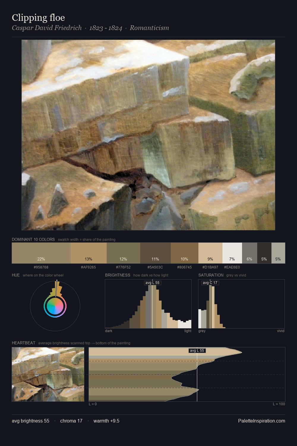
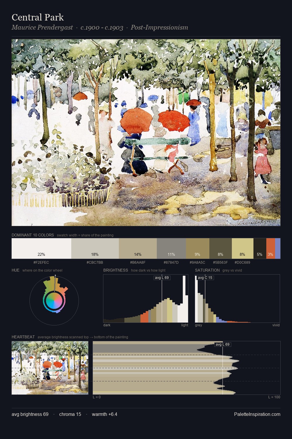
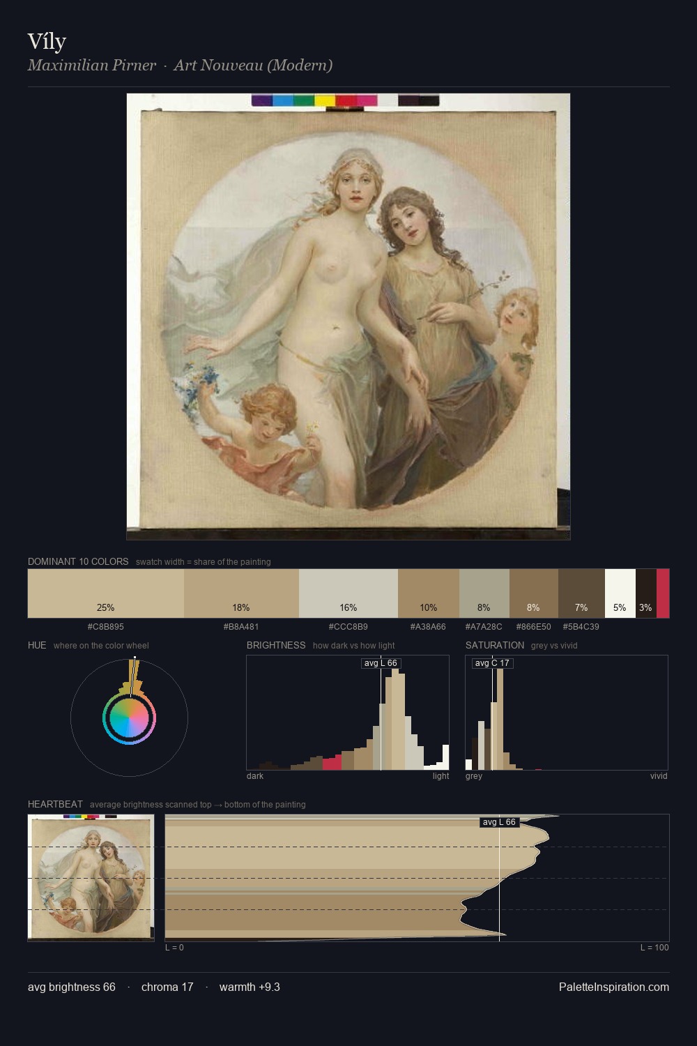
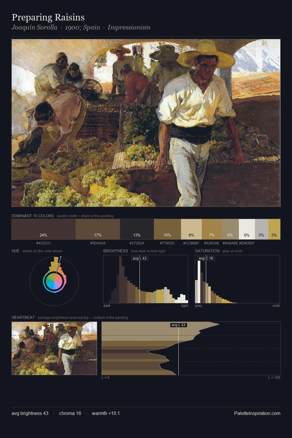
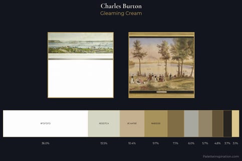
Charles Burton Palette 1
Palette Analysis
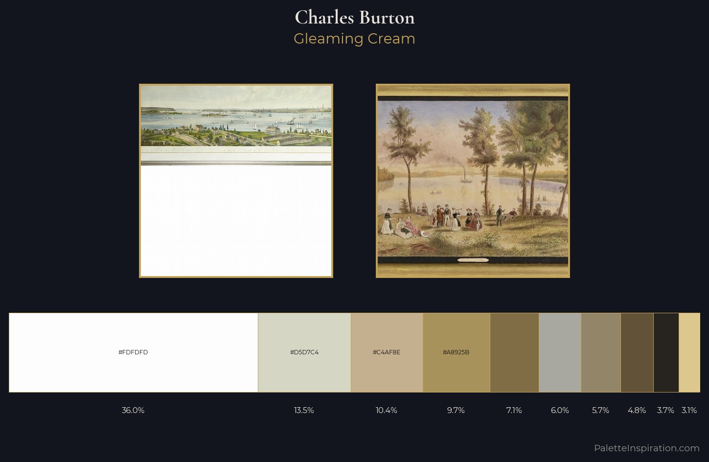
The high-key values of Charles Burton give it an effulgent, almost bleached quality. Cool hues prevail: blues, greens, and greys anchor the palette's emotional temperature. Chroma is kept low across all colours, producing the soft, enveloping quality that characterises tonal painting. At 36.0%, #FDFDFD functions less as a colour accent and more as a complete atmospheric environment. The most saturated colour, #806D46, is reserved to 7.1% of the surface, where it acts as a focal punctuation. The full value range is 73 units: broad enough to build convincing three-dimensional form. High luminosity and cool temperature suggest the plein-air condition: unfiltered daylight and open sky. Charles Burton's palette 1 carries its own internal logic while remaining in conversation with the artist's broader colour intelligence.
Example use cases
- florist branding
- event design
- real estate
- jewelry retail
- hospitality branding
I Love This!
Copy, export, or download for your project