Cesare Biseo Palette 3
Palette Analysis
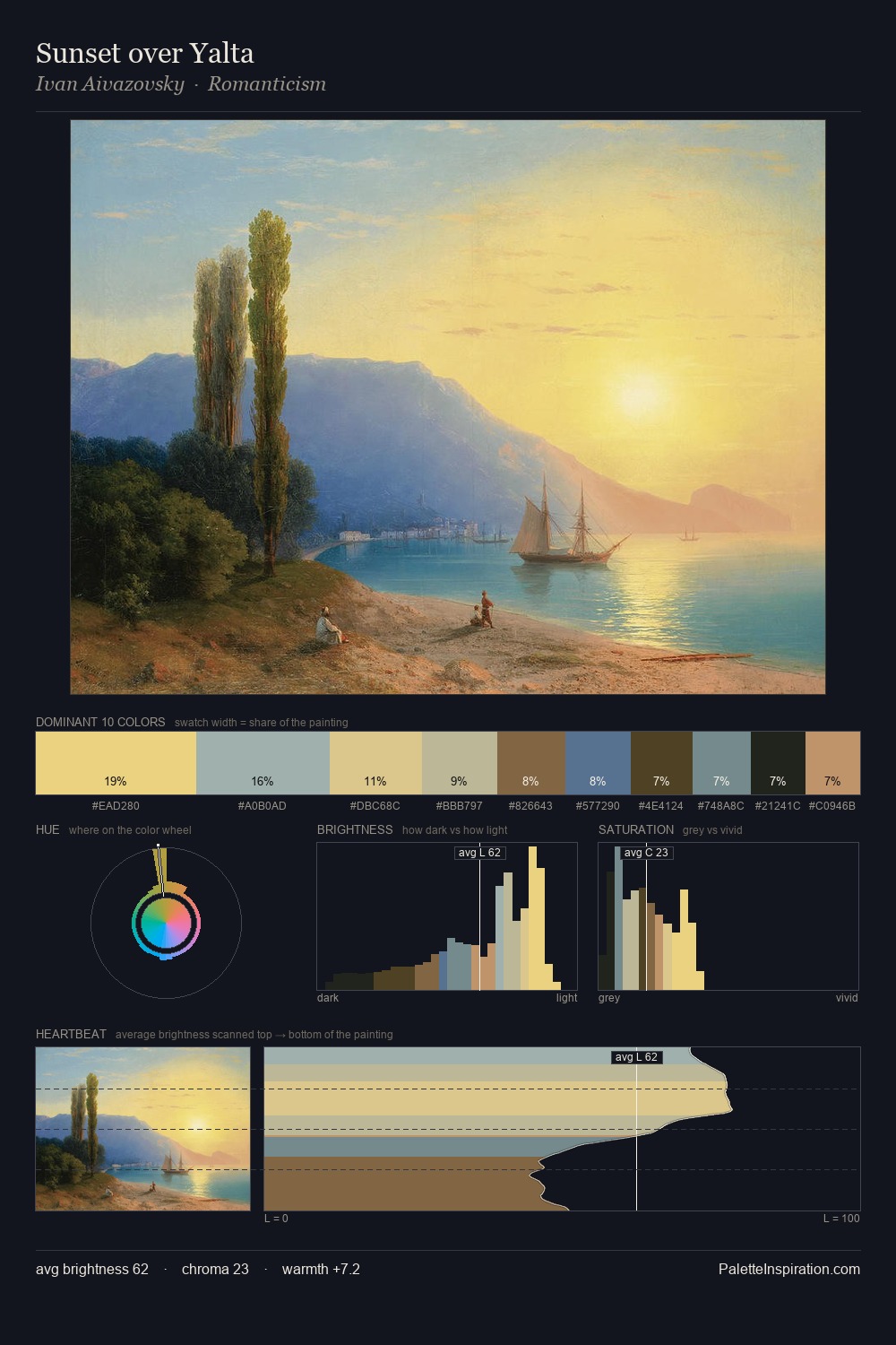
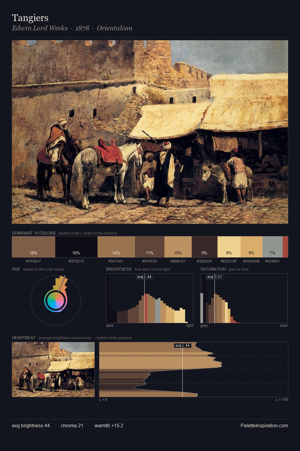
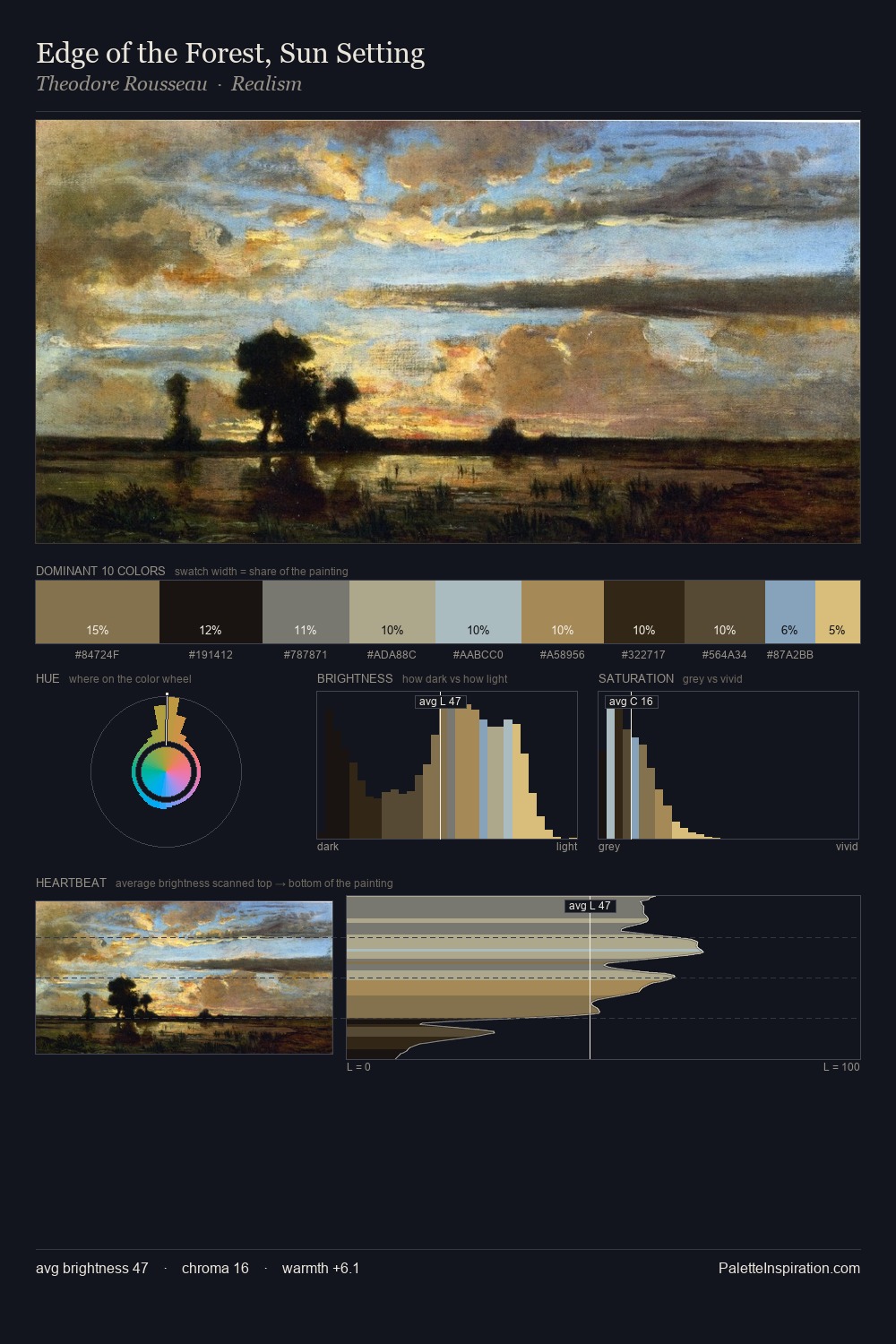
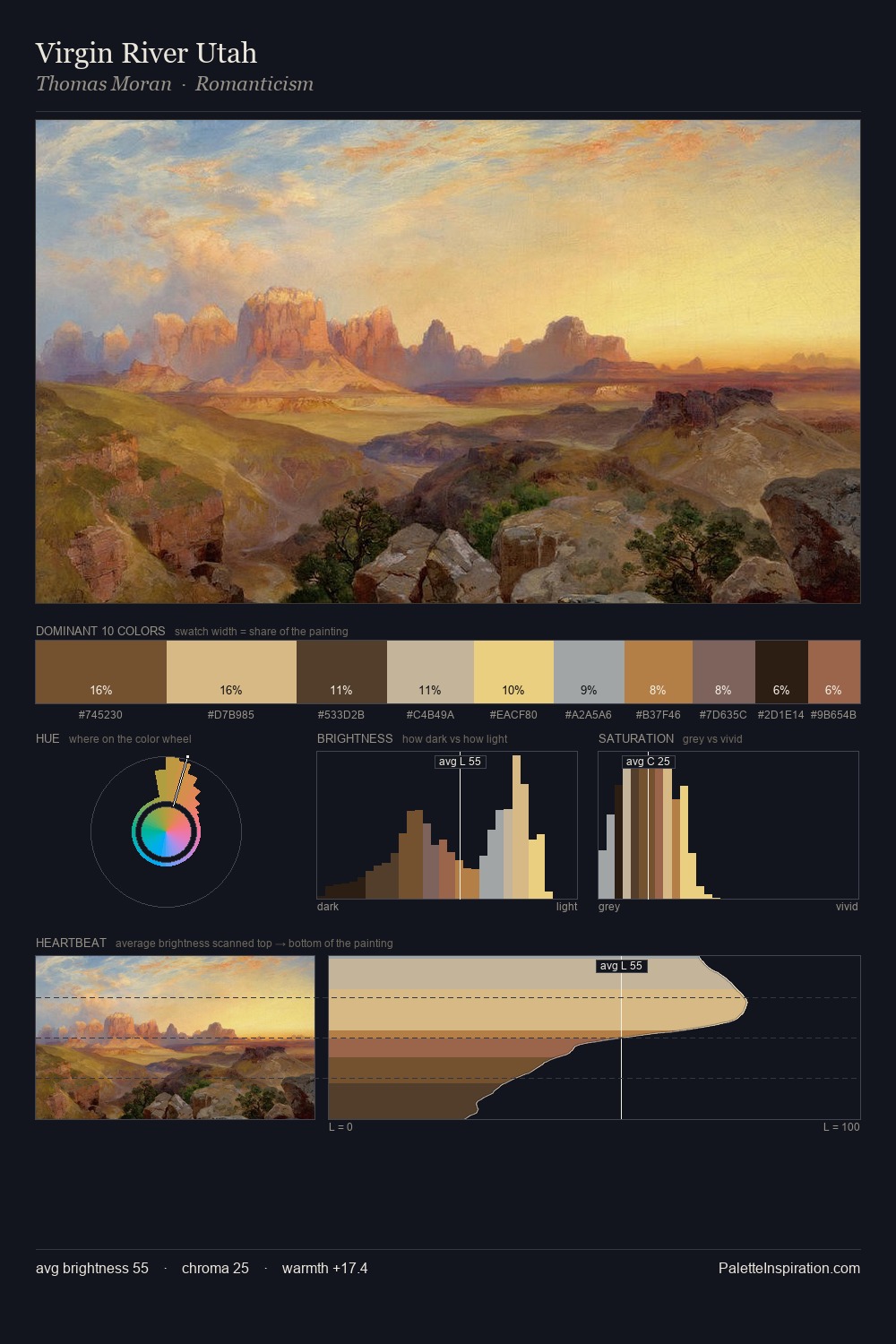
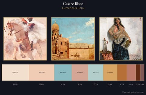
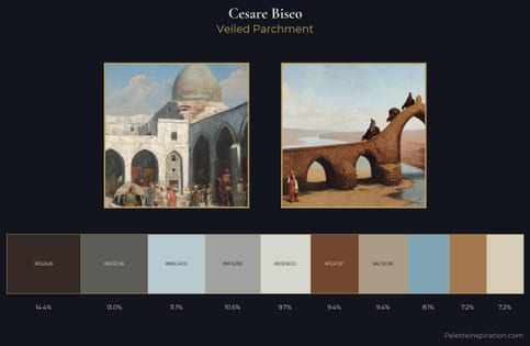
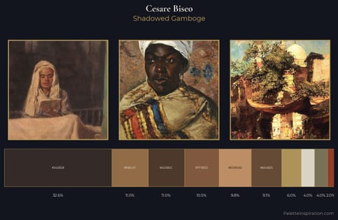
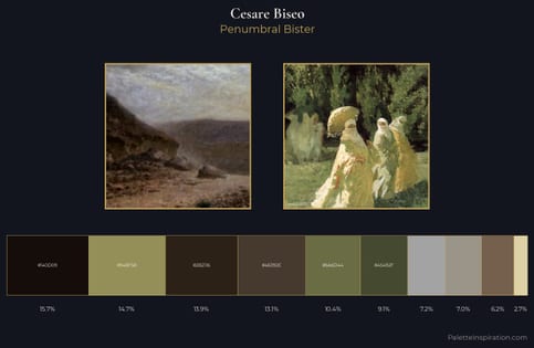
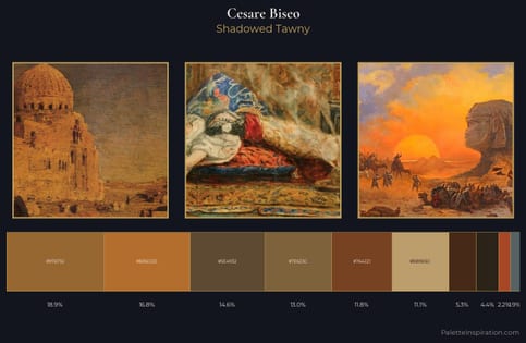
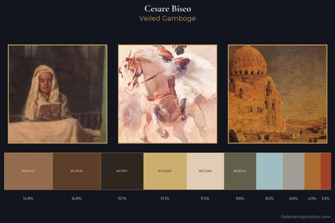
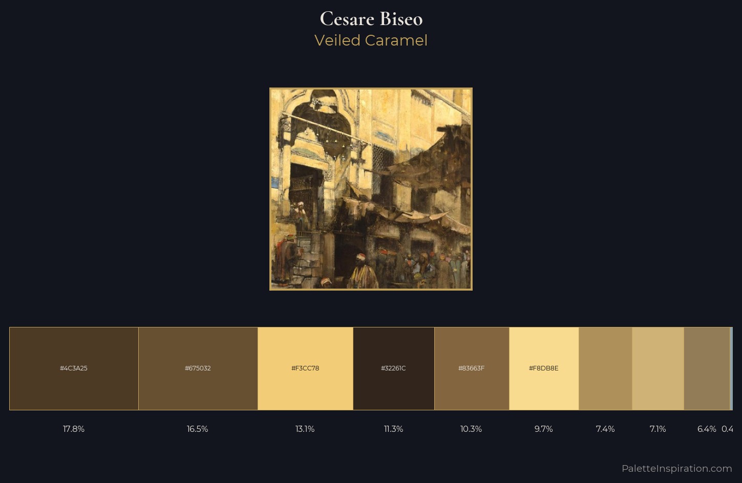
Cesare Biseo occupies the comfortable middle of the value scale, avoiding both extremes to hold the eye in a sustained middle grey. Cesare Biseo keeps warm and cool in parity, a balance that lends the work a perceptual shimmer. A restrained, mid-chroma palette: every hue is present and legible, but nothing shouts. #CFB276 delivers the chromatic peak at only 7.1% - a small shot of colour with outsized visual impact. From deepest dark to palest light, the palette traverses 62 units of the value scale - a span that creates natural depth. The palette reads as an Impressionist one - light-biased, chromatically direct, and built on temperature contrast rather than value opposition. Palette 3 sits within the larger chromatic argument that Cesare Biseo's complete body of work advances.
Example use cases
- publishing
- corporate identity
- consumer apps
- hospitality
- design agencies
I Love This!
Copy, export, or download for your project