Cennino Cennini Palette 1

Palette Analysis
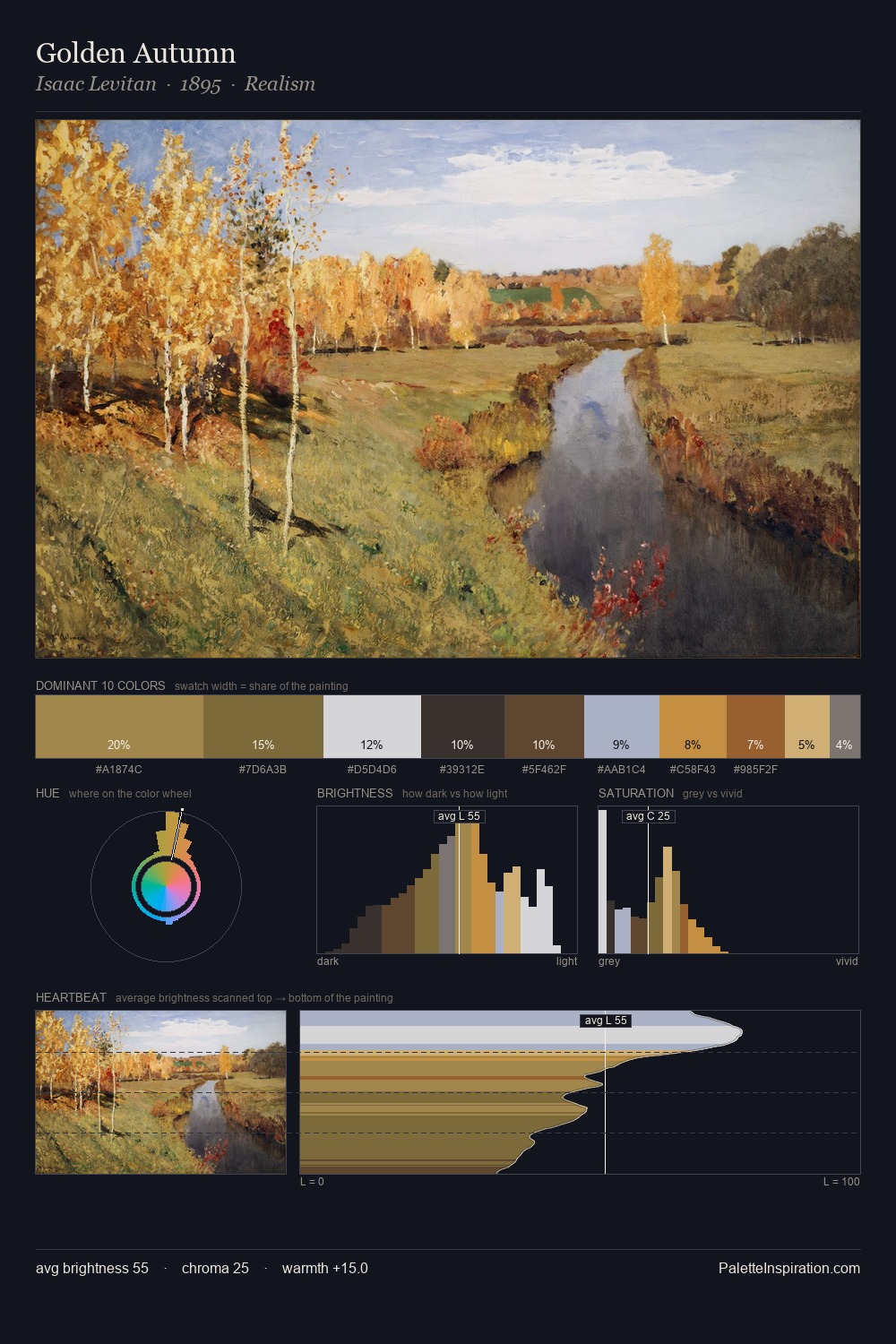
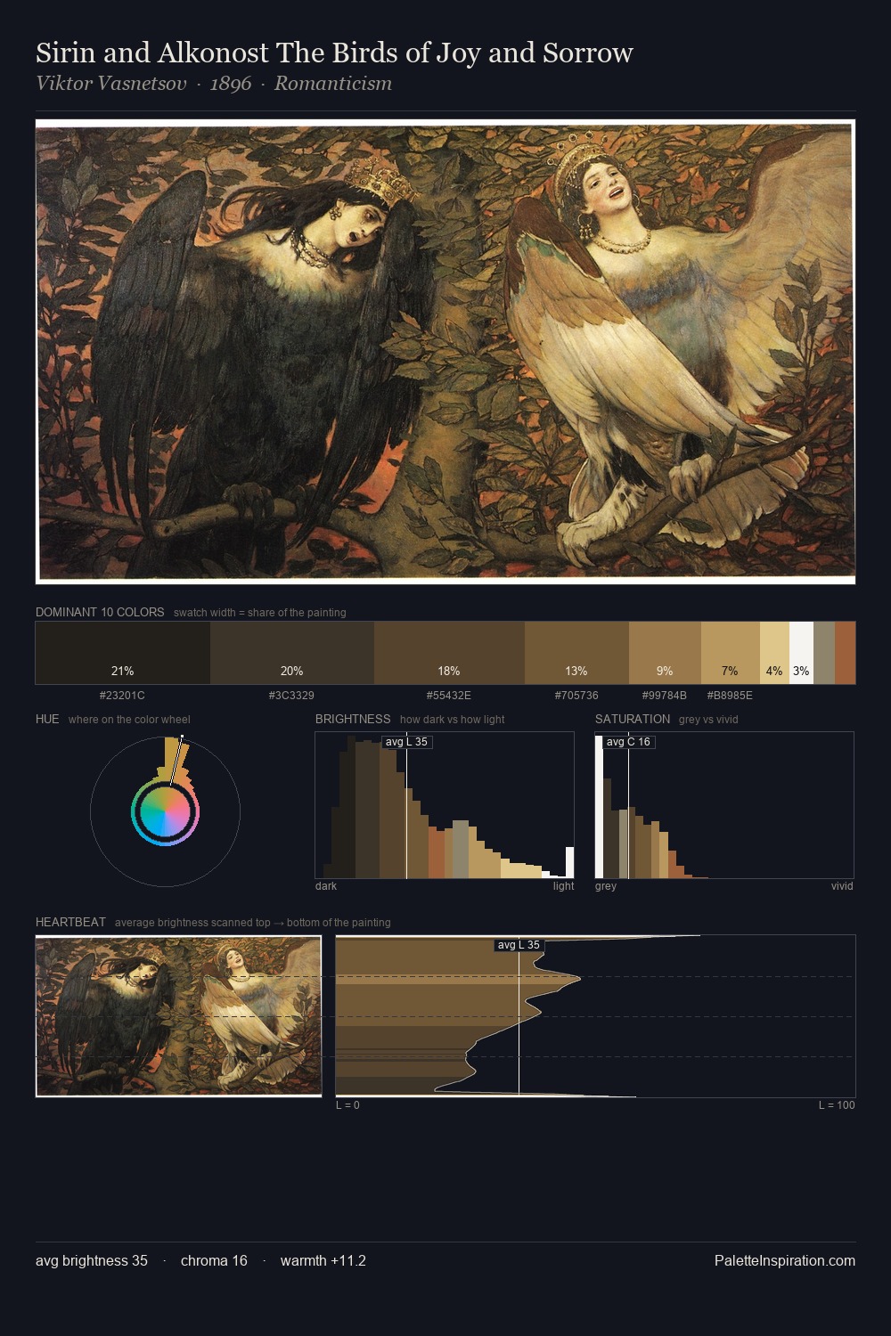
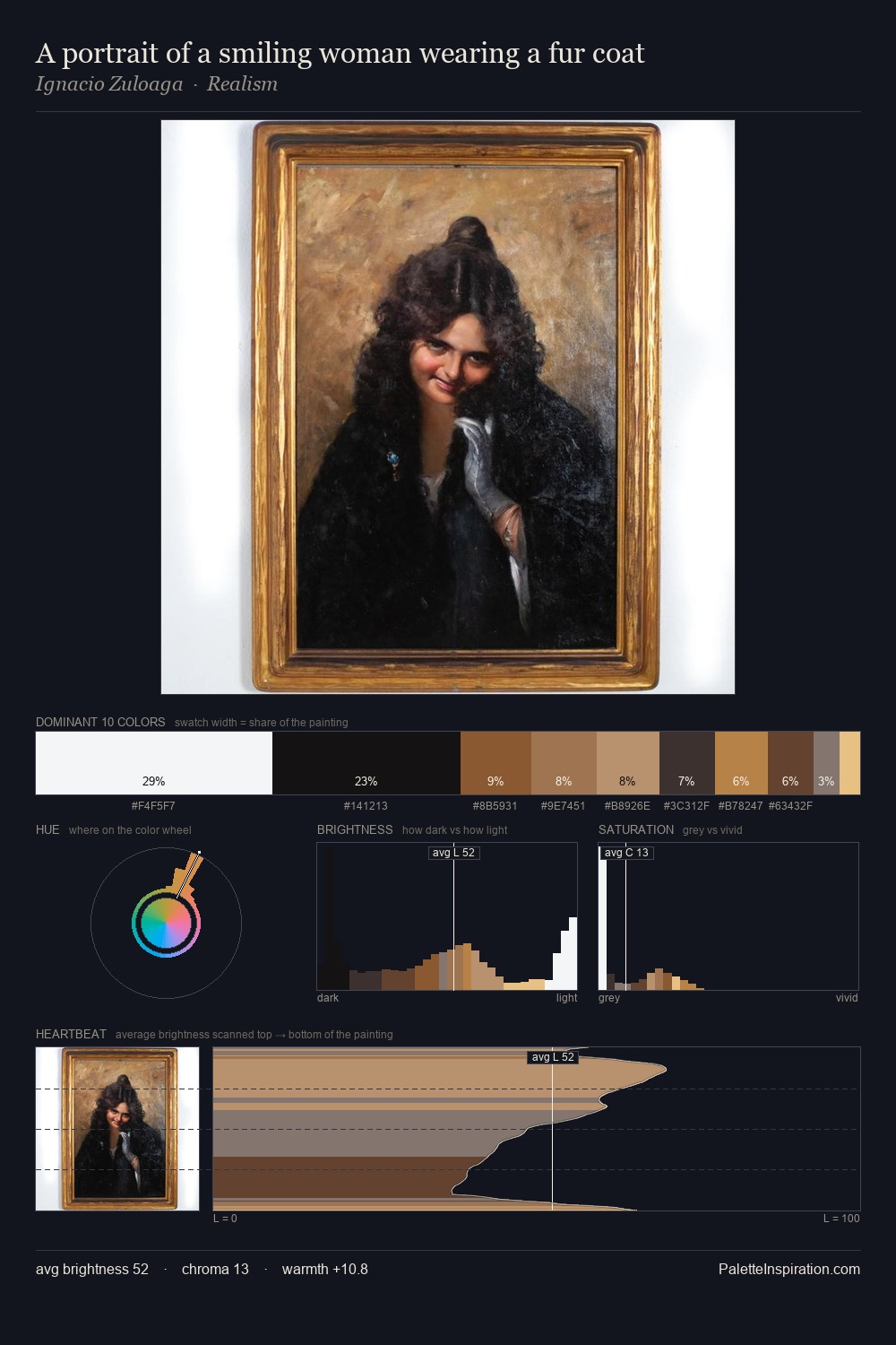
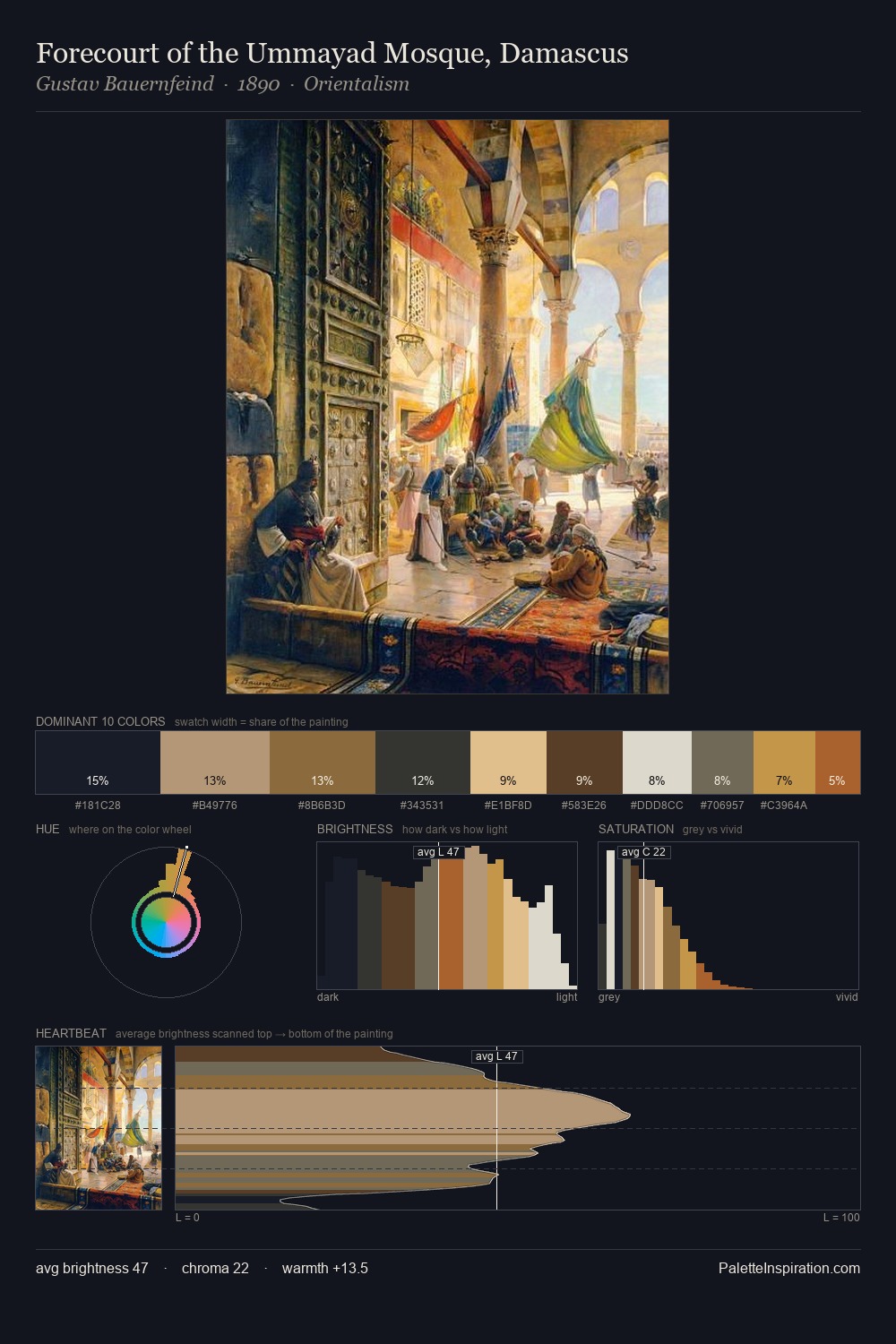
Cennino Cennini occupies the comfortable middle of the value scale, avoiding both extremes to hold the eye in a sustained middle grey. Cennino Cennini keeps warm and cool in parity, a balance that lends the work a perceptual shimmer. Saturation is measured and controlled, giving the palette presence without visual aggression. The highest-chroma note - #7E5E30 - appears at just 12.3%, deployed as a precision accent against the quieter ground. 68 units of value range underpin the palette's structural clarity: the eye always knows where light falls. Together these qualities point to the open-air Impressionist method: recording light rather than local colour. Palette 1 sits within the larger chromatic argument that Cennino Cennini's complete body of work advances.
Example use cases
- ceramics & pottery
- boutique hospitality
- menswear
- heritage food brands
- craft & artisan brands
I Love This!
Copy, export, or download for your project