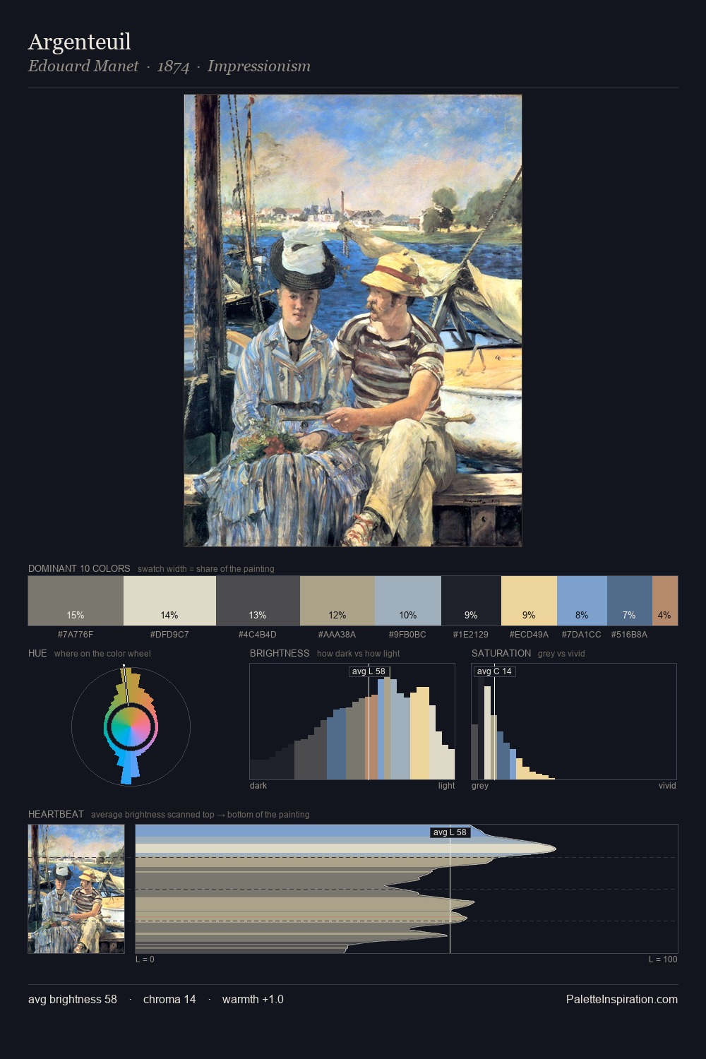
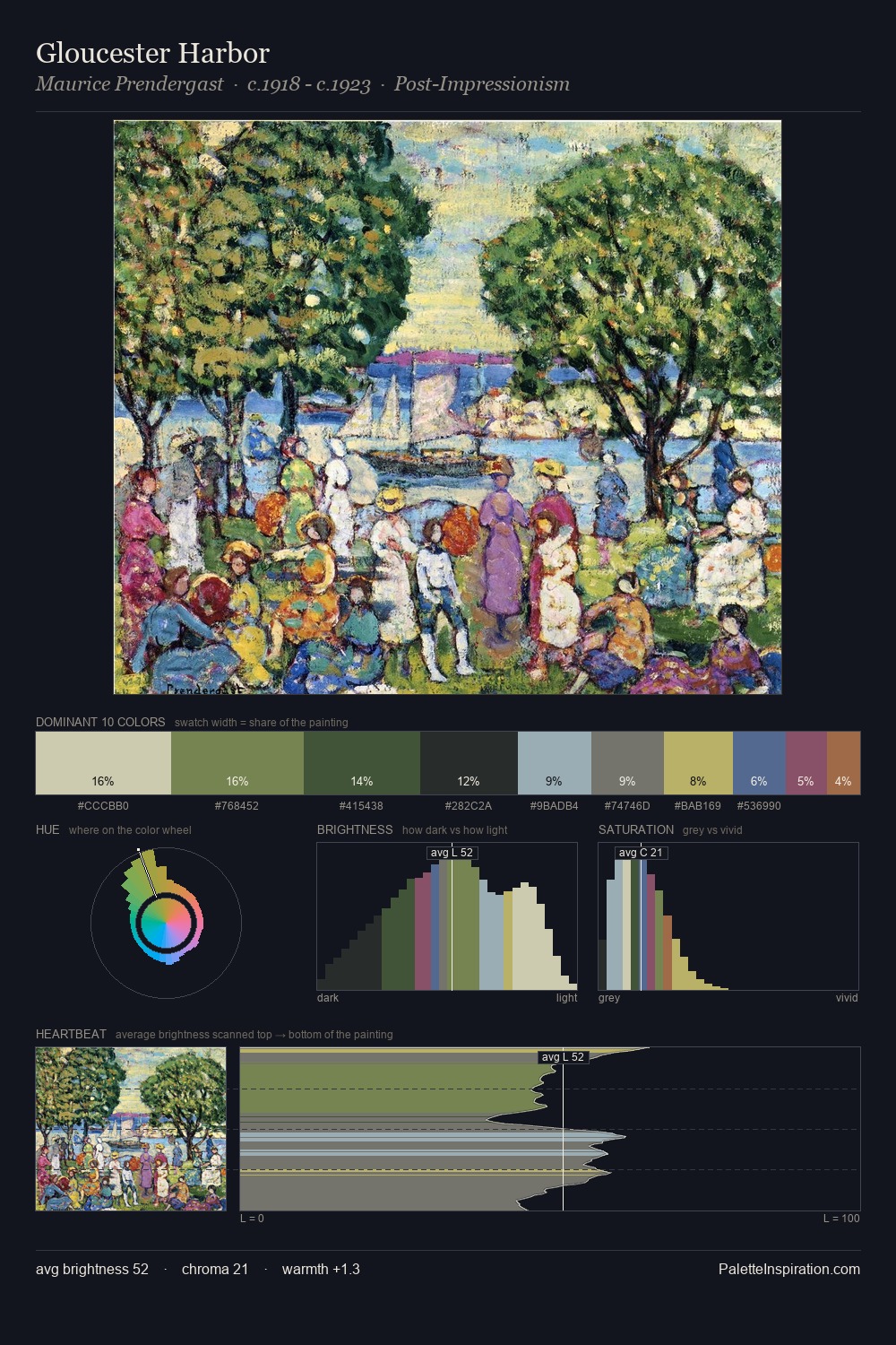
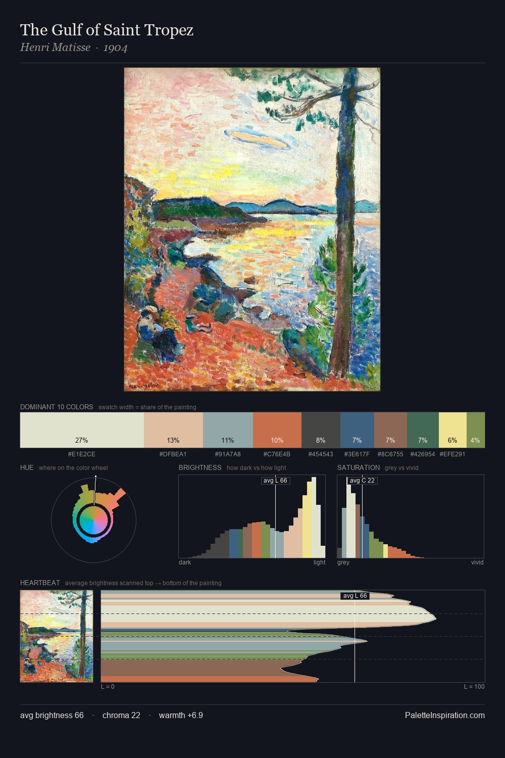
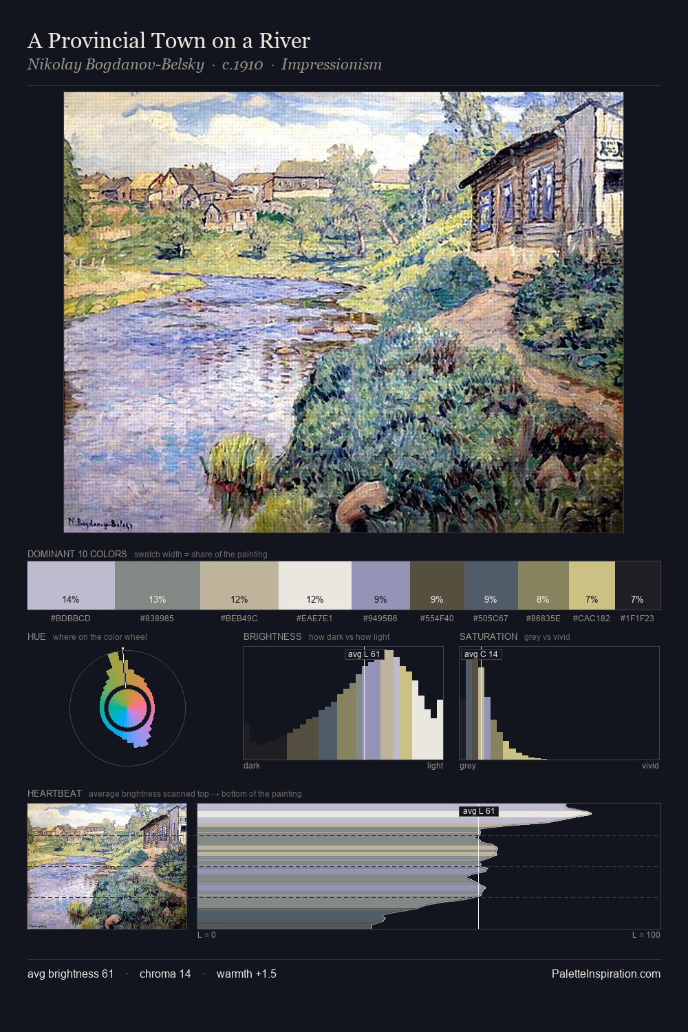
Carlo Carra Palette 6

Palette Analysis
Carlo Carra distributes its values across the middle register, creating harmony without high contrast. Carlo Carra tilts toward cool - blues and silver-greys carry the structural weight. Saturation is deliberately withheld - the beauty here lies in the near-monochromatic gradations rather than colour difference. Only 3.7% is devoted to #44627D, yet that small allocation delivers the palette's entire chromatic tension. 69 units of value range underpin the palette's structural clarity: the eye always knows where light falls. The palette has the character of outdoor light: cool, mid-bright, with colour rendered faithfully rather than expressively. In the context of Carlo Carra's full range of palettes, group 6 represents one movement in an ongoing chromatic dialogue.
Example use cases
- exhibition design
- foundation branding
- estate management
- art education
- museums & galleries
I Love This!
Copy, export, or download for your project