Carl Marcus Tuscher Master Palette
Palette Analysis
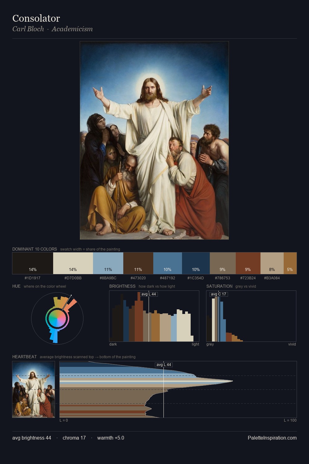
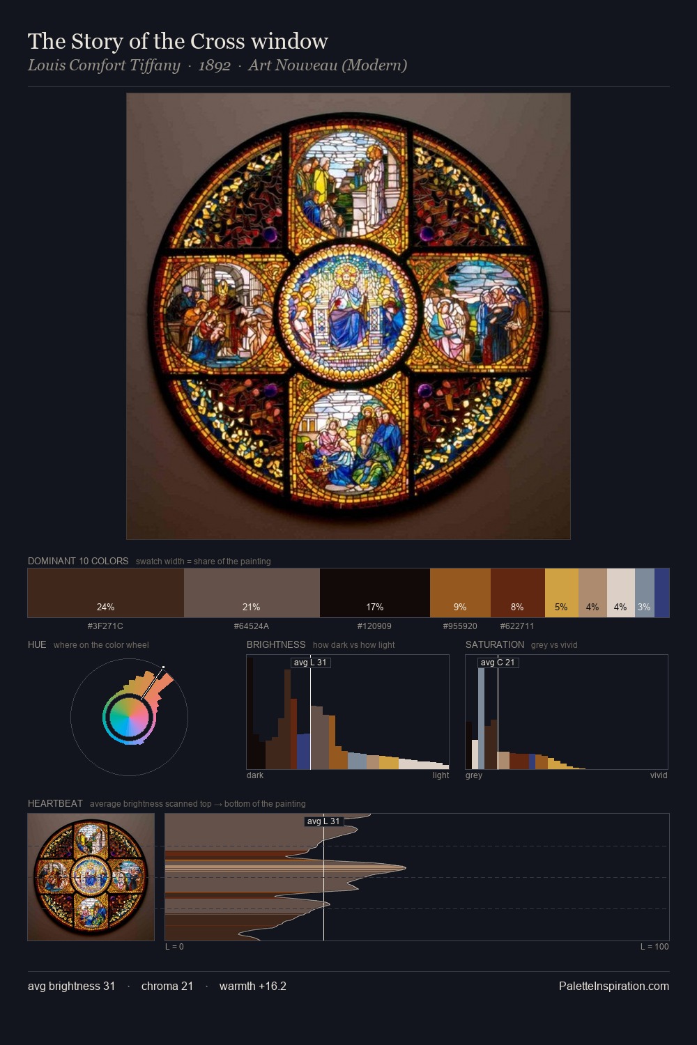
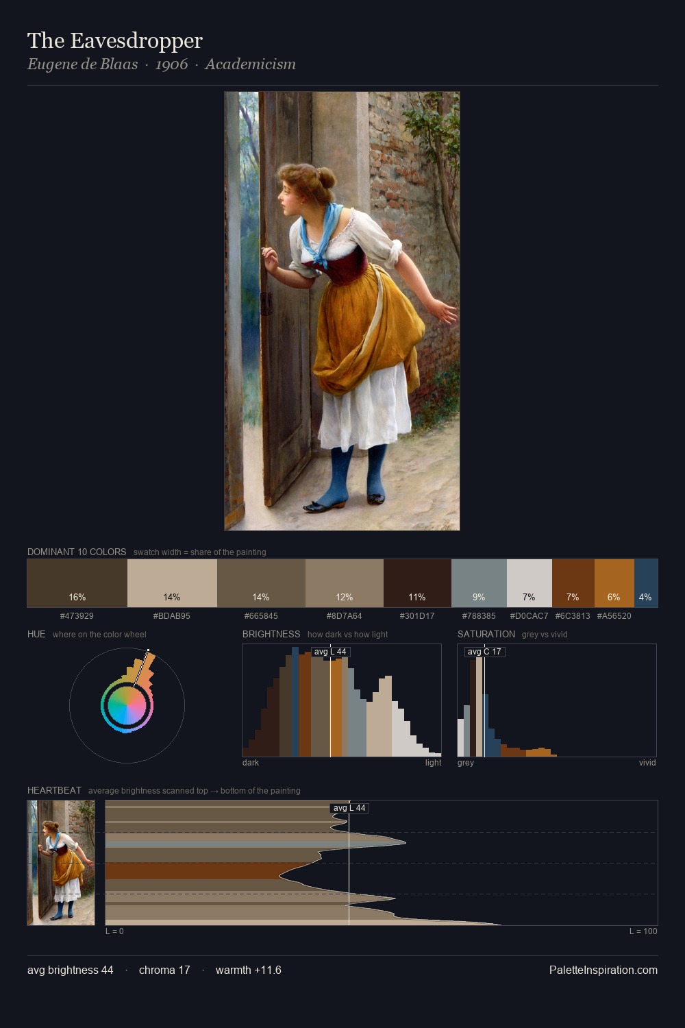
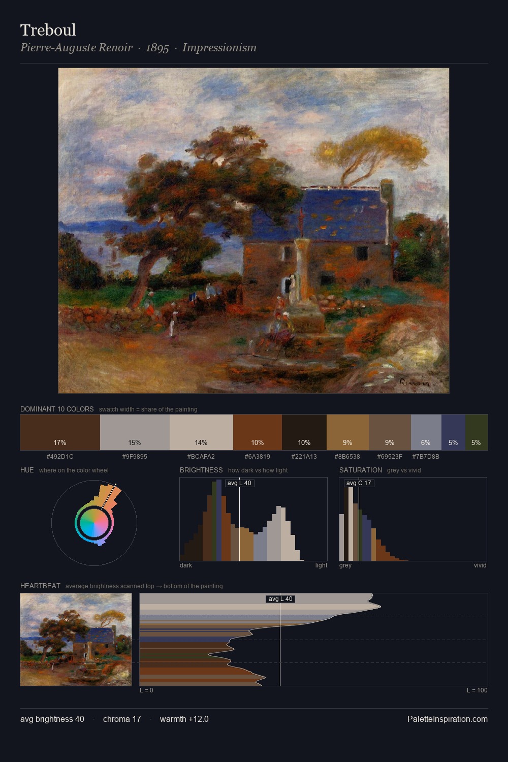
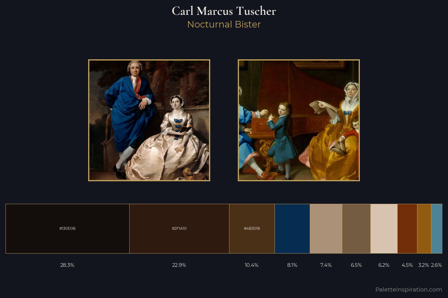
Carl Marcus Tuscher is built on dark foundations, with values clustered toward shadow. Temperature reads distinctly warm: the reds and earth tones from Carl Marcus Tuscher carry the compositional weight. Every colour is desaturated; the palette proceeds through near-neutrals and gently-coloured greys. A single dominant - #130E0B at 28.3% - sets the character of the whole composition. The saturated accent, #915C11, registers at 3.2% - sparse enough to feel like a deliberate surprise. 66 units of value range underpin the palette's structural clarity: the eye always knows where light falls. This tonal restraint is characteristic of the Carl Marcus Tuscher approach: colour serves light, not the reverse. This is the light Carl Marcus Tuscher preferred, made measurable.
Example use cases
- theater design
- jewelry brands
- tobacco-adjacent retail
- event branding
- film & entertainment
I Love This!
Copy, export, or download for your project