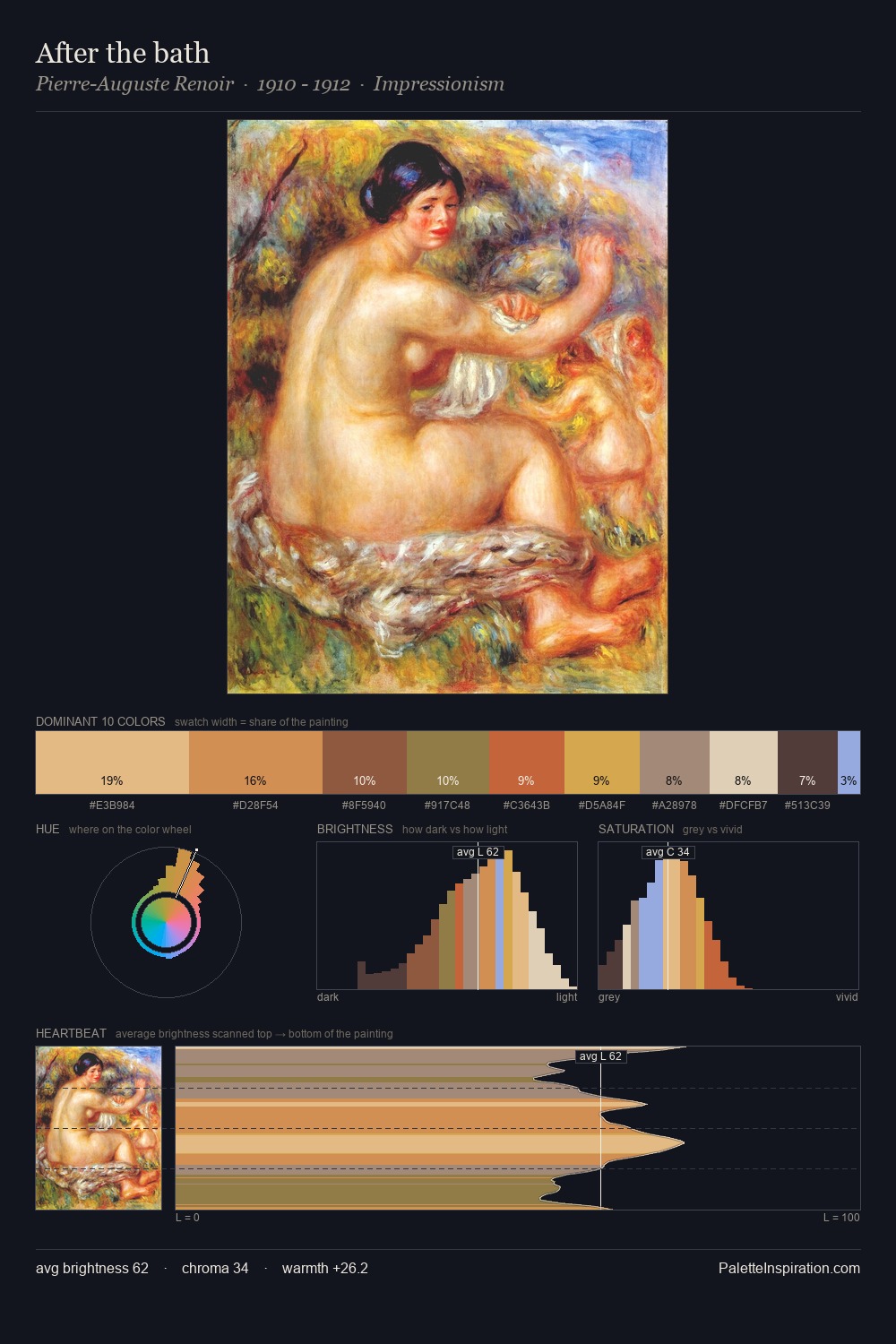
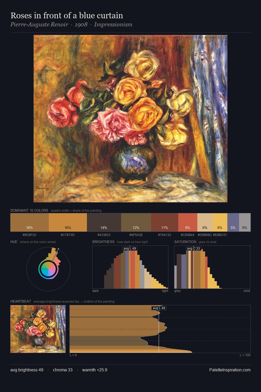
Carl Larsson Palette 9
Muted Vermillion
Muted Deliberately desaturated - chroma pulled toward gray, the restraint of tonal painting.
Vermillion Brilliant red-orange - the classic mercury sulfide pigment, vivid and warm.

Palette Analysis
Carl Larsson keeps values measured and balanced, a hallmark of tonal restraint. The dominant temperature is warm, with earth tones and fire-hues setting the emotional key. Colours are neither washed out nor blazing; they occupy the productive middle ground of the chroma scale. The highest-chroma note - #C64D23 - appears at just 4.0%, deployed as a precision accent against the quieter ground. 53 units of value spread create a palette that is varied but unified - contrast in the service of harmony. Palette 9 sits within the larger chromatic argument that Carl Larsson's complete body of work advances.
Example use cases
- ceramics & pottery
- boutique hospitality
- menswear
- heritage food brands
- craft & artisan brands
I Love This!
Use This Palette
Copy, export, or download for your project
Copy, export, or download for your project
Copy:
Download:
Share: