Carl Johan Billmark Master Palette
Muted Parchment
Muted Deliberately desaturated - chroma pulled toward gray, the restraint of tonal painting.
Parchment Aged warm neutral - the color of old manuscript parchment, tan and slightly yellowed.

Palette Analysis
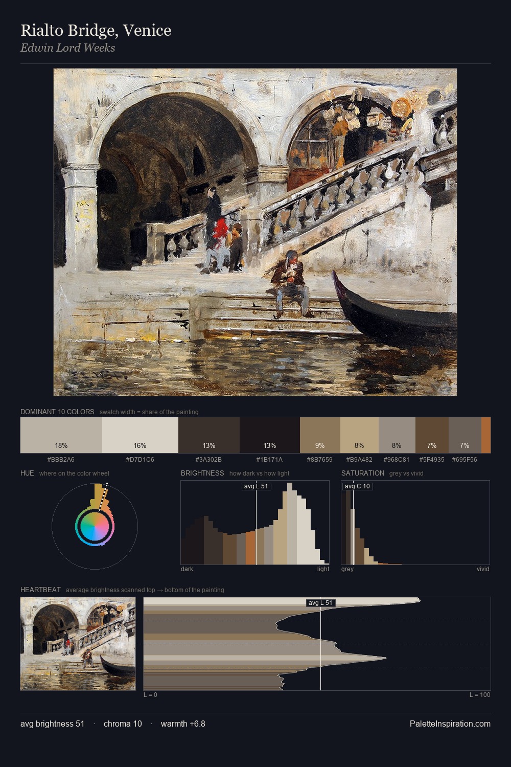
Values in Carl Johan Billmark rest in the mid-range - neither dramatically lit nor steeped in shadow. Yellow, ochre, sienna: warm hues that Carl Johan Billmark deploys as the palette's primary energy. All colours lean toward grey, building depth through value rather than colour punch. The most saturated colour, #4A3B2A, is reserved to 9.2% of the surface, where it acts as a focal punctuation. 70 units of value range underpin the palette's structural clarity: the eye always knows where light falls. Taken together, these qualities constitute Carl Johan Billmark's chromatic voice - distinctive enough to be read across an entire body of work.
Example use cases
- archival print
- university identity
- rare books
- cultural institutions
- nonprofit identity
I Love This!
Use This Palette
Copy, export, or download for your project
Copy, export, or download for your project
Copy:
Download:
Share: