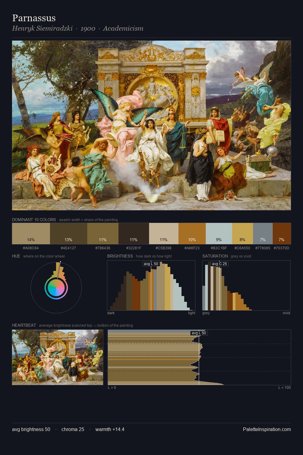
Carl Gustav Rodde Palette 4

Palette Analysis
Carl Gustav Rodde occupies the comfortable middle of the value scale, avoiding both extremes to hold the eye in a sustained middle grey. Blues and teal-greys govern the palette, lending it an aquatic or atmospheric quality. All colours lean toward grey, building depth through value rather than colour punch. The highest-chroma note - #443721 - appears at just 7.9%, deployed as a precision accent against the quieter ground. A value spread of 56 units gives the palette both depth and air - shadows are genuinely dark, lights genuinely light. The palette has the character of outdoor light: cool, mid-bright, with colour rendered faithfully rather than expressively. Palette 4 sits within the larger chromatic argument that Carl Gustav Rodde's complete body of work advances.
Example use cases
- exhibition design
- foundation branding
- estate management
- art education
- museums & galleries
I Love This!
Copy, export, or download for your project