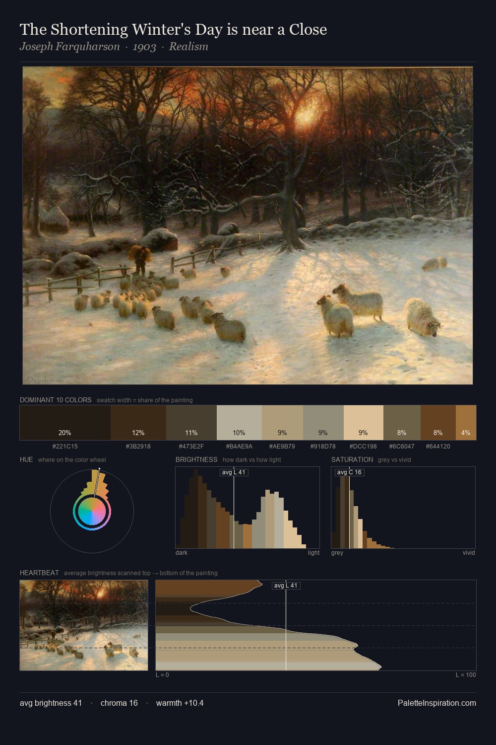
Carl Gustav Rodde Palette 3

Palette Analysis
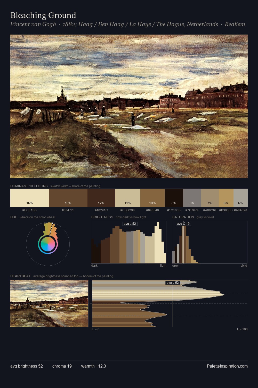
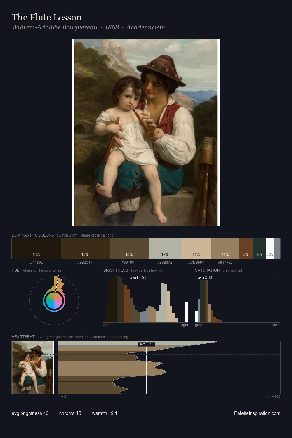
Carl Gustav Rodde occupies the comfortable middle of the value scale, avoiding both extremes to hold the eye in a sustained middle grey. Carl Gustav Rodde tilts toward cool - blues and silver-greys carry the structural weight. Muted throughout, the palette achieves its effects through value and temperature rather than chromatic force. The most saturated colour, #E2CE9F, is reserved to 7.2% of the surface, where it acts as a focal punctuation. 64 units of value range underpin the palette's structural clarity: the eye always knows where light falls. The palette has the character of outdoor light: cool, mid-bright, with colour rendered faithfully rather than expressively. This is palette 3 of Carl Gustav Rodde's sequence - a single chapter in a chromatic story told across many works.
Example use cases
- interior design
- furniture brands
- cookbook publishing
- wine & spirits
- food packaging
I Love This!
Copy, export, or download for your project