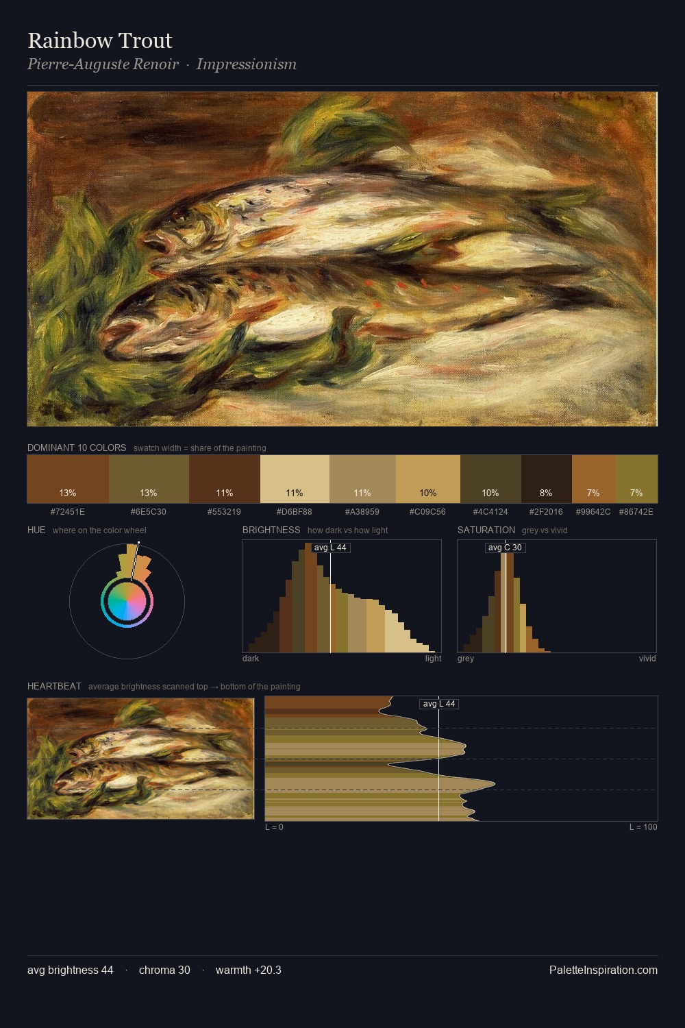
Carl Frederik Sorensen Palette 5

Palette Analysis
Carl Frederik Sorensen keeps values measured and balanced, a hallmark of tonal restraint. Cool hues prevail: blues, greens, and greys anchor the palette's emotional temperature. Colours are neither washed out nor blazing; they occupy the productive middle ground of the chroma scale. The saturated accent, #895E23, registers at 11.5% - sparse enough to feel like a deliberate surprise. A value spread of 65 units gives the palette both depth and air - shadows are genuinely dark, lights genuinely light. The palette has the character of outdoor light: cool, mid-bright, with colour rendered faithfully rather than expressively. Carl Frederik Sorensen's palette 5 carries its own internal logic while remaining in conversation with the artist's broader colour intelligence.
Example use cases
- theater design
- jewelry brands
- tobacco-adjacent retail
- event branding
- film & entertainment
I Love This!
Copy, export, or download for your project