Capriccio Master Palette

Palette Analysis
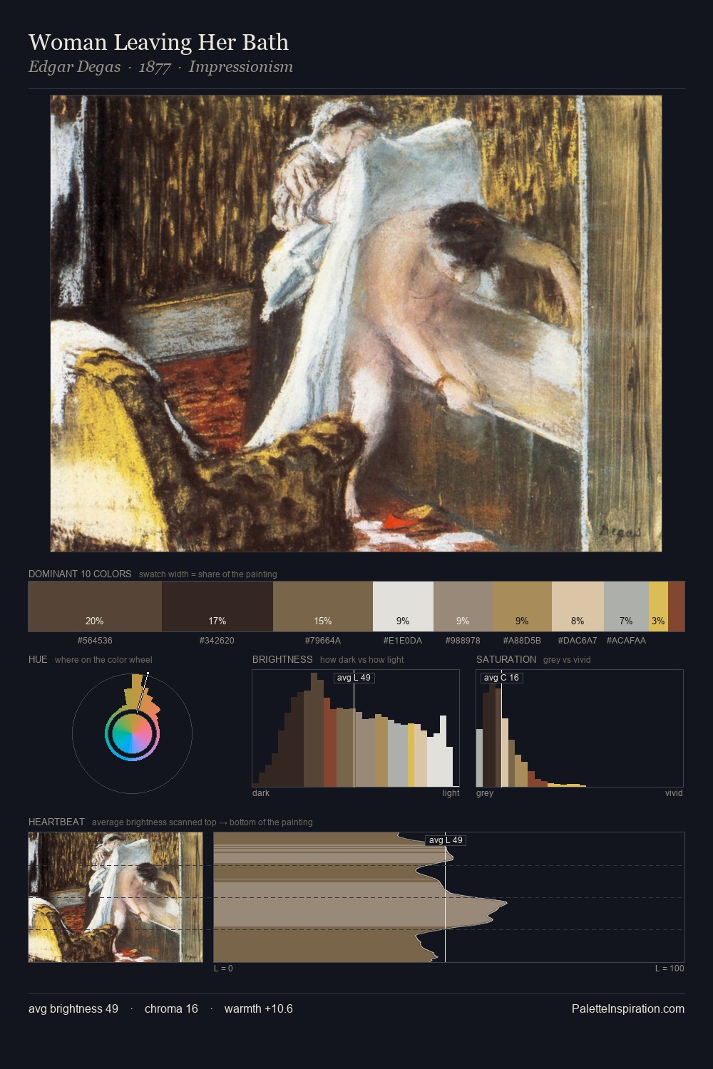
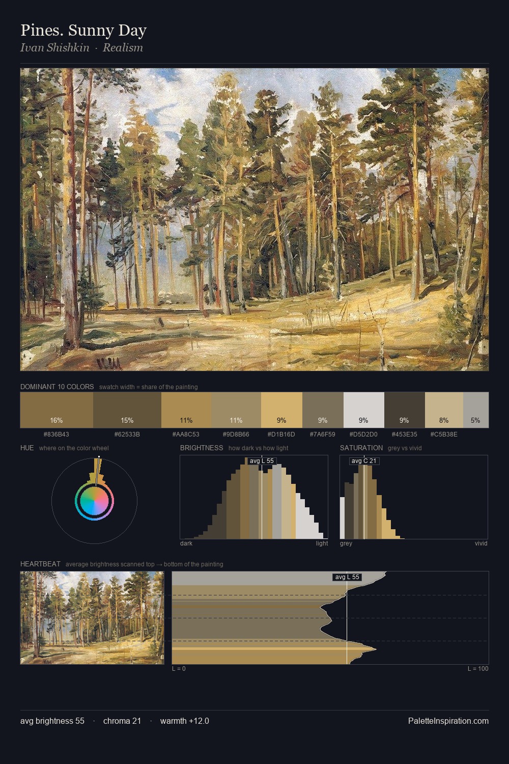
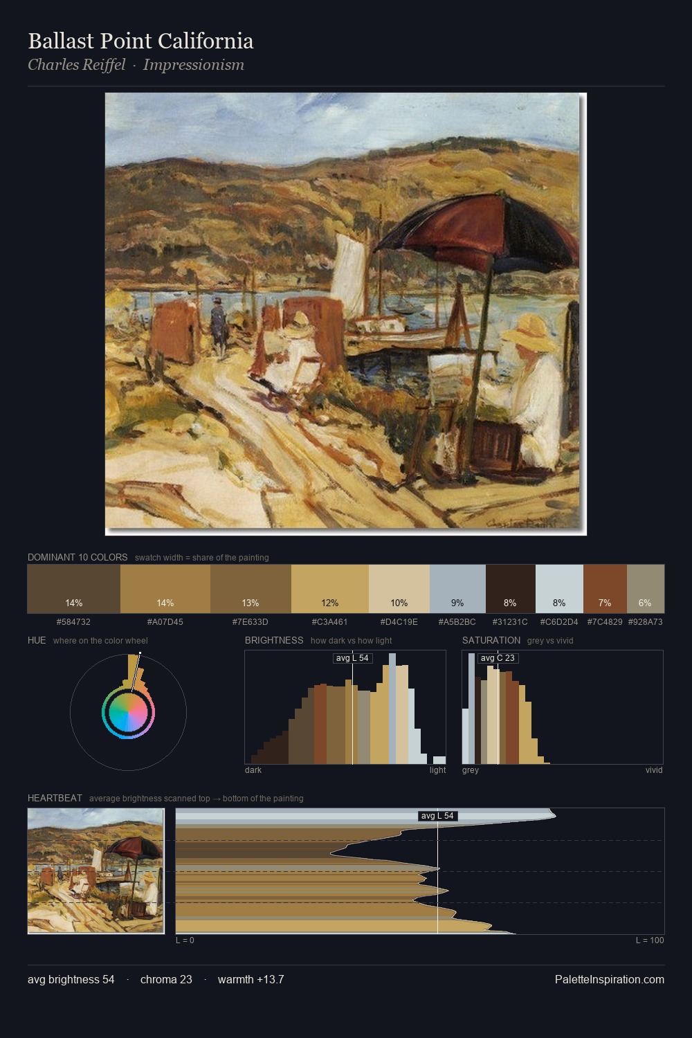
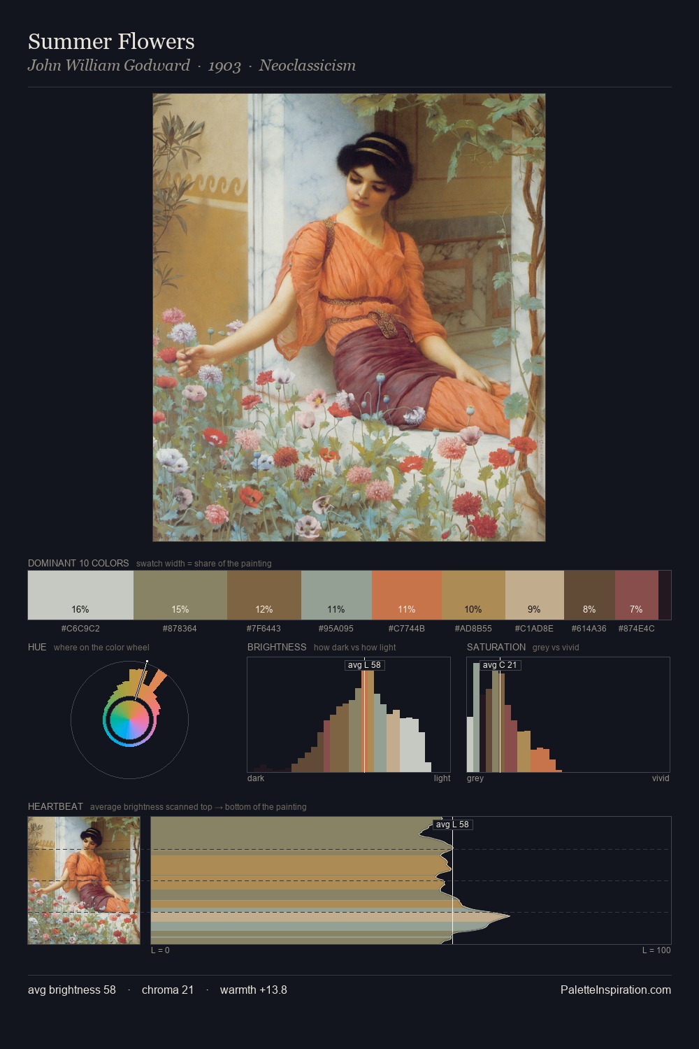
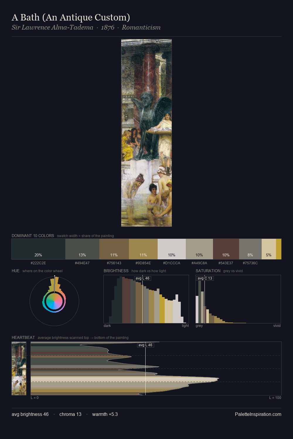
The capriccio tradition carries a consistent chromatic signature, and this master palette captures its essence. capriccio distributes its values across the middle register, creating harmony without high contrast. Warm and cool are kept in productive tension, creating the kind of chromatic harmony that sustains the eye. Saturation is deliberately withheld - the beauty here lies in the near-monochromatic gradations rather than colour difference. Only 7.2% is devoted to #B89359, yet that small allocation delivers the palette's entire chromatic tension. The value range spans 61 units across the palette, providing the full gamut from deep shadow to near-white and ensuring clear tonal hierarchy. The capriccio movement spoke in this palette's vocabulary.
Example use cases
- nonprofit identity
- public libraries
- historical sites
- literary journals
- archival print
I Love This!
Copy, export, or download for your project