Camille Corot Palette 12
Muted Parchment
Muted Deliberately desaturated - chroma pulled toward gray, the restraint of tonal painting.
Parchment Aged warm neutral - the color of old manuscript parchment, tan and slightly yellowed.

Palette Analysis
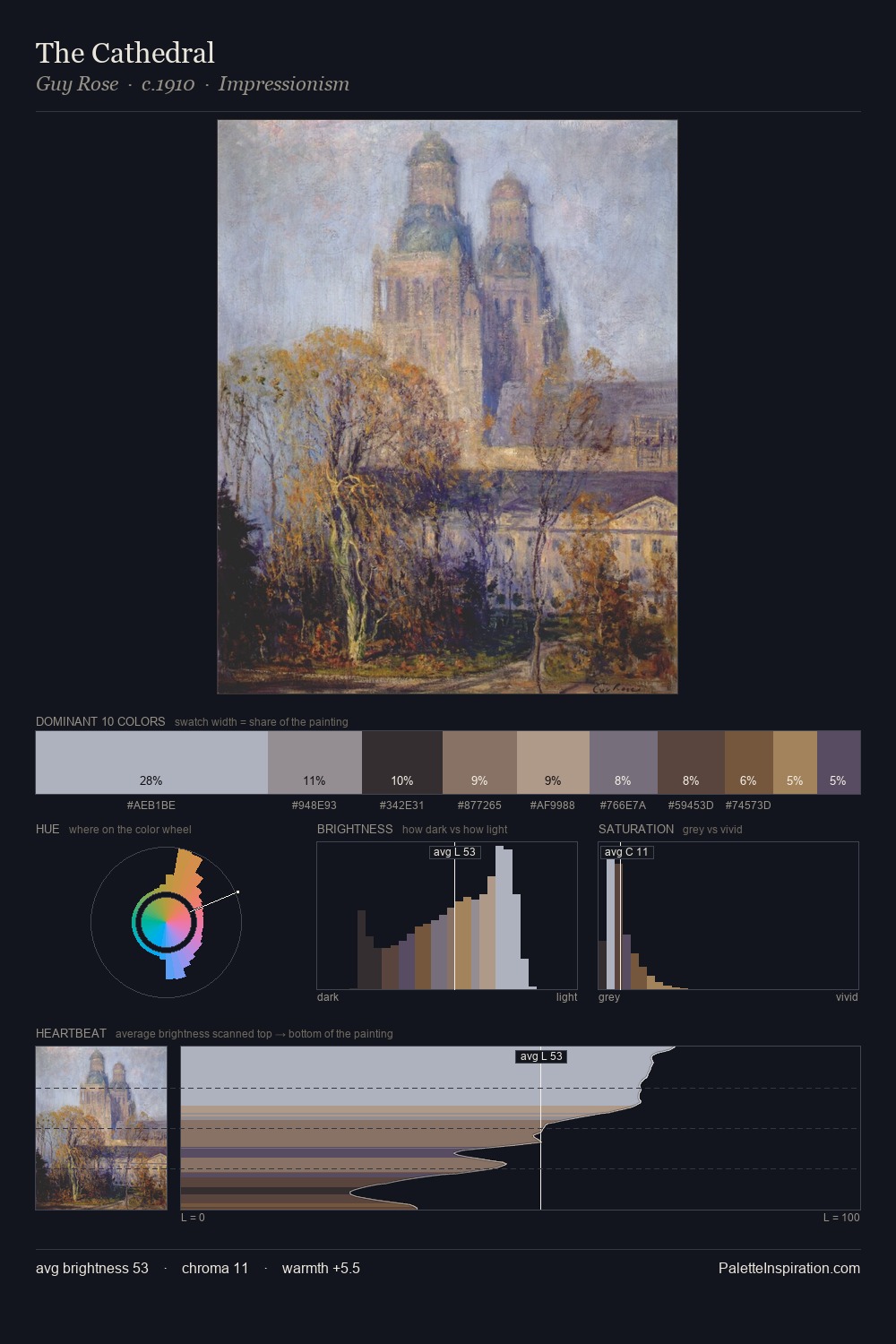
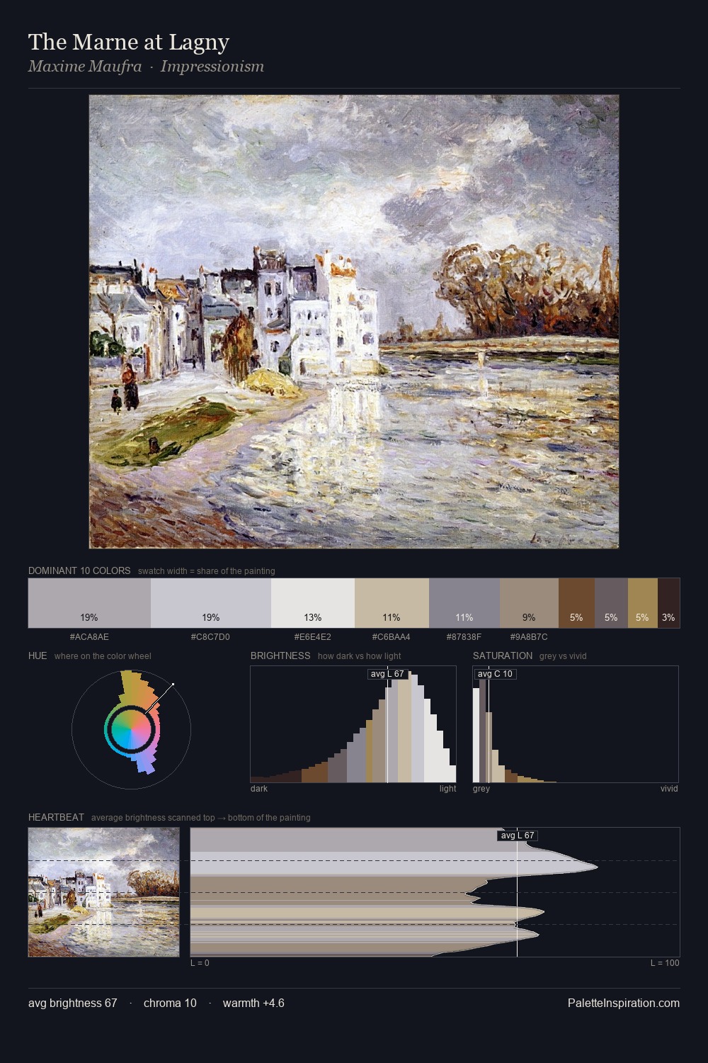
Camille Corot distributes its values across the middle register, creating harmony without high contrast. A distinctly cool atmosphere runs through this palette: sky, water, and mist given colour form. All colours lean toward grey, building depth through value rather than colour punch. #301E18 functions as the palette's exclamation mark: highest chroma, lowest percentage (6.9%). At 54 units across the value scale, the palette keeps contrast readable without letting it dominate. The mid-to-high key, cool bias, and moderate chroma point to outdoor observation - sky and diffused daylight as the dominant light source. This is palette 12 of Camille Corot's sequence - a single chapter in a chromatic story told across many works.
Example use cases
- exhibition design
- foundation branding
- estate management
- art education
- museums & galleries
I Love This!
Use This Palette
Copy, export, or download for your project
Copy, export, or download for your project
Copy:
Download:
Share: