Byzantine Palette 4
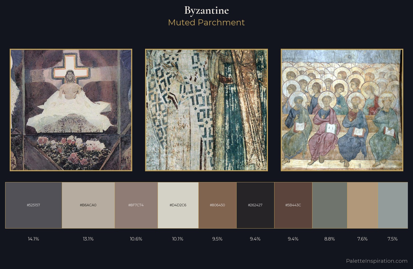
Muted Parchment
Muted Deliberately desaturated - chroma pulled toward gray, the restraint of tonal painting.
Parchment Aged warm neutral - the color of old manuscript parchment, tan and slightly yellowed.
Palette Analysis
Byzantine distributes its values across the middle register, creating harmony without high contrast. Warm and cool are kept in productive tension, creating the kind of chromatic harmony that sustains the eye. Chroma hovers near zero; colour declares itself through subtle shifts in hue rather than outright saturation. The most saturated colour, #B1987B, is reserved to 7.6% of the surface, where it acts as a focal punctuation. From deepest dark to palest light, the palette traverses 60 units of the value scale - a span that creates natural depth.
Example use cases
- nonprofit identity
- public libraries
- historical sites
- literary journals
- archival print
I Love This!
Use This Palette
Copy, export, or download for your project
Copy, export, or download for your project
Copy:
Download:
Share: