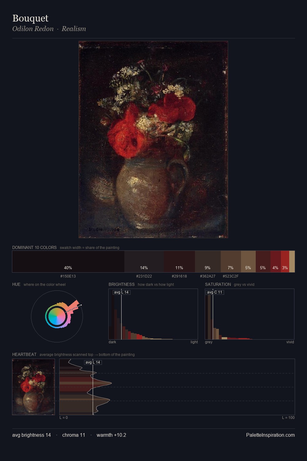
Byam Shaw Palette 10

Palette Analysis
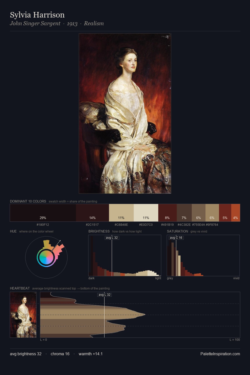
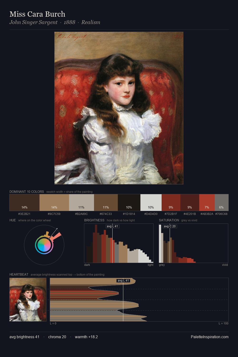
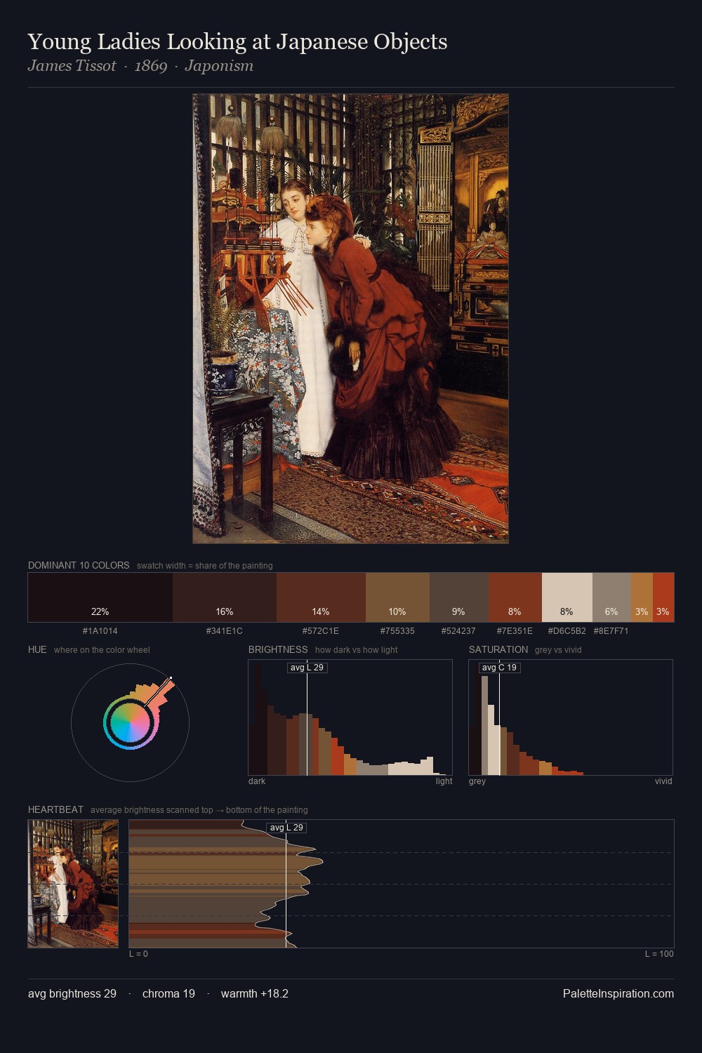
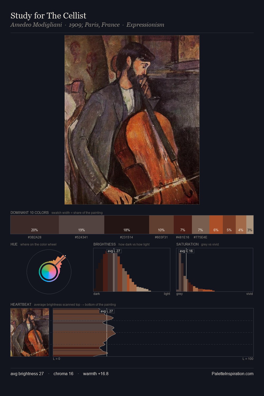
Byam Shaw works almost entirely in the lower half of the value scale, privileging depth over brilliance. Warm hues command this palette; Byam Shaw favours the reds, oranges, and yellows of firelight and earth. Chroma hovers near zero; colour declares itself through subtle shifts in hue rather than outright saturation. Only 3.9% is devoted to #712E22, yet that small allocation delivers the palette's entire chromatic tension. Value range is moderate at 54 units - enough contrast for legibility, not so much as to fragment the tonal unity. Together these qualities place Byam Shaw firmly in the tonal tradition - concerned with mood and atmosphere rather than chromatic display. Palette 10 sits within the larger chromatic argument that Byam Shaw's complete body of work advances.
Example use cases
- theater design
- jewelry brands
- tobacco-adjacent retail
- event branding
- film & entertainment
I Love This!
Copy, export, or download for your project