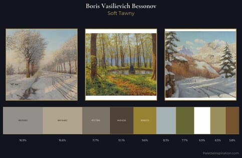
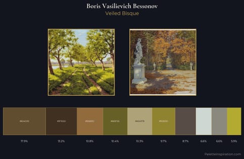
Boris Vasilievich Bessonov Master Palette
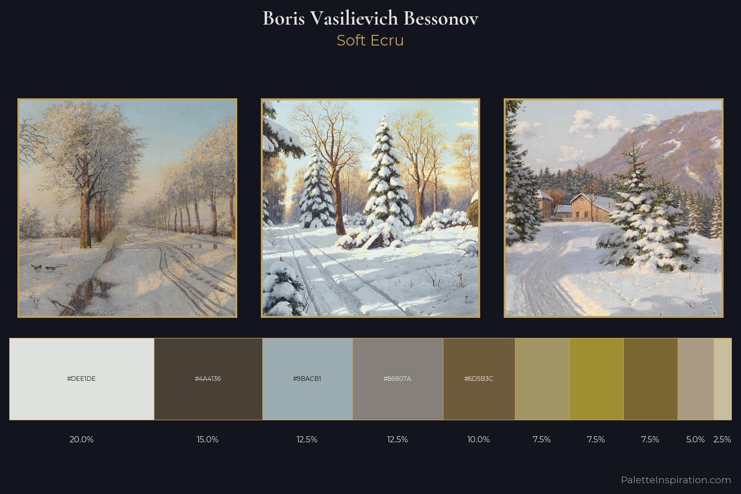
Palette Analysis
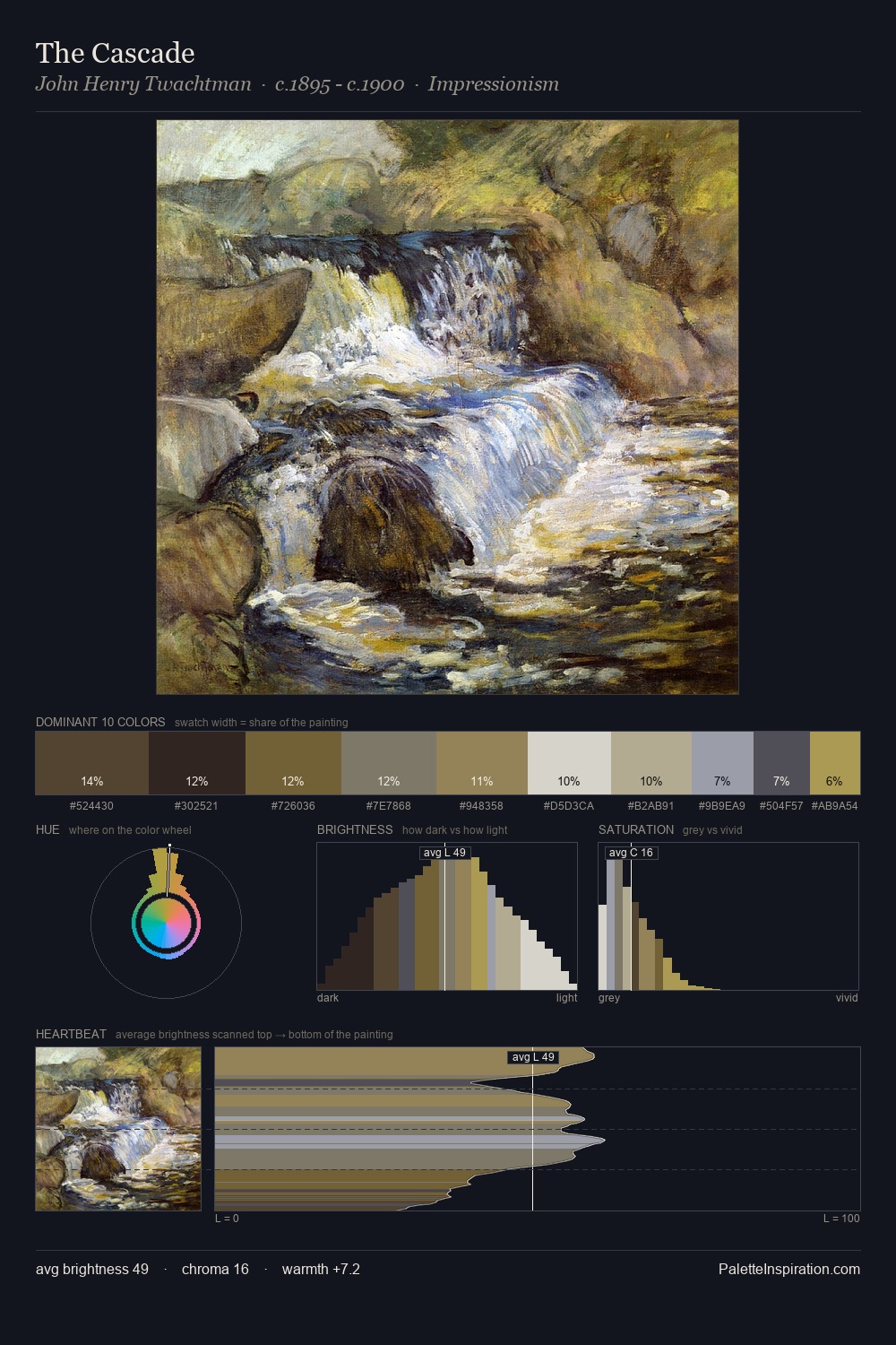
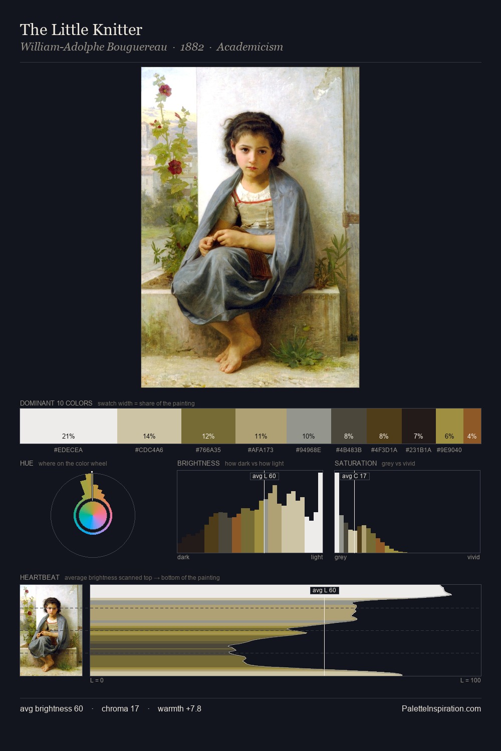
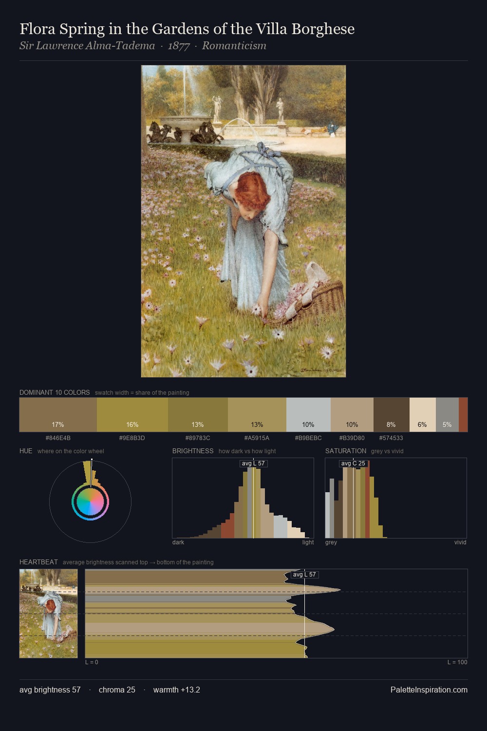
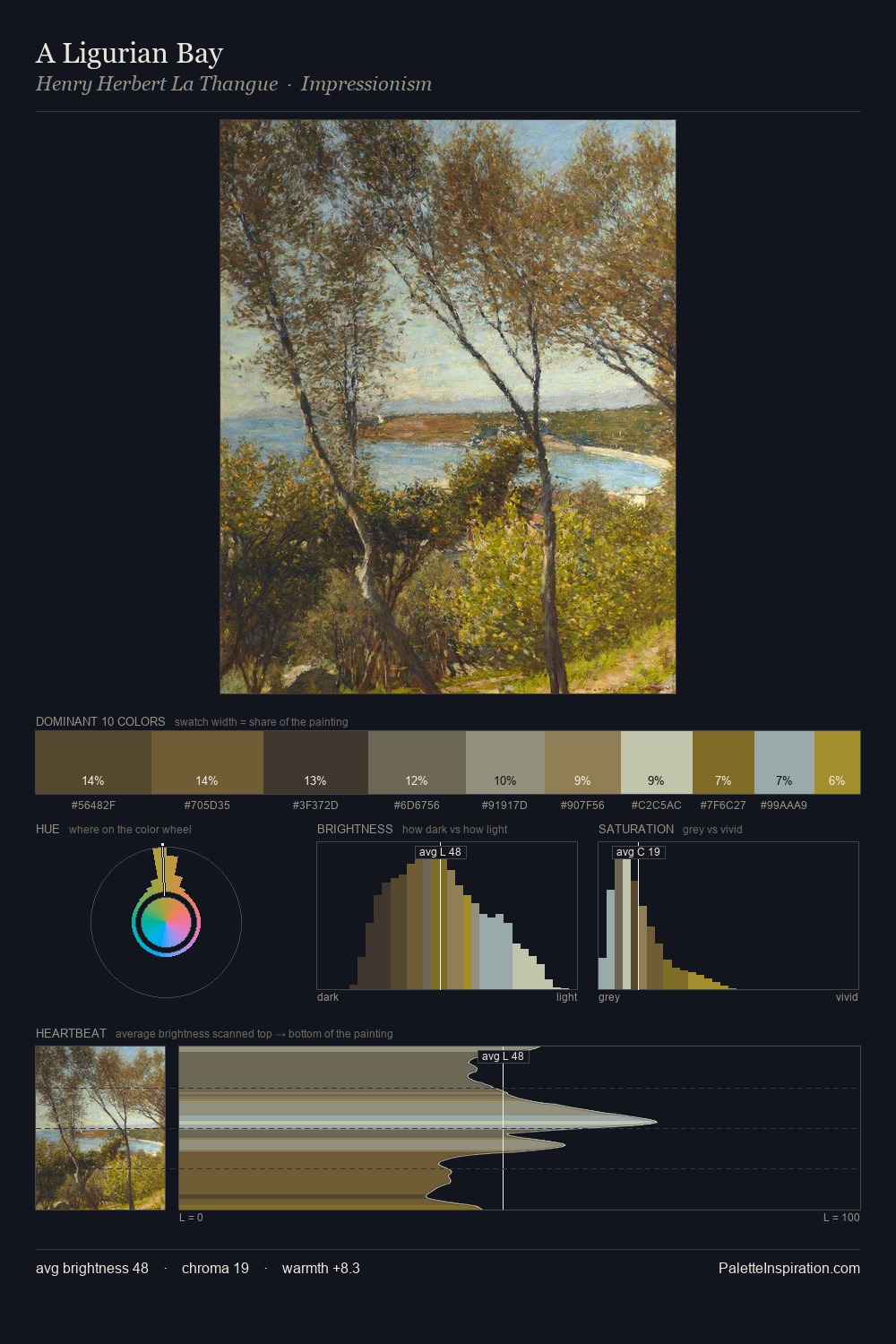
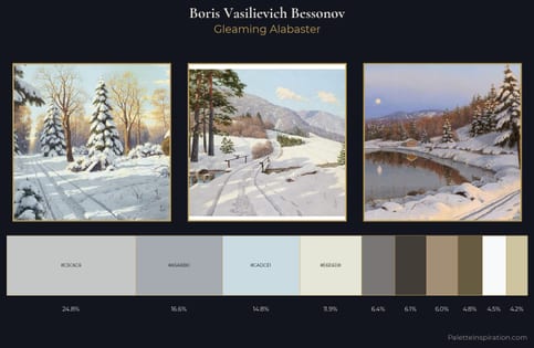
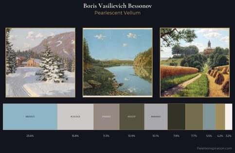
Boris Vasilievich Bessonov keeps values measured and balanced, a hallmark of tonal restraint. Boris Vasilievich Bessonov builds on cool foundations: the palette favours the blue-cyan-green arc. Every colour is desaturated; the palette proceeds through near-neutrals and gently-coloured greys. The highest-chroma note - #9E9032 - appears at just 7.5%, deployed as a precision accent against the quieter ground. At 53 units across the value scale, the palette keeps contrast readable without letting it dominate. The palette has the character of outdoor light: cool, mid-bright, with colour rendered faithfully rather than expressively. The palette is recognisably Boris Vasilievich Bessonov's own: particular in its temperature, chroma, and the economy of its brightest note.
Example use cases
- nonprofit identity
- public libraries
- historical sites
- literary journals
- archival print
I Love This!
Copy, export, or download for your project