Boris Vasilievich Bessonov Palette 2
Pearlescent Vellum
Pearlescent Iridescent light quality - high-key with subtle hue variation, like mother-of-pearl.
Vellum Smooth pale tan - the color of prepared calf-skin vellum, warmer than parchment.

Palette Analysis
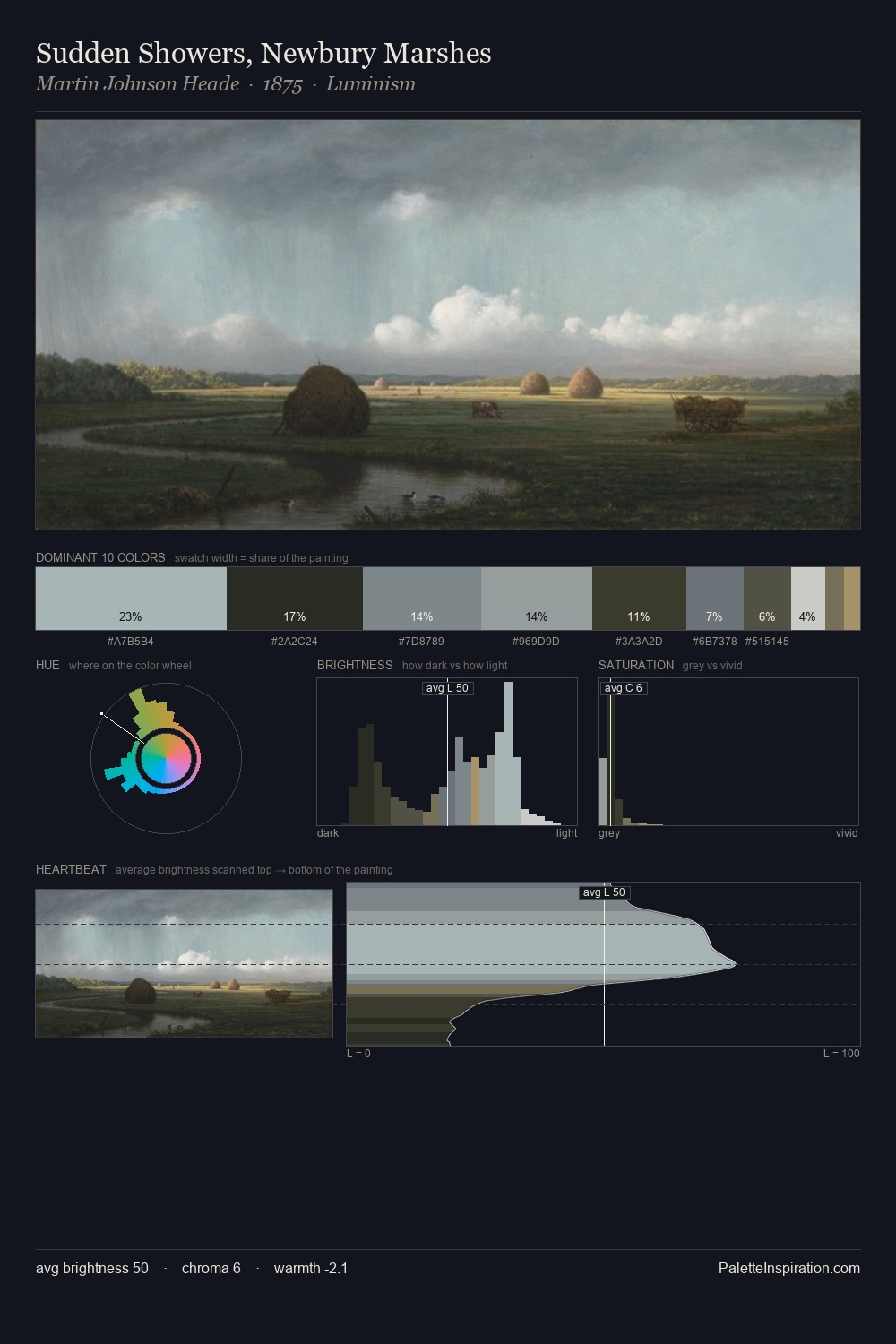
Boris Vasilievich Bessonov is high in key: pale, luminous, and filled with optical air. Cool hues prevail: blues, greens, and greys anchor the palette's emotional temperature. All colours lean toward grey, building depth through value rather than colour punch. The most saturated colour, #9E8C5A, is reserved to 4.2% of the surface, where it acts as a focal punctuation. From deepest dark to palest light, the palette traverses 65 units of the value scale - a span that creates natural depth. High luminosity and cool temperature suggest the plein-air condition: unfiltered daylight and open sky. Palette 2 sits within the larger chromatic argument that Boris Vasilievich Bessonov's complete body of work advances.
Example use cases
- archival print
- university identity
- rare books
- cultural institutions
- nonprofit identity
I Love This!
Use This Palette
Copy, export, or download for your project
Copy, export, or download for your project
Copy:
Download:
Share: