Bertalan Szekely Palette 4
Shadowed Rust
Shadowed Low-key - values weighted toward shadow, the palette of dim interiors and overcast skies.
Rust Oxidized red-brown - the color of iron corrosion, warm and earthy-red.
Palette Analysis
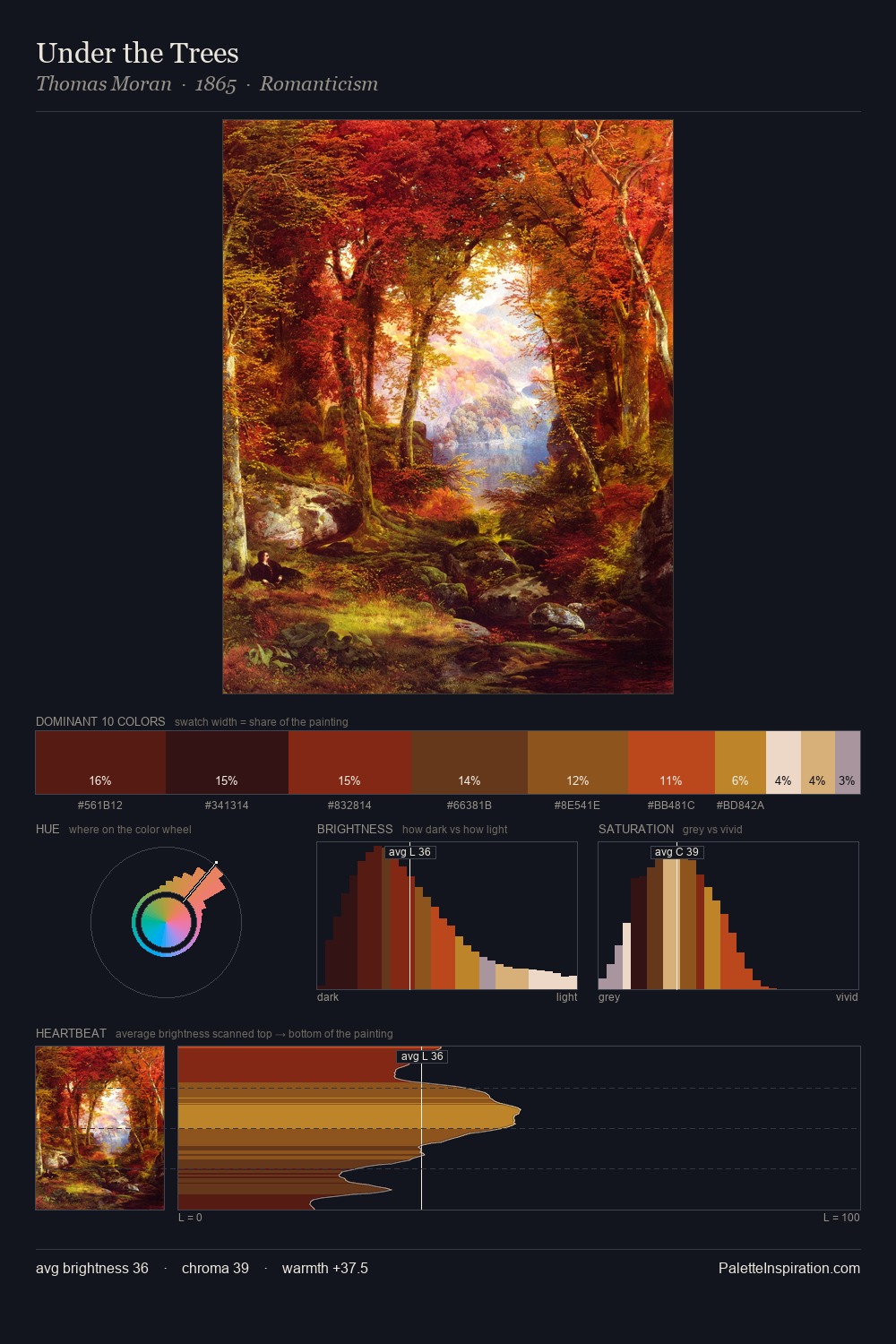
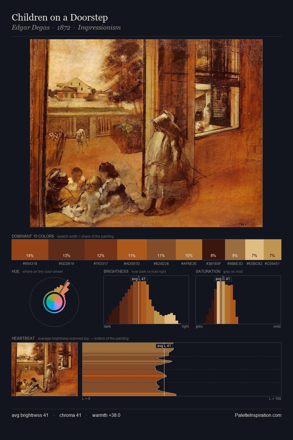
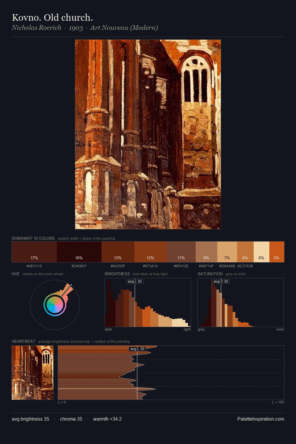
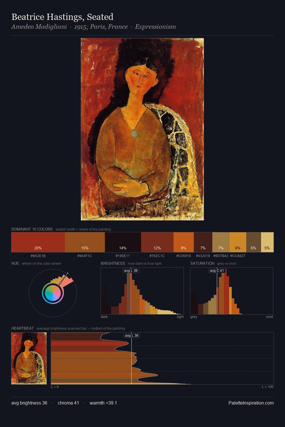
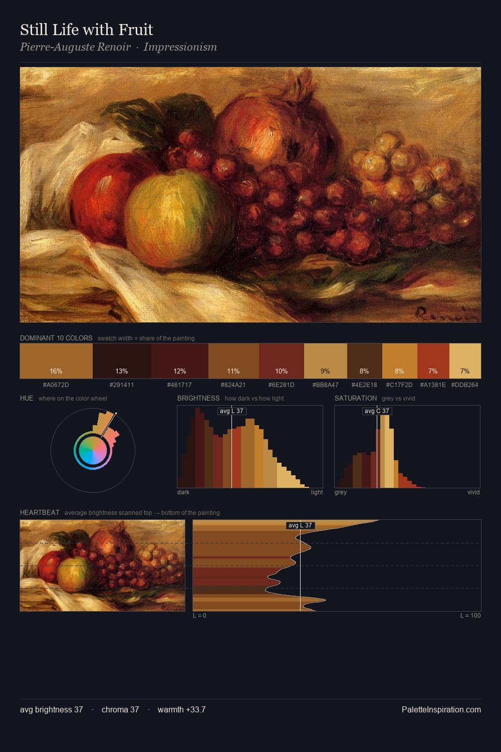
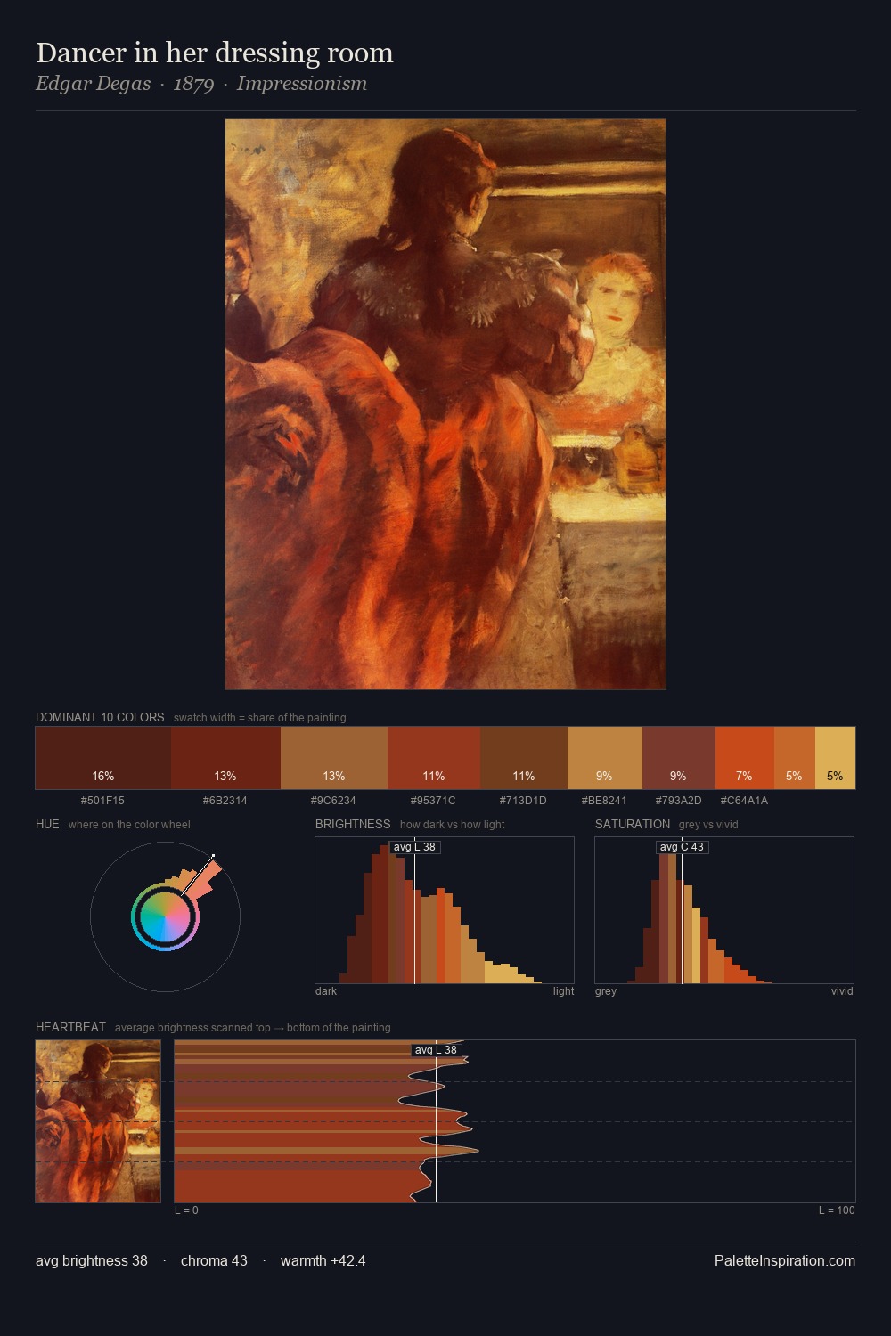
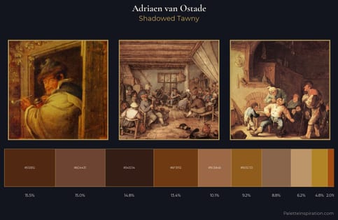
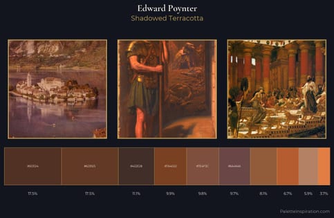
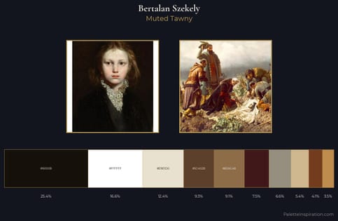
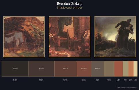
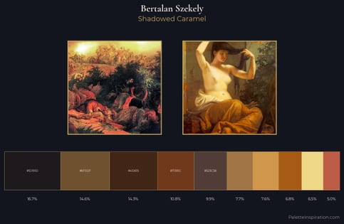
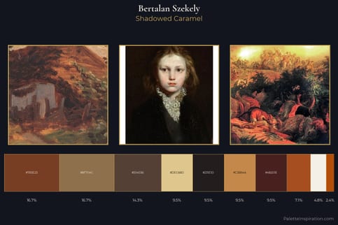
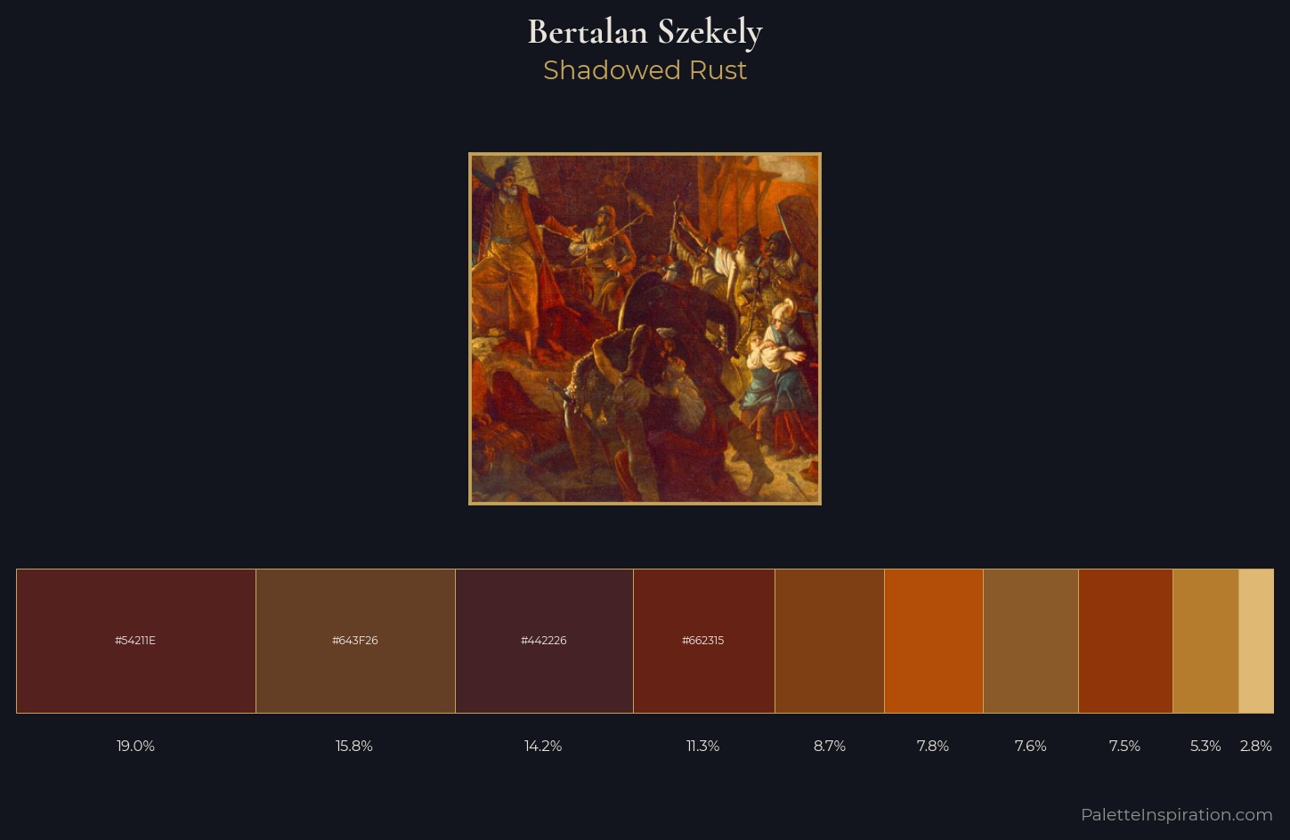
Values in Bertalan Szekely rest in the mid-range - neither dramatically lit nor steeped in shadow. Temperature reads distinctly warm: the reds and earth tones from Bertalan Szekely carry the compositional weight. Colours are neither washed out nor blazing; they occupy the productive middle ground of the chroma scale. Only 8.7% is devoted to #7F3F14, yet that small allocation delivers the palette's entire chromatic tension. 50 units of value spread create a palette that is varied but unified - contrast in the service of harmony. Palette 4 sits within the larger chromatic argument that Bertalan Szekely's complete body of work advances.
Example use cases
- premium streaming
- cocktail bars
- fashion campaigns
- book covers
- music labels
I Love This!
Use This Palette
Copy, export, or download for your project
Copy, export, or download for your project
Copy:
Download:
Share: