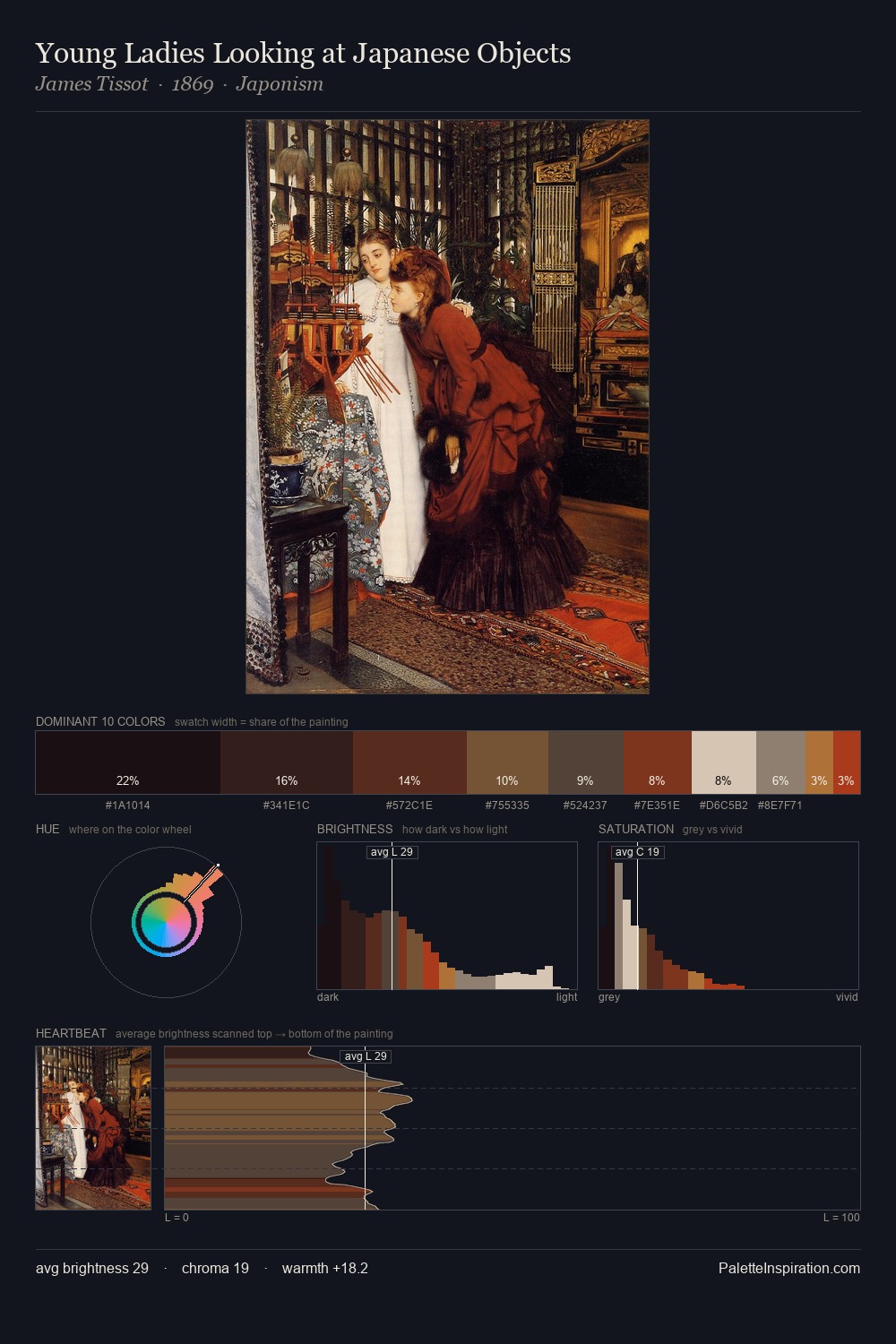
Bernardo Strozzi Palette 9

Palette Analysis
Bernardo Strozzi is built on dark foundations, with values clustered toward shadow. Yellow, ochre, sienna: warm hues that Bernardo Strozzi deploys as the palette's primary energy. Muted throughout, the palette achieves its effects through value and temperature rather than chromatic force. At 38.3%, #120E0D functions less as a colour accent and more as a complete atmospheric environment. #B87B51 delivers the chromatic peak at only 3.4% - a small shot of colour with outsized visual impact. The value range spans 66 units across the palette, providing the full gamut from deep shadow to near-white and ensuring clear tonal hierarchy. This tonal restraint is characteristic of the Bernardo Strozzi approach: colour serves light, not the reverse. Bernardo Strozzi's palette 9 carries its own internal logic while remaining in conversation with the artist's broader colour intelligence.
Example use cases
- theater design
- jewelry brands
- tobacco-adjacent retail
- event branding
- film & entertainment
I Love This!
Copy, export, or download for your project