Bernardo Bellotto Palette 2
Pale Ivory
Pale High-key and low-chroma - delicate, bleached, washed with light.
Ivory Warm creamy white - the color of natural ivory, warmer than pure white.
Palette Analysis
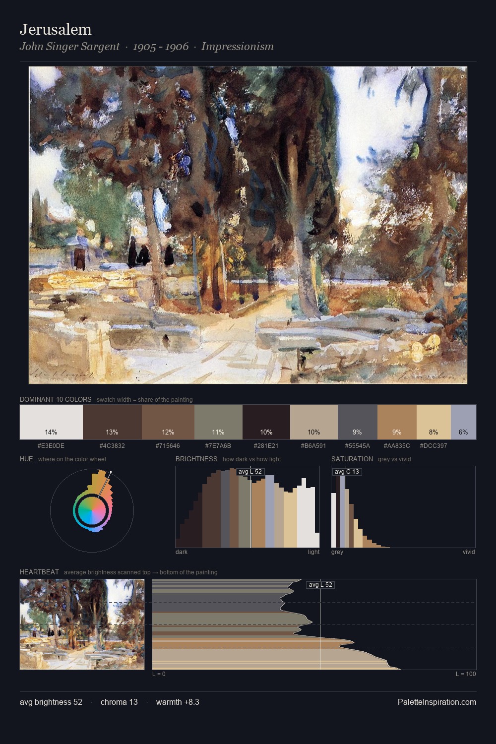
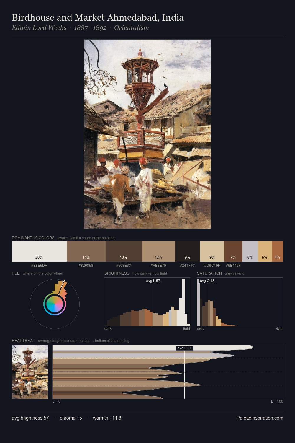
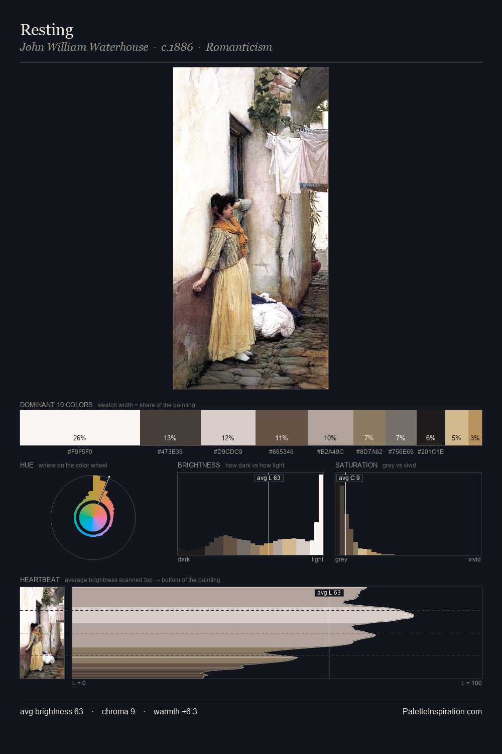
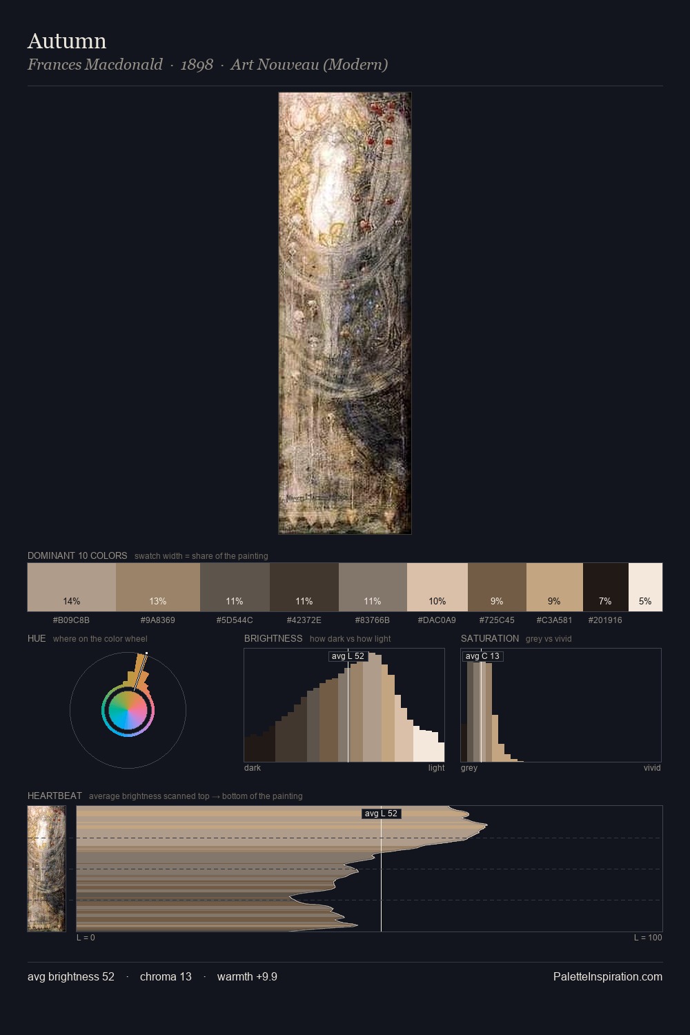
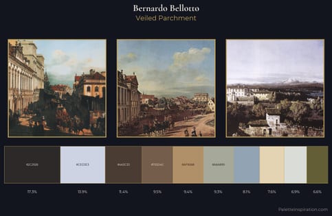
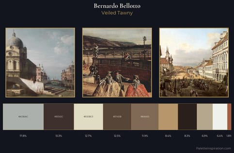
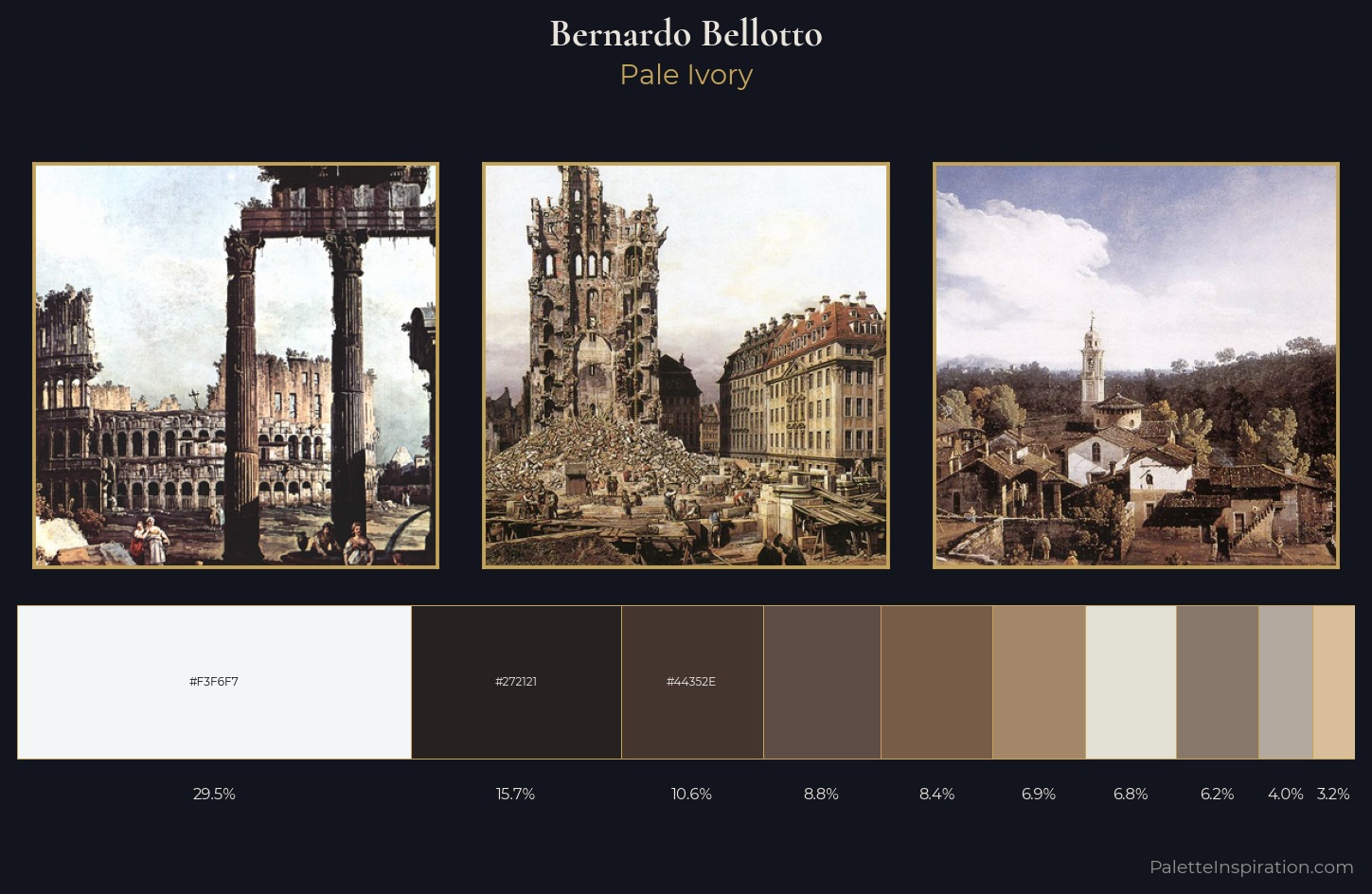
Values in Bernardo Bellotto rest in the mid-range - neither dramatically lit nor steeped in shadow. Yellow, ochre, sienna: warm hues that Bernardo Bellotto deploys as the palette's primary energy. Every colour is desaturated; the palette proceeds through near-neutrals and gently-coloured greys. A single dominant - #F3F6F7 at 29.5% - sets the character of the whole composition. #A38768 functions as the palette's exclamation mark: highest chroma, lowest percentage (6.9%). 72 units of value range underpin the palette's structural clarity: the eye always knows where light falls. Bernardo Bellotto's palette 2 carries its own internal logic while remaining in conversation with the artist's broader colour intelligence.
Example use cases
- exhibition design
- foundation branding
- estate management
- art education
- museums & galleries
I Love This!
Use This Palette
Copy, export, or download for your project
Copy, export, or download for your project
Copy:
Download:
Share: